Responsive Web Design: A Practical Guide for 2026
What if a website looked polished on a large screen but made its most important content harder to use on a phone? That’s the real test of responsive web design: not whether a page simply shrinks, but whether its layout, navigation and calls to action continue to work as screen sizes change.
If you’re unsure how responsive design differs from a mobile-friendly site or a separate mobile website, you’re not alone. It can also be difficult to picture how content will rearrange across phones, tablets and desktops, or how a design team checks that the experience feels clear on each one.
This practical guide explains the principles behind adaptable layouts, how to plan a website around user needs and what to check across different screens. You’ll also learn what to look for when commissioning a professional build, from the connection between UX/UI design and development to testing and support. With a clear framework, you can make informed decisions and create a website that offers a cohesive experience as people move between devices.
Key Takeaways
- Understand how responsive web design adapts layouts to available space while keeping content and key actions usable.
- Learn why a page that looks right at one phone width may still need adjustments on other screens.
- Use a practical planning and testing workflow to check real content across varied viewport widths before launch.
- Assess a web design partner by how they connect audience needs, usability, visual design, testing and post-launch support.
- Know what to review across mobile, tablet and desktop to make a more informed decision about your website.
What Is Responsive Web Design, and What Should It Do for Your Website?
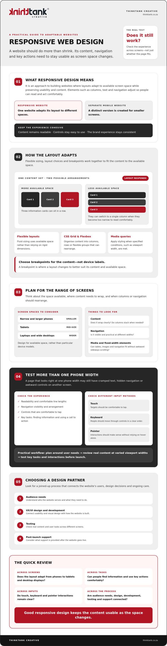
Responsive web design is an approach to building websites in which layouts adapt to the available screen space while preserving usability and content. Rather than forcing a fixed-width page onto every screen, the design adjusts elements such as columns, text and navigation so visitors can read and act comfortably. A separate mobile-only website uses a distinct version for smaller screens; a responsive site adapts the same website to different spaces.
The goal is more than making a page fit. Content should remain readable, controls easy to use and the brand experience consistent, whether someone is browsing on a phone or a wide desktop display. For a foundational overview of the approach and its history, see Responsive web design (RWD).
For a practical visual introduction, watch this guide to responsive web design:
How Is Responsive Design Different from Mobile-Friendly Design?
“Mobile-friendly” describes a user experience goal: a website should be practical to use on a mobile device. It doesn’t prescribe a particular technical method. Responsive layouts can adjust fluidly as space changes or switch arrangement at chosen breakpoints, where the design changes to better suit the content and available width.
A page that looks fine at one phone width may still have cramped text, hidden navigation or awkward controls on a narrower phone or larger tablet. Check how the layout behaves across widths, rather than relying on one mobile check.
Which Screens and User Contexts Should a Website Support?
Plan for a range of available spaces: narrow and larger phones, tablets, laptops and wide desktop displays. Focus on where content needs to wrap, columns should stack or navigation needs a different arrangement, rather than designing for particular device models.
Consider how people interact, too. Touch targets should be comfortable to tap; keyboard users should be able to move through controls in a clear order; and pointer interactions should be understandable without relying on hover alone. Review key tasks, such as finding information or using a call to action, at different widths and with different input methods. This helps a cohesive design serve people, not just screens.
How Responsive Web Design Works: Flexible Layouts, Breakpoints, and Media
Responsive web design relies on coordinated decisions. Layouts must accommodate changing space, typography should remain readable, images and other media need to fit their containers, and navigation and controls should stay usable as the page rearranges.
A breakpoint is a point at which a layout changes to better suit its content and the available space. For example, a row of three information cards might work on a wide screen, then switch to a single column when each card becomes too narrow to read comfortably.
Choose breakpoints when the layout needs to change, not because a screen belongs to a particular device category. This content-led approach helps the design adapt to the space it actually has. MDN Web Docs explains how responsive layouts work, including the role of flexible layouts and media queries.
How Do Flexible Grids and CSS Layouts Adapt?
Fluid sizing lets elements use a proportion of the available space instead of relying on rigid, fixed dimensions. CSS Grid and Flexbox can organise content into columns, rows or flexible groups that rearrange as space changes. The right choice depends on the content and purpose of the page: a comparison may need aligned columns, while a set of service cards may work well as a flexible row that wraps.
Fixed-width elements can cause trouble when the viewport is narrower than expected. A wide table, image or navigation bar may overflow its container, forcing visitors to scroll sideways or making content difficult to reach. Flexible proportions help prevent this, but still need sensible limits so text doesn’t stretch across an uncomfortably wide line.
How Do Responsive Images, Typography, and Media Queries Help?
Media queries apply styling when specified conditions, such as available viewport width, are met. They can support a layout change, adjust spacing or refine typography. The aim isn’t to shrink every element uniformly; it’s to preserve clarity and hierarchy as the composition changes.
Responsive images can display or serve suitable image options for the space available. In either case, media should stay within its container rather than creating unwanted overflow. Text needs similar care: body copy should remain legible, headings should wrap cleanly and line lengths should feel comfortable on both narrow and wide screens.
Treat these choices as one design system, not a collection of isolated fixes. If you’re planning a site and want to see how layout, visual design and development can work together, explore custom website design and development.
Responsive Web Design Misconceptions: What a Smaller Screen Test Can Miss
A page that appears to work on one phone isn’t necessarily ready for every screen. A slightly narrower viewport might squeeze navigation, wrap a heading awkwardly or push a button beyond the visible area. Responsive web design needs to be checked across a range of layouts, not approved after a single small-screen test.
Shrinking a desktop page without changing its structure can create dense text and controls that are difficult to use. Some content may need to move, stack or be prioritised so visitors can complete essential tasks without struggling through a cramped version of the desktop experience.
Does Responsive Design Mean Making Everything Smaller?
No. Scaling every element down can weaken readability and visual hierarchy, leaving important information and actions hard to distinguish. A navigation bar might become a more compact menu, while a multi-column section could stack into a clear reading order.
Decide what visitors need to accomplish, then preserve those tasks as the layout changes. The aim isn’t to squeeze every desktop element onto a narrow screen; it’s to make the right content and controls easy to find and use.
Can a Responsive Website Still Be Difficult to Use?
Yes. A page can adapt to its viewport and still have small tap targets, clipped text, horizontal scrolling or unclear keyboard focus states. Check content, interaction and accessibility as well as layout. Google’s responsive design basics offer further context, but responsiveness alone doesn’t guarantee accessibility, speed, search rankings or conversions.
Test key actions with touch, keyboard and pointer input. Confirm that focus is visible, text remains readable and visitors aren’t forced to scroll sideways to reach essential content. For a broader usability perspective, read the guide to improving website user experience.
How to Plan and Test a Responsive Website Before It Goes Live
Plan responsive behaviour from the start, then test whether people can complete key tasks as the layout changes. A useful test checks real content and essential tasks across varied viewport widths, rather than relying on one preferred device preset.
- Identify user needs. List the main things visitors need to do, such as find a service, submit an enquiry or locate contact details. Use these tasks to guide page priorities.
- Organise content and structure. Decide what information belongs on each page and what visitors should notice first. Consider how sections should reorder or stack when space is limited.
- Make UX/UI decisions. Plan the navigation, page hierarchy, typography, calls to action and layout together. Keep important actions easy to find without giving every element equal prominence.
- Build and review at varied widths. Use actual page content, including long headings, forms and images. Check narrow and wider viewports, not only standard presets, and refine layouts wherever text wraps awkwardly or elements compete for space.
- Test interactions, then refine. Move through the site with a keyboard and check touch interactions where relevant. Confirm focus states are clear, controls work as expected, and content isn’t clipped or pushed into horizontal scrolling.
What Should You Check Across Viewport Sizes?
At narrow widths, review the order of page content, navigation, calls to action, forms and other key information. Make sure images keep their proportions and fit within their containers. Look for cut-off labels, overlapping elements and unexpected sideways scrolling.
Repeat the checks at wider widths, too. A layout that works on a phone can feel sparse or stretched on a large display. Use both touch and keyboard input to check that controls remain understandable and the essential journey is easy to follow.
How Should a Team Build Responsive Design into Its Process?
Start with audience needs and page content, then connect UX/UI design to visual refinement and coding. Testing should inform improvements before launch, rather than being left until the end. A considered project process can also include launch, training and support, so the work continues beyond the initial design and build.
For broader project-planning context, explore custom website design strategy. If you’re ready to plan a responsive website around your organisation and its users, discuss your website design and development project.
Choosing a Responsive Web Design Partner: From Strategy to Ongoing Support
A strong responsive website starts with more than a visual style. It should reflect your organisation, audience, content and the tasks visitors need to complete. Choose a partner who can explain how those priorities shape design and development, and how the work will be tested and supported beyond launch.
What Should You Ask Before Commissioning Responsive Website Design?
Use early conversations to understand the team’s process and how you’ll work together. Ask questions such as:
- How do you understand our audience and their needs? Look for a clear explanation of how those needs inform UX/UI design choices, page structure and content priorities.
- How do design and development connect? Ask how the team moves from design decisions to coding, and how it checks the result before launch.
- What happens after the website is ready? Clarify what testing, launch, training and post-launch support involve, and who is responsible for each step.
- How will we collaborate? Agree who communicates decisions, when you’ll review design choices, how feedback is gathered and how changes are handled.
Clear answers help you assess whether the process suits your organisation, not just whether a portfolio looks appealing. They also set shared expectations, so the project’s priorities and responsibilities are understood from the outset.
How ThinkTank Creative Connects Design, Development, and Support
ThinkTank Creative is a South African agency founded in 2001, offering custom website design and development. Its website process brings UX/UI design together with coding, testing and launch, followed by training and support. That connection matters: design decisions need to carry through development, while testing gives the team an opportunity to review the finished experience before it goes live.
For a responsive build, collaboration should keep your organisation’s identity, audience and user tasks in view throughout the project. ThinkTank Creative also offers ongoing service after project completion, providing continuity as your website moves beyond launch.
Every project has its own needs and timeline. Discussing both helps establish the scope, and an estimated cost is provided after that discussion rather than relying on a fixed price. To explore whether the approach fits your plans, discuss your website design and development needs.
Build a Website That Moves Your Business Forward
Make responsiveness part of a wider commitment to a clear, considered online experience. The strongest responsive web design choices begin with what your audience needs to do, then bring content, visual identity and development together around those priorities. Reviewing the site across screen sizes helps reveal where the experience needs refinement before launch.
Choosing the right partner matters, too. ThinkTank Creative has been helping businesses with website design and development since 2001. Its process includes UX/UI design, coding, testing, launch, training and support, with ongoing service after project completion. That continuity can help keep your website aligned with your organisation as its needs evolve.
If you’re planning a new website or considering improvements to an existing one, start with a conversation about your goals and timeline. Discuss your website design and development needs with ThinkTank Creative.
Frequently Asked Questions
What is responsive web design?
Responsive web design is an approach to creating websites that adapt their layouts to available screen space while keeping content and key actions usable. Columns may stack on a narrow screen, for example, while navigation adjusts to remain accessible. The goal isn’t simply to make a desktop page smaller. It’s to provide a clear, consistent experience across phones, tablets and larger displays, shaped around what visitors need to find or do.
How does responsive web design work?
Responsive web design combines flexible layouts, suitable typography, adaptable media and considered interaction choices. A layout can change at breakpoints, which are points where the arrangement shifts to suit the content and available space. For example, a row of information panels might become a single column when the panels no longer fit comfortably. Designers and developers then test the page at different widths and refine anything that feels cramped, unclear or difficult to use.
Is responsive web design the same as mobile-friendly design?
Not exactly. “Mobile-friendly” describes the broad goal of making a website practical to use on mobile devices; it doesn’t specify one technical method. Responsive design is one way to meet that goal by adapting a layout to different screen widths. A site that appears usable on one phone may still have awkward navigation or crowded content on another, so check it across a range of sizes rather than relying on one mobile test.
Does responsive web design improve SEO?
Responsive design can support a positive search experience by making pages easier to use across screen sizes, but it doesn’t guarantee higher rankings. Google primarily uses a website’s mobile version for indexing, so important content and functions should remain available and clear on smaller screens. Search visibility also depends on other factors, including content relevance and technical performance. Treat responsive design as part of sound website planning, not a standalone SEO solution.
How do I test whether a website is responsive?
Review important pages at varied viewport widths, including narrow and larger phones, tablets and desktop sizes. Check that text remains readable, navigation and calls to action work, images fit their containers, and no content is clipped or causes unwanted horizontal scrolling. Try completing key tasks, such as finding contact details or submitting a form. Also test keyboard navigation and touch interactions where relevant, since a layout can adapt visually yet remain awkward to use.
Can an existing website be redesigned to be responsive?
Yes. An existing website can be redesigned to adapt to different screens, although the right approach depends on its current layout, content and technical structure. A review can identify which pages, navigation patterns and user tasks need attention before design and development begin. The project may involve refining the visual experience, reorganising content, coding and testing the updated site. Plan for checks across screen sizes before launch, followed by suitable training and support.