Branding and Printing Services: Strategic Guide for 2026
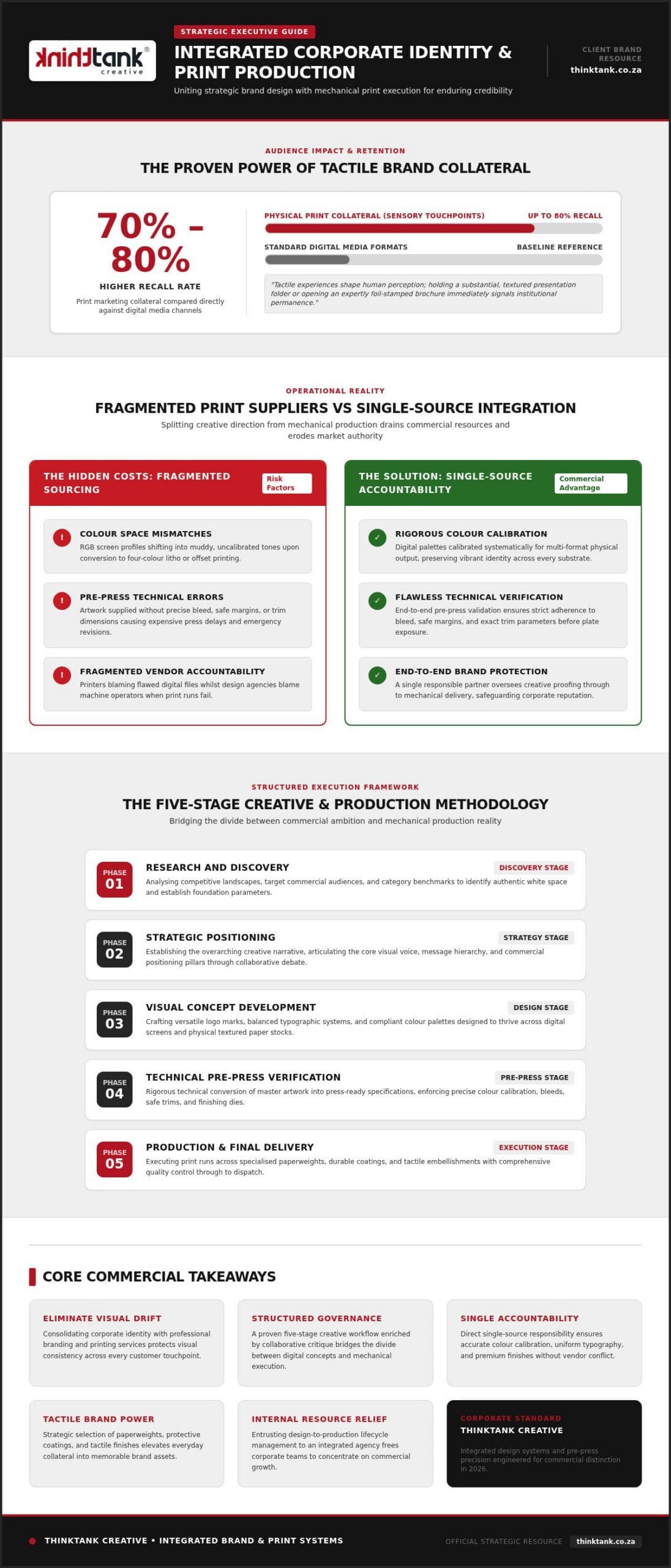
Print marketing materials achieve a 70% to 80% higher recall rate than digital media, yet visionary campaigns frequently unravel the moment digital files meet physical paper. Aligning strategic corporate identity with integrated branding and printing services is no longer merely an aesthetic preference; it is the vital foundation of enduring commercial credibility.
You already understand the quiet frustration of managing disconnected design agencies alongside separate commercial print suppliers. When vibrant screen palettes translate into muddy colours, fragile paper stock, or flawed technical specifications, marketing expenditure bleeds value whilst brand authority steadily erodes.
Discover how integrating strategic corporate identity with professional printing services protects your visual reputation and elevates customer engagement across every physical touchpoint. From rigorous colour calibration to premium tactile finishes, this guide reveals how uniting creative artistry with flawless production execution commands market attention and drives measurable growth in 2026.
Key Takeaways
- Consolidating corporate identity with professional branding and printing services eliminates visual drift whilst protecting consistency across every physical touchpoint.
- A structured five-stage creative workflow, enriched by collaborative debate, bridges the gap between ambitious digital concepts and flawless physical execution.
- Single-source accountability ensures precise colour calibration, uniform typography, and premium finishes without the friction of managing disconnected vendors.
- Strategic selection of paperweights, durable coatings, and tactile embellishments elevates routine corporate collateral into memorable brand experiences.
- Partnering with an end-to-end creative agency manages the complete design-to-production lifecycle, liberating your internal resources to drive commercial growth.
Understanding Integrated Branding and Printing Services for Commercial Growth
Tactical marketing often treats creative design and physical manufacturing as isolated events. In contrast, integrated branding and printing services unite strategic visual asset development with disciplined production, transforming abstract identity systems into powerful tangible collateral. While a classical definition of a brand encompasses the distinctive signs and associations identifying a business, leaving those assets to disconnected print vendors risks severe reputational damage. Discerning commercial clients judge corporate competence through physical touchpoints. When paper stocks feel fragile or corporate colours drift across collateral, market trust deteriorates rapidly.
The Synergy Between Visual Identity and Tangible Collateral
Physical assets carry a sensory weight that digital interfaces cannot replicate. Tactile experiences shape human perception; holding a substantial, textured presentation folder or opening an expertly foil-stamped brochure immediately signals institutional permanence. Premium paper stocks and bespoke finishes transform routine communications into memorable brand encounters. When visual consistency flows uninterrupted from digital monitors to physical print runs, clients perceive a dependable, detail-driven organisation committed to quality across every facet of its enterprise.
The Hidden Business Costs of Disconnected Design and Production
Splitting creative direction from mechanical production creates operational friction that drains internal resources. Common pitfalls of fragmented sourcing include:
- Colour space mismatches: Graphic designers working exclusively in digital colour profiles often produce RGB artwork that shifts into muddy, uncalibrated tones when converted to four-colour litho or offset printing.
- Pre-press technical errors: Artwork supplied without proper bleed, safe margins, or trim dimensions triggers expensive production delays and emergency revisions.
- Fragmented vendor accountability: When a print run fails, commercial printers blame flawed design files whilst design agencies blame machine operators.
Unifying strategic design with end-to-end branding and printing services removes this dispute entirely, guaranteeing that visual integrity is rigorously protected from the initial design proof through to final delivery.
Creative Methodology: From Brand Strategy to Production
Rigorous creative work demands structure. High-performing branding and printing services do not rely on artistic intuition alone; they thrive on a proven five-stage methodology that bridges the gap between commercial ambition and mechanical reality. Superior design concepts emerge when teams engage in genuine debate, challenging initial assumptions about market positioning before a single layout takes shape. This methodical progression ensures that every aesthetic decision directly supports commercial objectives whilst anticipating production constraints.
Phase One to Three: Research, Strategy, and Corporate Identity Design
Effective brand building starts with disciplined discovery:
- Phase 1: Research and Discovery: We analyse competitive landscapes, target audiences, and category benchmarks to identify authentic white space.
- Phase 2: Strategic Positioning: We establish the overarching creative narrative, determining visual voice, message hierarchy, and core positioning pillars.
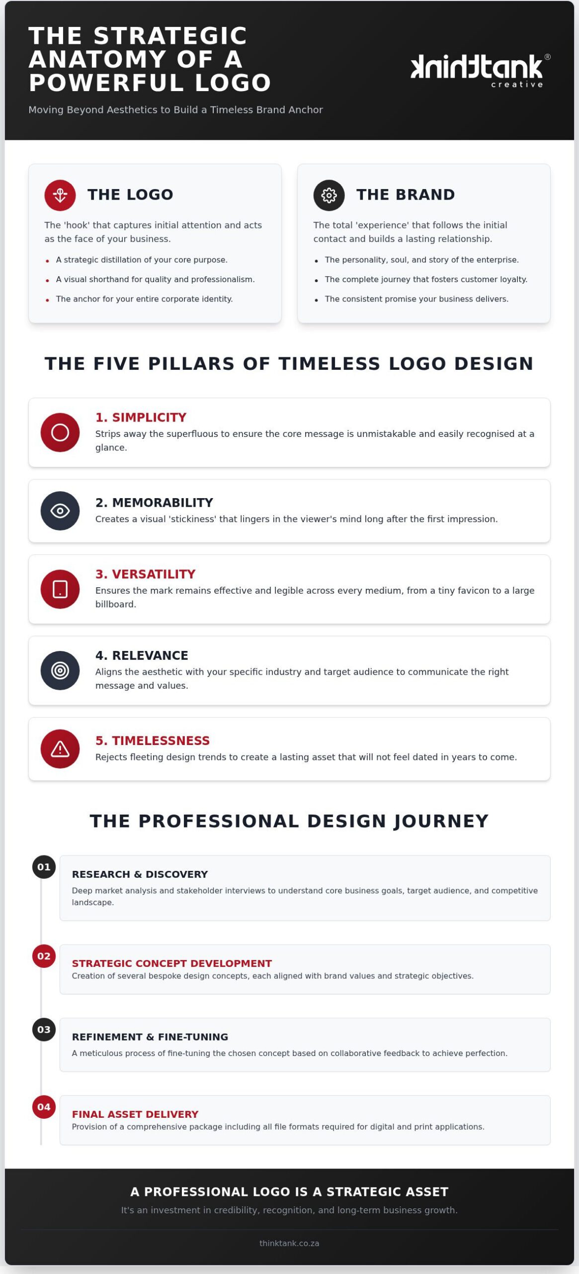
- Phase 3: Visual Concept Development: Our designers craft versatile logo marks, balanced typographic systems, and compliant color palettes. Exploring what makes a good logo design provides deeper insight into crafting enduring marks that thrive across both digital viewports and textured print collateral.
Every concept undergoes iterative critique and client evaluation. Through active collaboration, ideas are refined until the corporate identity reflects sharp strategic differentiation.
Phase Four and Five: Pre-Press Precision, Production, and Final Delivery
Strategic design means very little if execution falters at the press:
- Phase 4: Technical Pre-Press Verification: Designers convert creative files into press-ready artwork. This includes auditing trim lines, building accurate three-millimetre bleeds, rasterising complex transparencies, and mapping Pantone spot colours to exact CMYK curves. Substrate testing guarantees that ink density performs predictably across coated and uncoated fibres alike.
- Phase 5: Manufacturing and National Distribution: Production commences under stringent quality controls. From lithographic runs to custom tactile finishes, each asset undergoes inspection before final nationwide dispatch to ensure complete physical fidelity.
If you want your collateral to communicate genuine authority, partner with ThinkTank Creative to guide your visual assets seamlessly from concept sketch to press delivery.
Integrated Creative Agencies Versus Traditional Print Shops: A Strategic Comparison
Choosing between an integrated agency and a commercial print shop fundamentally dictates how effectively your brand communicates. Traditional print shops operate primarily as manufacturing facilities. They focus on press volumes, ink runs, and machine throughput, rarely questioning whether supplied artwork aligns with broader commercial goals. Integrated branding and printing services, however, unite strategic visual conceptualisation with direct manufacturing oversight. This holistic model establishes single-source accountability for brand colours, typographic balance, and tangible messaging, ensuring collateral actively advances your business positioning rather than simply filling storage boxes.
Harmonising Physical Collateral with Digital Brand Presence
Modern commercial success demands absolute cohesion between offline assets and virtual customer journeys. High-impact collateral should never function as an isolated sales brochure. Instead, it must mirror the structure and messaging established across your core digital presence. Reviewing strategic insights on custom website design in South Africa demonstrates how cohesive digital infrastructure establishes the visual rules that print pieces must honour.
Unifying these environments generates clear operational advantages:
- Interactive bridgeheads: Deploying trackable, styled QR codes within printed corporate reports or capability statements directs high-intent prospects straight into tailored landing pages.
- Synchronised corporate assets: Campaign colour palettes, bespoke typography, and imagery guidelines remain identical across web platforms, social channels, and physical print runs.
- Unified campaign narratives: Prospects encounter consistent corporate messaging regardless of whether they first review an embossed presentation deck or visit an online portal.
Accountability, Turnaround Efficiency, and Long-Term Value
Splitting procurement between external graphic designers and transactional commercial printers introduces friction that inflates marketing expenditure. When colour discrepancies arise on an expensive print run, printers claim poor artwork preparation, whilst independent designers point fingers at press calibration. Managing those disputes consumes valuable executive hours.
Integrated agencies eliminate this friction entirely through unified creative protocols. Professional designers collaborate directly with production specialists on the exact same project brief, adjusting paper selections, varnish finishes, and ink densities before production commences. Multi-disciplinary oversight shortens revision cycles, eliminates costly redesign loops, and ensures your team invests in high-performing corporate assets that make your business look sharp, capable, and authoritative.
Selecting Essential Print Marketing Collateral and Technical Specifications
Every printed piece serves an explicit commercial purpose. Rather than viewing print procurement as a generic catalogue exercise, forward-thinking organisations deploy collateral strategically to support specific stages of the business development pipeline. Professional branding and printing services combine rigorous substrate knowledge with tailored visual engineering, ensuring that each physical deliverable substantiates your market value during pivotal corporate exchanges.
Executive Stationery and High-Impact Leave-Behind Collateral
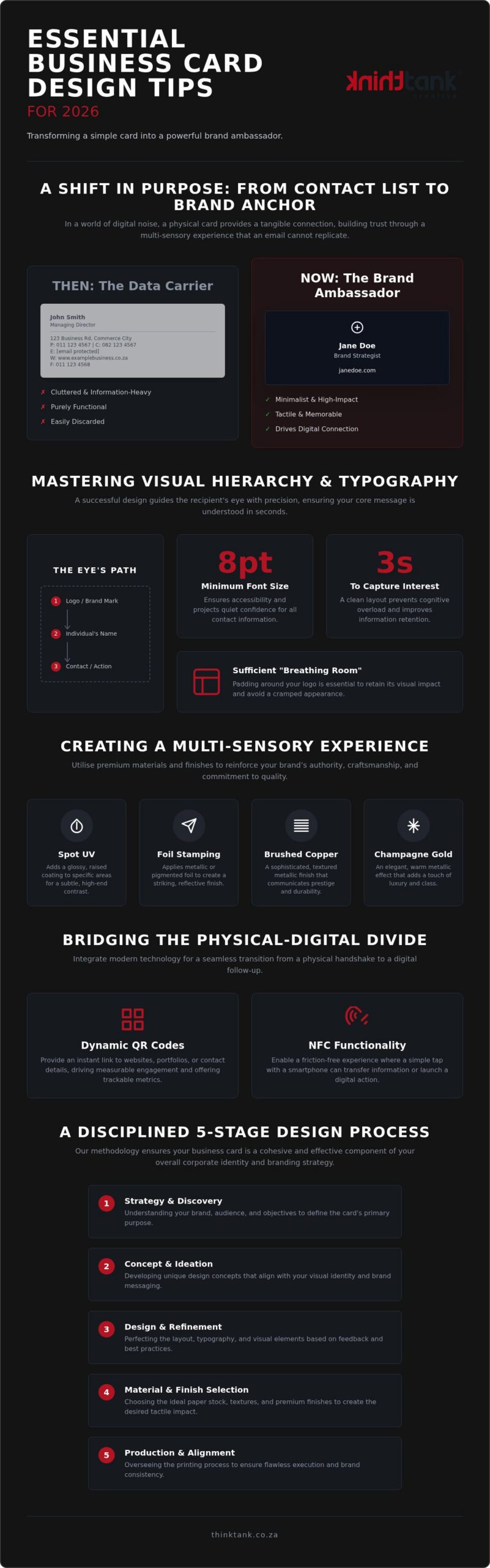
Handshake moments demand collateral that commands respect. An executive business card printed on dense 400gsm artboard with raised spot UV or subtle blind debossing creates an immediate impression of structural solidity. Beyond initial introductions, structured leave-behind materials anchor your authority long after a presentation concludes:
- Corporate profiles and capabilities decks: Comprehensive multi-page brochures featuring PUR binding that articulate service depth and operational proof points.
- Custom presentation folders: Heavyweight folders equipped with die-cut document pockets and business card slots to house proposals elegantly.
- Strategic briefing sheets: Compact, single-sheet executive summaries engineered to help prospective clients champion your solutions internally.
Large-Format Displays, Signage, and Promotional Branded Material
Brand visibility often hinges on national exhibitions, trade conferences, and corporate real estate. Deploying tear-resistant roll-up banners, modular fabric exhibition stands, and rigid architectural signage ensures that your physical presence reflects identical corporate standards across every venue. When curated thoughtfully, functional promotional branded items, such as executive metal pens or bound notebook journals, stay on executive desks for months, serving as subtle daily reminders of your capabilities. Aligning physical touchpoints with robust lead generation strategies for South African businesses transforms passive visual collateral into active conversion pathways.
Substrate Selection, Colour Calibration, and Premium Finishes
Balancing production mechanics with creative ambition requires decisive technical oversight:
- Substrates: Coated art papers (gloss or silk) maximize photographic sharpness and ink holdout, whereas uncoated tactile stocks (such as textured bond) convey understated craft.
- Print processes: Digital short-run printing offers unmatched flexibility for personalised, variable-data collateral under 500 units; offset lithography provides exceptional cost efficiencies and precise ink control for enterprise runs exceeding 1,000 units.
- Finishing barriers: Applying soft-touch velvet laminations or scuff-resistant matte films protects high-use covers from fingerprint oils and transport wear.
- Colour fidelity: Calibrating spot colours across the Pantone Matching System ensures absolute uniformity across diverse digital and litho presses.
Take full control of your physical assets today; explore our complete spectrum of creative design and commercial printing solutions to elevate your visual presence nationwide.
Partnering with ThinkTank Creative for Comprehensive Brand and Print Solutions
Established in 2001, ThinkTank Creative operates as a strategic all-rounder agency backed by over two decades of national creative delivery. Our guiding philosophy is straightforward: “We Do It All So You Don’t Have To”. Rather than forcing internal marketing teams to coordinate disparate suppliers, our integrated branding and printing services unite award-winning graphic designers with end-to-end print management. We prioritise usability, functional clarity, and striking visual execution, ensuring that every asset reinforces your authority in front of key decision-makers.
Full-Service Marketing Execution Under One Roof
Exceptional creative work thrives on open dialogue. We believe the strongest ideas emerge through purposeful debate and active collaboration with our clients. By consolidating corporate identity, creative design, digital channels, and printing solutions into a unified workflow, your visual presence retains uncompromising integrity across every platform. Examining our framework on how to create a content marketing plan illustrates how synchronising tangible print assets with multi-channel digital distribution builds formidable market authority across competitive national sectors.
Starting Your Brand Transformation with Confidence
Beginning a corporate identity evolution or large-scale collateral rollout should feel inspiring, not daunting. Our engagement begins with a collaborative consultation to examine your distinct commercial goals, target audience, and operational requirements. Because every business requires bespoke solutions, estimated costs follow a thorough brief discussion to align transparently with your exact scope, print volumes, and technical specifications.
From initial design concepts to final nationwide delivery, our team manages each production milestone with meticulous care. Sustained ongoing support ensures your visual standards remain protected as your market footprint expands. Investing in full-spectrum branding and printing services equips your enterprise with an agile creative partner deeply dedicated to your enduring commercial success.
Transform Your Visual Presence with Cohesive Print Strategy
Commercial authority requires uniting disciplined visual design with flawless physical execution. Eliminating the divide between creative ideation and technical pre-press protects your marketing investment, ensuring every executive card, presentation folder, and corporate report commands immediate respect. Comprehensive branding and printing services transform ordinary business touchpoints into enduring signals of credibility.
Founded in 2001, ThinkTank Creative brings over two decades of national creative delivery to your enterprise. Our award-winning in-house design and production specialists embody a steadfast philosophy: “We Do It All So You Don’t Have To”. Rather than juggling fragmented suppliers, you gain an accountable partner dedicated to making your business look intelligent, capable, and distinguished. Ready to command market attention? Partner with ThinkTank Creative to elevate your corporate branding and printing today.
Frequently Asked Questions
What is the main advantage of hiring one agency for both branding and printing services?
Consolidating branding and printing services under one roof establishes complete accountability from concept to delivery. Rather than arbitrating technical disagreements between external designers and commercial printers over colour shifts or incorrect trims, you partner with a unified team. This seamless oversight protects visual consistency, accelerates turnaround schedules, and reduces overhead costs by eliminating communication gaps across separate vendors.
How do you ensure corporate brand colours match across digital screens and printed collateral?
Accurate cross-medium colour matching relies on rigorous colour management systems. Creative teams translate screen-based RGB hues and digital Hex codes into standardised Pantone Matching System formulas and calibrated CMYK profiles during pre-press development. Conducting hard-copy press proofs on the exact intended paper substrate before full production runs ensures ink absorption behaviour doesn't distort your approved corporate identity.
What is the difference between digital printing and lithographic offset printing for corporate collateral?
Digital printing uses toner or liquid ink without physical printing plates, making it exceptionally fast and economical for short runs under 500 units or variable data projects. Lithographic offset printing utilises aluminium plates and wet inks transferred onto rubber blankets. While offset requires upfront plate setup, it delivers unmatched per-unit cost efficiency and microscopic colour fidelity on substantial print volumes exceeding 1,000 units.
What specific items should be included in a professional corporate identity package?
A comprehensive corporate identity package establishes the bedrock of visual communication. Core deliverables include primary and secondary logo configurations, typographic hierarchies, clear space rules, and standardised colour systems. Physical collateral encompasses executive business cards, formal letterheads, compliant email signatures, bespoke presentation folders, and structured corporate brochures. Together, these elements form a unified toolkit ready for both digital deployment and physical print manufacturing.
How does ThinkTank Creative calculate the estimated cost of a branding and printing project?
Rather than offering arbitrary fixed packages, ThinkTank Creative calculates estimated costs following a collaborative briefing session. Pricing directly reflects project scope, creative exploration requirements, chosen substrates, specialty embellishments, and volume runs. This consultative approach guarantees transparent resource allocation tailored precisely to your strategic goals, ensuring you invest effectively in high-impact deliverables without paying for unnecessary production extras.
Can branding and printing services accommodate tight turnaround times for national corporate events?
Yes, professional branding and printing services manage responsive production schedules through streamlined digital workflows and disciplined project management. By unifying design adaptation with local print capacity, urgent exhibition pull-up banners, event brochures, and promotional merchandise can be prioritised rapidly. Early collaborative consultation allows production specialists to recommend agile substrates and rapid digital printing methods that meet immoveable national event deadlines.
What technical artwork specifications are required before marketing collateral enters print production?
Press-ready artwork requires precise technical preparation to prevent output defects. Files must be exported as high-resolution PDFs (minimum 300 DPI) set to the CMYK colour space. Critical production elements include a standard three-millimetre bleed beyond the trim line, embedded or outlined typography to avoid font substitution, and safe interior margins that keep vital text safely away from cutting edges.
How does premium physical print collateral support modern B2B lead generation strategies?
Tangible marketing collateral breaks through digital fatigue by providing executive decision-makers with a memorable sensory experience. Substantial paperweights, tactile finishes, and elegant presentation folders convey institutional stability and seriousness that digital emails cannot match. Integrating interactive elements like trackable QR codes bridges offline discussions into qualified digital sales pipelines, creating measurable lead generation opportunities during high-stakes corporate engagements.