How to Plan a Website Redesign Project: A Practical 2026 Guide

A website redesign planned as a visual refresh can leave the problems that matter most untouched. If you’re asking how to plan a website redesign project, start by treating it as a business change, not simply a new look.

Priorities can blur when stakeholders have different expectations, content needs reviewing and technical decisions start to mount up. Without a clear plan, a redesign can also put search visibility and important user journeys at risk. Agreeing on a shared direction makes decisions easier to manage and keeps the project focused on what the website needs to achieve.

This guide sets out a practical sequence for connecting business goals with user needs, content, technology and launch readiness. You’ll learn how to shape a brief that aligns stakeholders and delivery teams, decide what to keep or improve, and prepare for launch while protecting key content and search performance. The result is a considered foundation for your redesign and a website your team can continue to refine after it goes live.

Key Takeaways

  • Plan your website redesign around defined business goals, rather than visual change alone.
  • Use customer questions, website insights and staff knowledge to shape a brief around audience needs and next steps.
  • Choose between a focused refresh and a broader redesign by weighing the scope against your business needs and the website’s technical condition.
  • Make the project manageable by assigning clear owners for decisions, content, reviews and approvals at each milestone.
  • Use a considered pre-launch check to catch issues, then treat launch as the start of ongoing improvement.

How to Plan a Website Redesign Project Around Business Goals

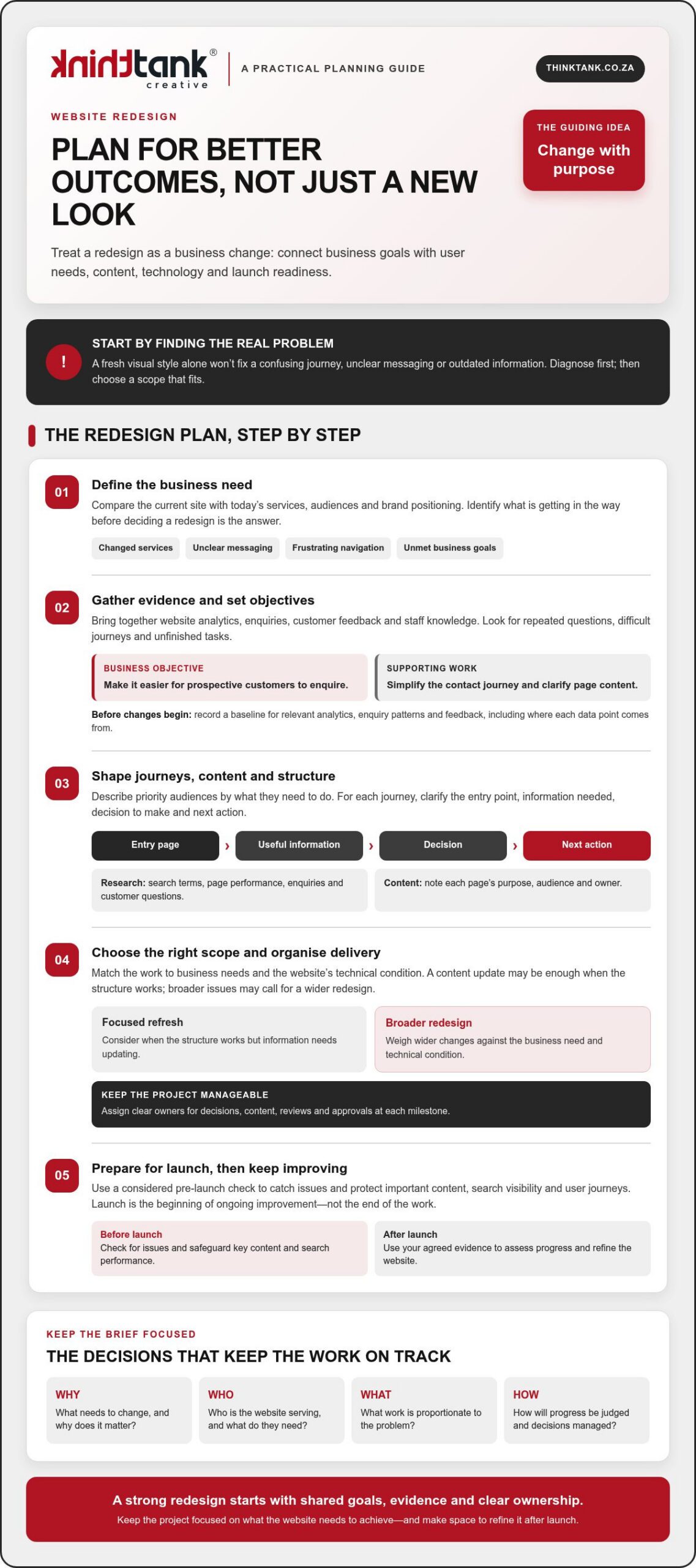
Changed services, unclear messaging, frustrating navigation or business goals the website isn’t helping to meet are all valid reasons to review your site. First, identify the underlying problem before deciding that a redesign is the answer. A new visual style alone won’t resolve a confusing journey or outdated information.

Gather evidence from website analytics, enquiries, customer feedback and staff who speak with customers or update the site. Look for patterns: visitors may struggle to find a service, ask questions the website should answer or leave an important journey unfinished. This gives stakeholders a shared view of what needs attention and helps distinguish structural or technical issues from problems a focused content update could solve.

A good project plan turns that evidence into decisions. This short video offers another perspective on why planning matters:

Decide whether your website needs a redesign

Compare the current site with your present-day services, audiences and brand positioning. If visitors can’t tell what you offer or staff repeatedly answer the same basic questions, the issue may involve messaging, navigation or page structure. If the structure works but some information is out of date, a content update may be enough. Understanding the difference keeps the scope proportionate to the problem.

Design should support clarity and ease of use, not compete with them. Reviewing established web design principles can help frame discussions about how layout, visual choices and interaction work together to serve visitors.

Set objectives and agree how progress will be judged

Choose a small set of objectives tied to business priorities, then define what evidence could show progress. Keep the objective separate from the website deliverable: “make it easier for prospective customers to enquire” is a business objective; “simplify the contact journey and clarify the relevant page content” describes work that may support it.

Record a baseline before changes begin. Note the relevant analytics, enquiry patterns and feedback, along with where each data point comes from, so you can make a fair comparison after launch. For a deeper look at how usability decisions shape the experience, see this website user experience strategic guide.

A redesign brief is the shared record of a project’s goals, scope and success measures. Use it to align stakeholders, guide design and development decisions, and keep the work focused as details emerge. Knowing how to plan a website redesign project starts with agreeing what needs to change, why it matters and how you’ll assess the outcome.

Research, Content and Site Structure: Build the Redesign Brief

Once the project’s goals are clear, gather the evidence that will shape the experience. Review search terms, page performance and enquiry patterns alongside the questions customers ask your team. Staff who handle sales, service or website updates often know where people get stuck, what details they need and which information is frequently missing. Bringing these perspectives together helps the brief reflect real needs, not assumptions.

Describe priority audiences by what they’re trying to do. For each group, note their likely entry point, the information they need, the decision they must make and the next action you want them to take. A prospective customer might arrive on a service page, compare options, then enquire. Sketching that path can expose missing information or unnecessary steps before design and development begin. The lead generation strategies framework can also help connect audience journeys with meaningful next actions.

Turn audience research into useful user journeys

Map the important journeys in a simple diagram. Show how someone moves from an entry page through key decisions to a call to action, and mark where they may need reassurance or more detail. Keep the map focused on user tasks rather than imagined demographic profiles. Check that each step is clear, relevant and easy to complete, then use the findings to guide content and structure decisions.

Create a content inventory and draft the sitemap

List current pages and record each page’s purpose, intended audience, owner, available performance evidence and recommended action. Classify content to retain, revise, combine, remove or create. Flag material that needs subject-matter review, approval, rewriting or migration so content work doesn’t become a late-stage obstacle.

Next, group pages into a sitemap with clear, audience-friendly labels. A sitemap shows the proposed hierarchy; user-flow diagrams show how people move through it. Together, they can reveal duplicated sections, gaps in key information and journeys that lead nowhere. Share these drafts with relevant stakeholders and invite specific feedback before they become design assumptions.

This is how to plan a website redesign project with a brief grounded in evidence and ready to guide delivery. If you’re considering professional support, you can explore ThinkTank Creative’s website design and development as one option for taking the work from research and strategy through design, development and testing.

Compare Redesign Approaches, Platforms and Key Project Risks

Choose the scale of change to fit the problem. A focused refresh may suit a site with a sound technical foundation but outdated content or inconsistent visual presentation. A broader redesign may be more appropriate if the structure, user journeys or underlying technology no longer support your business needs. The ultimate guide to website redesign offers further considerations, but your decision should reflect your own scope, capacity and requirements.

Choose an approach that matches your resources and requirements

An in-house project can keep decisions close to the business, provided the team has the time and skills to do the work and maintain content afterwards. DIY tools may suit a straightforward site, but assess their limits against your design and technical needs. An agency-led project brings external design and development capability, while requiring clear communication and timely feedback from your team. Consider your available decision-makers, internal skills and responsibility for ongoing content before choosing.

Approach Control Internal capacity Complexity and support
In-house High Requires dedicated staff time and skills Internal team manages delivery and ongoing needs
DIY High over routine edits Requires time to build and maintain the site Best assessed against the project’s technical demands
Agency-led Shared through agreed decisions Needs a client-side contact for input and approvals Can support design, development and testing; agree responsibilities upfront

Assess a content management system (CMS) by how well it supports your publishing workflow, required integrations, accessibility needs and long-term maintainability. Avoid choosing on popularity alone. If you’re weighing bespoke requirements against other options, this custom website design strategic guide provides broader service considerations.

Plan for content migration, search continuity and data protection

Before build work starts, list pages, files, forms and important URLs, then record whether each will move, change, be combined or be retired. Map old URLs to relevant new destinations and arrange suitable redirects for changed or removed pages. Test those redirects and key page links before launch. Rankings can’t be guaranteed, so record search and analytics performance beforehand, then check for broken pages, indexing issues and changes in relevant traffic after launch.

Include forms and analytics in your migration checks. Identify where personal information is collected, used or stored, and ask an appropriate person to review the project against current South African privacy requirements. Knowing how to plan a website redesign project means addressing these risks early, not treating them as final launch tasks.
How to Plan a Website Redesign Project: A Practical 2026 Guide

Turn the Website Redesign Plan into a Manageable Project Roadmap

A clear sequence turns the agreed brief into work people can own and approve. Use a roadmap to move from planning to launch without leaving key decisions until the last moment:

For each milestone, record the person responsible, what they need to deliver and who has final approval. Set review windows that reflect people’s availability, and ask contributors to consolidate feedback before sending it to the project team. Keep approved materials, decisions, open questions and dependencies in one source of truth, such as a shared project document or workspace, so the latest agreed direction is easy to find.

Set responsibilities, approvals and project boundaries

Name a decision-maker, then identify contributors for business, content, design and technical reviews. Define what the project includes and what requires separate discussion. If a new request changes the agreed scope, assess its impact on priorities, timing and estimated cost before approving it. Clear ownership and approval points reduce avoidable project uncertainty.

Coordinate content, design and development work

Track dependencies: design may need approved copy and brand assets, while development may rely on agreed integrations and access to existing systems. Plan design reviews before build work, then test against the user and business requirements in the brief. Include training and handover planning so the team understands how to manage day-to-day website tasks after launch.

Keep the timeline proportionate to the scope, review capacity and dependencies rather than selecting a launch date before the work is understood. Costs depend on the project’s needs and timeline. ThinkTank Creative provides an estimated cost after discussing these with you, not a fixed price before the requirements are clear.

If you want a collaborative team to help shape and deliver the roadmap, discuss your website redesign project with ThinkTank Creative, from research and strategy through design, development, testing, launch and support.

Prepare for Launch and Choose the Right Redesign Partner

Launch is a handover, not a finish line. A thorough readiness check helps the team catch avoidable issues, while a clear plan for monitoring and support gives the new site room to improve as people use it.

Use a practical website launch-readiness checklist

Before going live, test priority journeys on relevant devices and confirm that essential content and contact routes work as intended. Use this checklist with the project team responsible for each area:

Use the agreed project requirements as your reference rather than assuming a site is ready because it looks polished. Once live, monitor the measures set in the brief, gather feedback from users and staff, and prioritise improvements based on what you learn. Launch begins the next cycle of observation and refinement; it doesn’t prove that every business objective has already been achieved.

Evaluate a redesign partner beyond visual presentation

Ask prospective partners how they approach research and strategy, UX/UI design, coding, testing, launch and support. Discuss who will make decisions, how feedback and approvals are managed, and what your team will need to provide. A clear, collaborative process makes responsibilities easier to understand and keeps the work aligned with the brief.

Plan for ownership after launch, too. Ask what training, documentation and support are included, and how your team will learn to manage routine website tasks. These details help make handover a practical transfer of knowledge, rather than simply receiving a completed site.

ThinkTank Creative, founded in 2001, offers end-to-end website design and development, from research and strategy through design, development, testing, launch, training and support. Its approach reflects the promise, “We Do It All So You Don’t Have To”, while keeping discussion and collaboration central to the project. If you’re considering a redesign, discuss your website redesign with ThinkTank Creative.

Turn Your Redesign Plan into Lasting Progress

A successful redesign starts with clear business goals, evidence about what users need and a brief that gives stakeholders a shared direction. From there, choose an approach and platform suited to your requirements, assign clear owners, and plan content, testing and launch with care.

Knowing how to plan a website redesign project also means looking beyond launch day. Track the measures you agreed, listen to user feedback and use what you learn to guide ongoing improvements. A thoughtful plan gives your team a stronger foundation for making those decisions with confidence.

ThinkTank Creative was founded in 2001 and offers website services spanning UX/UI design, coding, testing, launch, training and support, with ongoing service after project completion. If you’re ready to explore a collaborative approach to your redesign, discuss your website redesign project with ThinkTank Creative.

With shared goals and a practical roadmap in place, your next website can become a more useful, adaptable part of your business.

Frequently Asked Questions

When should a business plan a website redesign?

Plan a redesign when the site no longer reflects your services, confuses visitors or makes important tasks difficult. Other signs include outdated content, repeated customer questions, navigation problems or website goals that aren’t being met. First, check whether a content update or focused improvement could address the issue. A broader redesign makes sense when the underlying structure, technology or user journeys also need attention.

How do you start planning a website redesign project?

Start by agreeing on the business problem the redesign needs to solve. Gather evidence from website analytics, customer enquiries and feedback, and staff who work with customers or manage the site. Then identify priority audiences, their key tasks and the actions they need to take. This helps you shape the scope, choose suitable measures of progress and build a shared brief before design and development begin.

What should a website redesign brief include?

A useful redesign brief records the project’s goals, scope and success measures. It should also outline priority audiences, key user journeys, content requirements, technical considerations, responsibilities and approval points. Note current performance where relevant, so you can compare results after launch. Keep business objectives distinct from deliverables: improving the enquiry journey is an objective, while updating page content or navigation may be work that supports it.

How do you redesign a website without losing search visibility?

Protect search continuity by recording important pages and URLs before work begins. Map each URL that will change to its most relevant new destination, and arrange suitable redirects for changed or retired pages. Before launch, check links, redirects and agreed search settings. After launch, monitor relevant search and analytics data and investigate broken pages or unexpected changes. These steps help manage risk, but no redesign can guarantee unchanged rankings.

Should I redesign my website myself or work with an agency?

Choose based on the project’s complexity, your team’s skills and the time available for delivery and ongoing content management. A DIY approach may suit a straightforward site; an in-house team can keep decisions close to the business if it has the required capacity. An agency can contribute design and development expertise, with your team providing input and approvals. Clarify responsibilities, process and post-launch support before deciding.

Who should be involved in a website redesign project?

Involve a decision-maker who can keep priorities clear, alongside people responsible for business requirements, customer insight, content and technical knowledge. Include those who manage enquiries or maintain the current website, as they can identify practical user and workflow issues. Assign clear owners for decisions, content supply, reviews and approvals. The right contributors depend on the project, but everyone should understand their role and when their input is needed.

What should be checked before a redesigned website goes live?

Test priority journeys, navigation, page content, links, forms and contact routes. Review responsive layouts on relevant devices, and confirm agreed analytics, search, backup and technical checks with the responsible project team. Make sure launch responsibilities are assigned, including who records issues and coordinates their resolution. Use the agreed project requirements as your checklist, and resolve any problems that could prevent visitors from finding information or completing key tasks.

What happens after a website redesign launches?

After launch, monitor the measures agreed in the brief, gather feedback from users and staff, and prioritise improvements based on what you learn. Check that key journeys and forms continue to work as expected. Make sure the team has the training and documentation needed to manage routine website tasks. Launch marks the transition to using and refining the new site, not proof that every business objective has already been achieved.
Responsive Web Design: A Practical Guide for 2026

What if a website looked polished on a large screen but made its most important content harder to use on a phone? That’s the real test of responsive web design: not whether a page simply shrinks, but whether its layout, navigation and calls to action continue to work as screen sizes change.

If you’re unsure how responsive design differs from a mobile-friendly site or a separate mobile website, you’re not alone. It can also be difficult to picture how content will rearrange across phones, tablets and desktops, or how a design team checks that the experience feels clear on each one.

This practical guide explains the principles behind adaptable layouts, how to plan a website around user needs and what to check across different screens. You’ll also learn what to look for when commissioning a professional build, from the connection between UX/UI design and development to testing and support. With a clear framework, you can make informed decisions and create a website that offers a cohesive experience as people move between devices.

Key Takeaways

  • Understand how responsive web design adapts layouts to available space while keeping content and key actions usable.
  • Learn why a page that looks right at one phone width may still need adjustments on other screens.
  • Use a practical planning and testing workflow to check real content across varied viewport widths before launch.
  • Assess a web design partner by how they connect audience needs, usability, visual design, testing and post-launch support.
  • Know what to review across mobile, tablet and desktop to make a more informed decision about your website.

What Is Responsive Web Design, and What Should It Do for Your Website?

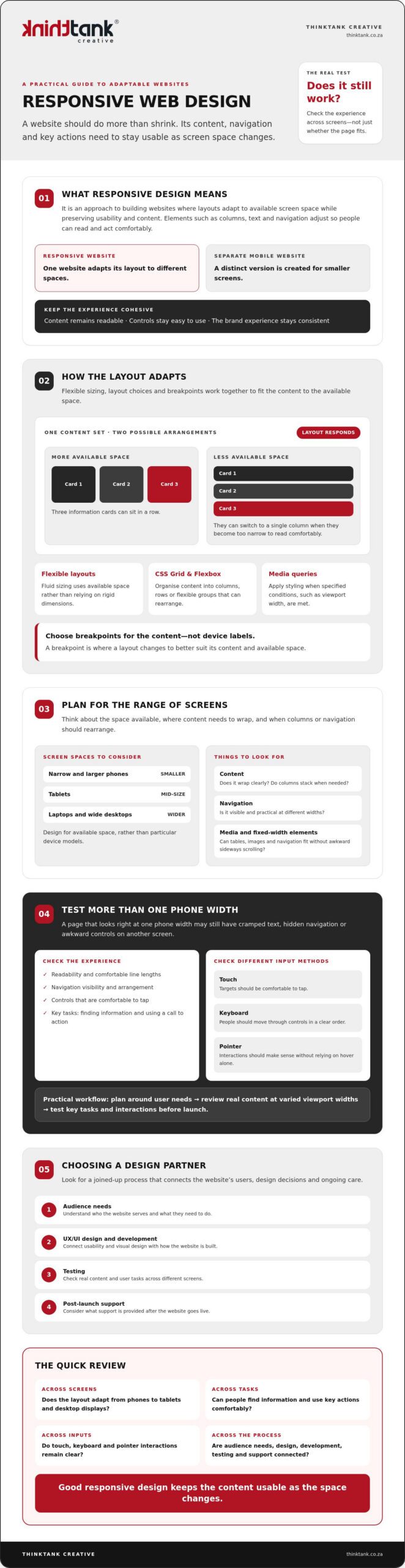
Responsive web design is an approach to building websites in which layouts adapt to the available screen space while preserving usability and content. Rather than forcing a fixed-width page onto every screen, the design adjusts elements such as columns, text and navigation so visitors can read and act comfortably. A separate mobile-only website uses a distinct version for smaller screens; a responsive site adapts the same website to different spaces.

The goal is more than making a page fit. Content should remain readable, controls easy to use and the brand experience consistent, whether someone is browsing on a phone or a wide desktop display. For a foundational overview of the approach and its history, see Responsive web design (RWD).

For a practical visual introduction, watch this guide to responsive web design:

How Is Responsive Design Different from Mobile-Friendly Design?

“Mobile-friendly” describes a user experience goal: a website should be practical to use on a mobile device. It doesn’t prescribe a particular technical method. Responsive layouts can adjust fluidly as space changes or switch arrangement at chosen breakpoints, where the design changes to better suit the content and available width.

A page that looks fine at one phone width may still have cramped text, hidden navigation or awkward controls on a narrower phone or larger tablet. Check how the layout behaves across widths, rather than relying on one mobile check.

Which Screens and User Contexts Should a Website Support?

Plan for a range of available spaces: narrow and larger phones, tablets, laptops and wide desktop displays. Focus on where content needs to wrap, columns should stack or navigation needs a different arrangement, rather than designing for particular device models.

Consider how people interact, too. Touch targets should be comfortable to tap; keyboard users should be able to move through controls in a clear order; and pointer interactions should be understandable without relying on hover alone. Review key tasks, such as finding information or using a call to action, at different widths and with different input methods. This helps a cohesive design serve people, not just screens.

How Responsive Web Design Works: Flexible Layouts, Breakpoints, and Media

Responsive web design relies on coordinated decisions. Layouts must accommodate changing space, typography should remain readable, images and other media need to fit their containers, and navigation and controls should stay usable as the page rearranges.

A breakpoint is a point at which a layout changes to better suit its content and the available space. For example, a row of three information cards might work on a wide screen, then switch to a single column when each card becomes too narrow to read comfortably.

Choose breakpoints when the layout needs to change, not because a screen belongs to a particular device category. This content-led approach helps the design adapt to the space it actually has. MDN Web Docs explains how responsive layouts work, including the role of flexible layouts and media queries.

How Do Flexible Grids and CSS Layouts Adapt?

Fluid sizing lets elements use a proportion of the available space instead of relying on rigid, fixed dimensions. CSS Grid and Flexbox can organise content into columns, rows or flexible groups that rearrange as space changes. The right choice depends on the content and purpose of the page: a comparison may need aligned columns, while a set of service cards may work well as a flexible row that wraps.

Fixed-width elements can cause trouble when the viewport is narrower than expected. A wide table, image or navigation bar may overflow its container, forcing visitors to scroll sideways or making content difficult to reach. Flexible proportions help prevent this, but still need sensible limits so text doesn’t stretch across an uncomfortably wide line.

How Do Responsive Images, Typography, and Media Queries Help?

Media queries apply styling when specified conditions, such as available viewport width, are met. They can support a layout change, adjust spacing or refine typography. The aim isn’t to shrink every element uniformly; it’s to preserve clarity and hierarchy as the composition changes.

Responsive images can display or serve suitable image options for the space available. In either case, media should stay within its container rather than creating unwanted overflow. Text needs similar care: body copy should remain legible, headings should wrap cleanly and line lengths should feel comfortable on both narrow and wide screens.

Treat these choices as one design system, not a collection of isolated fixes. If you’re planning a site and want to see how layout, visual design and development can work together, explore custom website design and development.

Responsive Web Design Misconceptions: What a Smaller Screen Test Can Miss

A page that appears to work on one phone isn’t necessarily ready for every screen. A slightly narrower viewport might squeeze navigation, wrap a heading awkwardly or push a button beyond the visible area. Responsive web design needs to be checked across a range of layouts, not approved after a single small-screen test.

Shrinking a desktop page without changing its structure can create dense text and controls that are difficult to use. Some content may need to move, stack or be prioritised so visitors can complete essential tasks without struggling through a cramped version of the desktop experience.

Assumption Practical reality
“It works on my phone.” Check narrower and wider viewports, and look for clipped content, awkward wrapping and overflow.
“Everything should stay in place, just smaller.” Navigation and page sections may need to rearrange to preserve clarity and key tasks.
“Responsive means accessible and fast.” Adaptable layouts help, but accessibility and performance need their own checks.

Does Responsive Design Mean Making Everything Smaller?

No. Scaling every element down can weaken readability and visual hierarchy, leaving important information and actions hard to distinguish. A navigation bar might become a more compact menu, while a multi-column section could stack into a clear reading order.

Decide what visitors need to accomplish, then preserve those tasks as the layout changes. The aim isn’t to squeeze every desktop element onto a narrow screen; it’s to make the right content and controls easy to find and use.

Can a Responsive Website Still Be Difficult to Use?

Yes. A page can adapt to its viewport and still have small tap targets, clipped text, horizontal scrolling or unclear keyboard focus states. Check content, interaction and accessibility as well as layout. Google’s responsive design basics offer further context, but responsiveness alone doesn’t guarantee accessibility, speed, search rankings or conversions.

Test key actions with touch, keyboard and pointer input. Confirm that focus is visible, text remains readable and visitors aren’t forced to scroll sideways to reach essential content. For a broader usability perspective, read the guide to improving website user experience.

Responsive Web Design: A Practical Guide for 2026

How to Plan and Test a Responsive Website Before It Goes Live

Plan responsive behaviour from the start, then test whether people can complete key tasks as the layout changes. A useful test checks real content and essential tasks across varied viewport widths, rather than relying on one preferred device preset.

  1. Identify user needs. List the main things visitors need to do, such as find a service, submit an enquiry or locate contact details. Use these tasks to guide page priorities.
  2. Organise content and structure. Decide what information belongs on each page and what visitors should notice first. Consider how sections should reorder or stack when space is limited.
  3. Make UX/UI decisions. Plan the navigation, page hierarchy, typography, calls to action and layout together. Keep important actions easy to find without giving every element equal prominence.
  4. Build and review at varied widths. Use actual page content, including long headings, forms and images. Check narrow and wider viewports, not only standard presets, and refine layouts wherever text wraps awkwardly or elements compete for space.
  5. Test interactions, then refine. Move through the site with a keyboard and check touch interactions where relevant. Confirm focus states are clear, controls work as expected, and content isn’t clipped or pushed into horizontal scrolling.

What Should You Check Across Viewport Sizes?

At narrow widths, review the order of page content, navigation, calls to action, forms and other key information. Make sure images keep their proportions and fit within their containers. Look for cut-off labels, overlapping elements and unexpected sideways scrolling.

Repeat the checks at wider widths, too. A layout that works on a phone can feel sparse or stretched on a large display. Use both touch and keyboard input to check that controls remain understandable and the essential journey is easy to follow.

How Should a Team Build Responsive Design into Its Process?

Start with audience needs and page content, then connect UX/UI design to visual refinement and coding. Testing should inform improvements before launch, rather than being left until the end. A considered project process can also include launch, training and support, so the work continues beyond the initial design and build.

For broader project-planning context, explore custom website design strategy. If you’re ready to plan a responsive website around your organisation and its users, discuss your website design and development project.

Choosing a Responsive Web Design Partner: From Strategy to Ongoing Support

A strong responsive website starts with more than a visual style. It should reflect your organisation, audience, content and the tasks visitors need to complete. Choose a partner who can explain how those priorities shape design and development, and how the work will be tested and supported beyond launch.

What Should You Ask Before Commissioning Responsive Website Design?

Use early conversations to understand the team’s process and how you’ll work together. Ask questions such as:

Clear answers help you assess whether the process suits your organisation, not just whether a portfolio looks appealing. They also set shared expectations, so the project’s priorities and responsibilities are understood from the outset.

How ThinkTank Creative Connects Design, Development, and Support

ThinkTank Creative is a South African agency founded in 2001, offering custom website design and development. Its website process brings UX/UI design together with coding, testing and launch, followed by training and support. That connection matters: design decisions need to carry through development, while testing gives the team an opportunity to review the finished experience before it goes live.

For a responsive build, collaboration should keep your organisation’s identity, audience and user tasks in view throughout the project. ThinkTank Creative also offers ongoing service after project completion, providing continuity as your website moves beyond launch.

Every project has its own needs and timeline. Discussing both helps establish the scope, and an estimated cost is provided after that discussion rather than relying on a fixed price. To explore whether the approach fits your plans, discuss your website design and development needs.

Build a Website That Moves Your Business Forward

Make responsiveness part of a wider commitment to a clear, considered online experience. The strongest responsive web design choices begin with what your audience needs to do, then bring content, visual identity and development together around those priorities. Reviewing the site across screen sizes helps reveal where the experience needs refinement before launch.

Choosing the right partner matters, too. ThinkTank Creative has been helping businesses with website design and development since 2001. Its process includes UX/UI design, coding, testing, launch, training and support, with ongoing service after project completion. That continuity can help keep your website aligned with your organisation as its needs evolve.

If you’re planning a new website or considering improvements to an existing one, start with a conversation about your goals and timeline. Discuss your website design and development needs with ThinkTank Creative.

Frequently Asked Questions

What is responsive web design?

Responsive web design is an approach to creating websites that adapt their layouts to available screen space while keeping content and key actions usable. Columns may stack on a narrow screen, for example, while navigation adjusts to remain accessible. The goal isn’t simply to make a desktop page smaller. It’s to provide a clear, consistent experience across phones, tablets and larger displays, shaped around what visitors need to find or do.

How does responsive web design work?

Responsive web design combines flexible layouts, suitable typography, adaptable media and considered interaction choices. A layout can change at breakpoints, which are points where the arrangement shifts to suit the content and available space. For example, a row of information panels might become a single column when the panels no longer fit comfortably. Designers and developers then test the page at different widths and refine anything that feels cramped, unclear or difficult to use.

Is responsive web design the same as mobile-friendly design?

Not exactly. “Mobile-friendly” describes the broad goal of making a website practical to use on mobile devices; it doesn’t specify one technical method. Responsive design is one way to meet that goal by adapting a layout to different screen widths. A site that appears usable on one phone may still have awkward navigation or crowded content on another, so check it across a range of sizes rather than relying on one mobile test.

Does responsive web design improve SEO?

Responsive design can support a positive search experience by making pages easier to use across screen sizes, but it doesn’t guarantee higher rankings. Google primarily uses a website’s mobile version for indexing, so important content and functions should remain available and clear on smaller screens. Search visibility also depends on other factors, including content relevance and technical performance. Treat responsive design as part of sound website planning, not a standalone SEO solution.

How do I test whether a website is responsive?

Review important pages at varied viewport widths, including narrow and larger phones, tablets and desktop sizes. Check that text remains readable, navigation and calls to action work, images fit their containers, and no content is clipped or causes unwanted horizontal scrolling. Try completing key tasks, such as finding contact details or submitting a form. Also test keyboard navigation and touch interactions where relevant, since a layout can adapt visually yet remain awkward to use.

Can an existing website be redesigned to be responsive?

Yes. An existing website can be redesigned to adapt to different screens, although the right approach depends on its current layout, content and technical structure. A review can identify which pages, navigation patterns and user tasks need attention before design and development begin. The project may involve refining the visual experience, reorganising content, coding and testing the updated site. Plan for checks across screen sizes before launch, followed by suitable training and support.

Improving Website User Experience: 2026 Strategic Guide

A website that merely functions is no longer a competitive advantage; it's the bare minimum for survival in an increasingly sophisticated digital economy. You might see healthy traffic numbers in your analytics, yet feel the frustration of high bounce rates as visitors slip away whilst searching for clarity. Understanding how to improve website user experience is the defining factor that separates an overlooked brand from a market leader. It's a delicate balance between bold creative vision and the technical precision required to keep a visitor engaged across every device they own.

We believe your digital presence should be a seamless extension of your professional identity, not a source of friction or developer jargon. This strategic guide provides a clear roadmap for your next optimisation project, detailing how to harmonise imaginative design with meticulous functionality. You will discover the actionable steps needed to elevate your brand and appreciate the significant ROI that follows a well-executed UX investment. By following our proven methodology, you can transform your website into a polished, high-performing asset that resonates with your audience and drives consistent conversions.

Key Takeaways

  • Distinguish between the aesthetic layers of UI and the strategic depth of UX to ensure your digital presence serves a clear business purpose.
  • Master how to improve website user experience by adopting a mobile-first mindset and optimising performance for the unique connectivity landscape of South Africa.
  • Utilise sophisticated visual storytelling techniques, such as the purposeful application of white space and consistent corporate identity, to enhance brand authority.
  • Establish a methodical audit framework using analytics and usability testing to identify and resolve the specific friction points that hinder your conversion rates.
  • Understand the value of a collaborative 5-stage development journey that moves seamlessly from initial planning through to rigorous testing and delivery.

Understanding User Experience: Why UX is the Engine of Business Growth

User experience is the invisible architecture that supports every successful digital transaction. It represents the strategic alignment between your customer's deepest needs and your core business objectives. Whilst many view it as a mere technical requirement, we see it as a journey of imagination where precision meets creativity. Understanding how to improve website user experience begins by recognising that UX isn't just a feature; it's the very engine of your brand's growth and long-term sustainability.

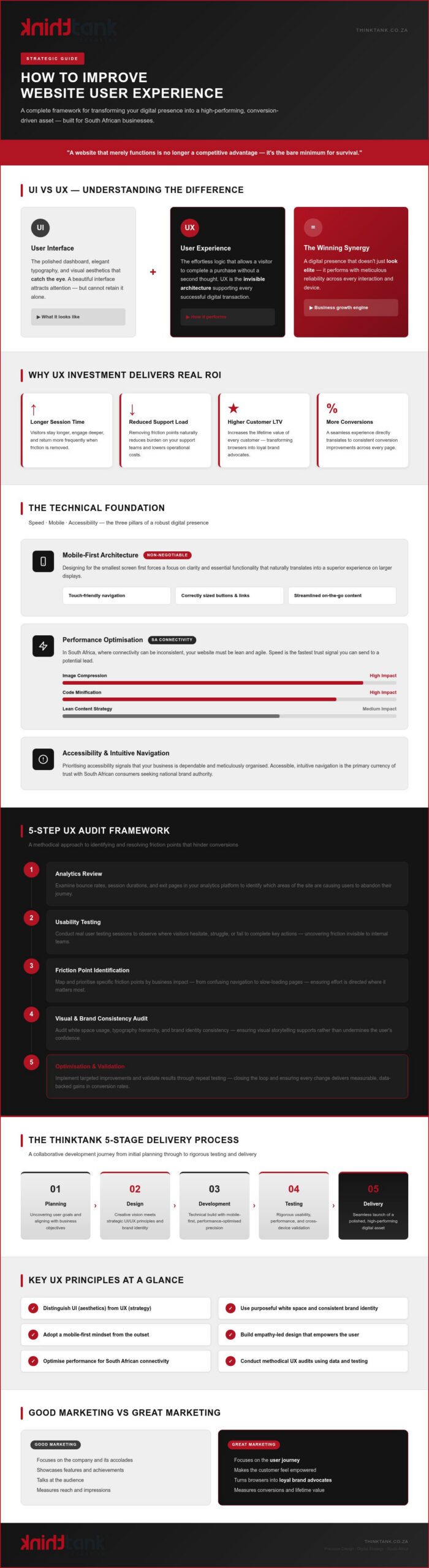
To gain clarity, one must distinguish between User Interface (UI) and User Experience (UX). If UI is the polished dashboard and elegant typography that catches the eye, UX is the effortless logic that allows a visitor to complete a purchase without a second thought. A beautiful interface might attract attention, but only a superior experience retains it. This synergy ensures that your digital presence doesn't just look elite; it performs with meticulous reliability across every interaction.

Investing in UX yields a tangible return that extends far beyond aesthetics. By removing friction points, you naturally reduce the burden on your support teams and increase the lifetime value of every customer. When a website is easy to use, visitors stay longer, engage deeper, and return more frequently. It's a calculated business strategy that transforms your site from a static brochure into a high-performing asset.

The Distinction Between Good and Great Marketing

Good marketing focuses on the company and its accolades; great marketing focuses on the user journey and makes the customer feel empowered. Our approach transforms your digital presence into a space where visitors feel understood and capable. This empathy-led design is what turns a casual browser into a loyal brand advocate. We prioritise a collaborative process that uncovers your users' true goals, ensuring every click feels like a step toward their own success rather than a hurdle to overcome.

UX as a Competitive Advantage in the South African Market

A polished digital presence is no longer optional for those seeking national brand authority amongst South African consumers. Trust is the primary currency of the web, and a seamless experience is the fastest way to earn it. By prioritising accessibility and intuitive navigation, you signal that your business is dependable and meticulously organised. For those looking to lead their industry, integrating these principles with custom website design South Africa provides the strategic context needed to dominate the local landscape and build lasting professional relationships.

Optimising the Technical Foundation: Speed, Mobile, and Accessibility

A flawless user experience is built upon a robust technical foundation. You cannot inspire confidence with a website that falters on a smartphone or takes an eternity to load over a standard mobile connection. When considering how to improve website user experience, you must begin with the mechanics that ensure your site is accessible to every South African, regardless of their device or data speed. This technical rigour provides the stability your brand needs to project an image of effortless professionalism and reliability.

The Mobile-First Architecture

Designing for the smallest screen first is a non-negotiable strategy for the modern digital landscape. By prioritising the mobile interface, you force a focus on clarity and essential functionality that naturally translates into a better experience on larger displays. Navigation must be touch-friendly, with buttons and links sized meticulously to avoid user frustration. Streamlining your content for on-the-go consumption ensures that your message remains impactful, even when viewed during a quick commute or a busy workday.

Performance Optimisation for National Reach

Speed is a critical component of trust. In a country where connectivity can be inconsistent, your website must be lean and agile to serve users effectively. Simple actions like image compression and the minification of code can have a profound impact on loading times, preventing potential leads from bouncing before your content even appears. These technical refinements are also deeply intertwined with your broader search engine optimisation South Africa strategy, as search engines increasingly penalise sluggish performance. Lighthouse scores are an automated metric provided by Google that assess your site's performance, accessibility, and best practices to ensure a high-quality digital experience in 2026. Maintaining these standards requires a commitment to excellence that often benefits from professional website maintenance and support.

Accessibility is the final, vital pillar of your technical foundation. Implementing inclusive design standards ensures your brand reaches a diverse audience, including those with visual or motor impairments. By utilising high-contrast colours, screen-reader-friendly layouts, and keyboard navigation, you demonstrate a level of corporate maturity that resonates with all users. This commitment to inclusivity doesn't just expand your reach; it solidifies your reputation as a forward-thinking industry leader that values every individual's journey.

Visual Storytelling and Brand Consistency

Visual appeal is the first handshake your brand offers a potential client. It acts as the emotional bridge between technical functionality and user engagement, transforming a cold digital interface into a space of professional resonance. When exploring how to improve website user experience, you must treat your visual assets as a unified language that speaks to your brand's authority and meticulous attention to detail. A site that looks fragmented or inconsistent suggests a lack of care, whilst a cohesive visual narrative projects stability and excellence.

Applying a consistent corporate identity across every page is fundamental to building trust. This includes the precise use of logos, specific colour palettes, and typography that reflects your brand's unique personality. Beyond these core elements, the strategic use of white space is essential for reducing cognitive load. By giving your content room to breathe, you direct user attention toward your most important messages and prevent the mental fatigue that often leads to high bounce rates. This deliberate organisation ensures that your visitors feel guided rather than overwhelmed.

The Power of Professional Brand Identity

A professional brand identity serves as the foundation of your digital reputation. When a visitor encounters a custom logo and stationery design that feels deliberate and high-quality, they immediately perceive a higher level of competence and reliability. Maintaining this cohesive vibe from your social media advertisements through to your website landing pages ensures a seamless transition for the user. The psychological impact of your chosen colour schemes and typography is profound; these elements subtly influence user behaviour and emotional response before a single word of copy is read. Pairing a strong visual identity with how to write effective website copy ensures that your messaging resonates just as powerfully as your design.

Information Architecture and Navigation

Strategic information architecture organises your content into a logical flow that leads users toward a specific, desired outcome. You can reduce friction significantly by limiting the number of clicks required to reach essential information. Our methodology incorporates specific "Choices" and "Feedback" stages during the design process to refine this navigation, ensuring every interaction feels intuitive and rewarding. Consider the following elements when refining your site's visual hierarchy:

By harmonising these visual components, you create a digital environment that is both beautiful and functional, reinforcing your position as a dependable partner in your client's success.

Improving Website User Experience: 2026 Strategic Guide

How to Conduct a UX Audit: A 5-Step Optimisation Framework

Transformative growth requires an honest assessment of your current digital performance. A UX audit is not merely a checklist of technical glitches; it is a meticulous strategic review designed to align your website with the evolving expectations of your audience. Learning how to improve website user experience is a continuous cycle of observation and refinement that ensures your brand remains relevant and resilient. By following a structured framework, you can move from guesswork to data-driven precision, identifying exactly where your digital presence excels and where it requires elevation.

Analysing User Behaviour

Data doesn't lie. It reveals the quiet frustrations of your visitors through metrics like bounce rates and exit pages. You don't need to be a data scientist to identify "rage clicks", those moments where a user clicks repeatedly on an unresponsive element, or confusing navigation paths that lead to dead ends. Heatmaps provide a vivid visual representation of user interaction, allowing you to see exactly where engagement thrives and where your most valuable content is being ignored. If you are ready to identify the hidden obstacles in your user journey, our team can help you conduct a professional UX audit that aligns with your long-term growth objectives.

Content and Conversion Review

A successful website guides the visitor toward a clear decision. Your calls to action (CTAs) must be noticeable, consistent, and focused entirely on the benefits provided to the user. We often find that removing even a single unnecessary form field can significantly increase lead generation by reducing the cognitive effort required to convert. This process of fine-tuning, based on authentic user feedback, ensures your website remains a polished and effective tool for business development. It's about creating a journey that feels less like a transaction and more like a collaborative success. For businesses seeking to maximise every visitor interaction, exploring lead generation website design South Africa strategies can provide the conversion-focused architecture needed to turn traffic into high-quality enquiries. Complementing this with proven lead generation strategies for South African businesses ensures your optimised UX is supported by a comprehensive framework for attracting and converting high-quality prospects.

The ThinkTank Process: Delivering Excellence Through Partnership

Excellence is never an accident; it's the result of a disciplined, collaborative process that values strategic depth over quick fixes. Achieving a superior digital presence requires more than just knowing how to improve website user experience; it demands a partner capable of executing that vision with surgical precision. We apply the standards of an international web-company to every project, ensuring that your site is as robust as it is beautiful. Our "all-rounder" capability means your branding, development, and marketing strategies are harmonised under one roof, reducing your stress whilst elevating your brand's authority.

Our methodology follows a comprehensive cycle designed to eliminate uncertainty and drive results. This proven path includes several critical phases:

From Imagination to Launch

Our designers prioritise usability and functionality as core tenets of every creative decision. We view the design phase as a collaborative journey of imagination where healthy debate and discussion lead to more refined UX outcomes. By favouring bespoke solutions over restrictive templates, we ensure your website is tailored to your specific business needs. This custom approach allows for greater flexibility and ensures your technical foundation can scale alongside your ambitions without the limitations of pre-packaged software.

Post-Launch Support and Evolution

A website is a living asset that requires constant attention to remain competitive. UX is never truly finished because user behaviour and technological standards are in a state of perpetual evolution. Our dedicated website maintenance and support services ensure your site remains secure, functional, and optimised for peak performance. We handle the technical complexities of your digital presence so you can focus on your core business operations with total confidence. Amplifying your site's authority through proven local link building strategies South Africa businesses rely on is an essential complement to ongoing UX refinement, ensuring your optimised experience is discoverable by the right audience. Embark on a journey of imagination with ThinkTank Creative today.

Elevating Your Brand Through Strategic Design

Mastering the digital landscape requires more than a functional website; it demands a meticulous commitment to the user journey. By harmonising technical performance with evocative visual storytelling, you transform your platform from a simple tool into a powerful engine for business growth. Understanding how to improve website user experience is a continuous process of auditing, refining, and innovating to meet the sophisticated expectations of your audience. Whether you are optimising for mobile-first connectivity or defining a bespoke corporate identity, every detail contributes to a cohesive and authoritative brand presence.

ThinkTank Creative has been a trusted partner in this journey since 2001, providing an elite end-to-end service that covers everything from initial research to ongoing support. Our award-winning in-house design team is ready to help you navigate these complexities with quiet assurance and creative excellence. It's time to move beyond the template and embrace a digital strategy that truly reflects your professional standard. Partner with ThinkTank Creative for a Bespoke UX Strategy and begin your brand's transformation today. We're excited to collaborate on your next milestone.

Frequently Asked Questions

What is the difference between UX and UI design?

UI is the visual interface, encompassing colours, buttons, and typography, whilst UX is the strategic logic governing how a user interacts with those elements. Think of UI as the beautiful finish on a vehicle and UX as the engine and handling that determine the drive's quality. Both must work in synergy to ensure your brand's digital presence is both aesthetically pleasing and meticulously functional for every visitor who engages with your brand.

How long does it typically take to improve a website's user experience?

The timeframe depends on the scope of the project, but initial high-impact optimisations can often be implemented within a few weeks. A comprehensive overhaul following our 5-stage development process typically spans several months to ensure every detail is tested and refined. We prioritise a methodical approach that balances rapid improvements with the strategic depth required for long-term brand transformation and sustainable growth across all digital channels.

Can I improve my website UX without a full redesign?

Yes, you can certainly implement incremental changes that yield significant benefits without a complete overhaul. Small refinements, such as optimising navigation menus, improving page load speeds, or clarifying your calls to action, can immediately enhance how to improve website user experience. These targeted adjustments allow you to resolve specific friction points identified in a UX audit whilst maintaining your existing brand structure and technical foundation.

How does website speed affect user experience and SEO?

Website speed is a fundamental pillar of both user satisfaction and search engine rankings. A sluggish site frustrates visitors, leading to higher bounce rates and lost conversions, whilst search engines like Google penalise slow-loading pages in their results. By prioritising performance through image compression and efficient coding, you create a seamless experience that encourages longer engagement and signals to search engines that your site is a high-quality resource.

What are the most common UX mistakes South African businesses make?

Many local businesses fail to account for the mobile-first reality of the South African market and the varying connectivity speeds across the country. Another frequent error is ignoring how to improve website user experience by using technical jargon that alienates the user. Overly complex forms and a lack of consistent corporate identity across different devices also create friction that prevents visitors from trusting a brand or completing a transaction.

Is mobile-first design really necessary for my B2B business?

Mobile-first design is absolutely essential for B2B enterprises because professional decision-makers increasingly research partners on their smartphones during transit or between meetings. If your site is difficult to navigate on a small screen, you risk appearing out of touch and unreliable. A responsive, mobile-optimised interface ensures your brand projects a consistent image of excellence, regardless of the device your potential partners choose to use.

How do I measure if my UX improvements are actually working?

You can measure success by monitoring key performance indicators such as conversion rates, average session duration, and bounce rates in your analytics. Qualitative feedback from usability testing and a reduction in customer support enquiries also provide clear evidence of a smoother user journey. These metrics allow you to see the tangible ROI of your UX investment and guide your future efforts for continuous digital evolution.

What is the estimated cost for a professional UX audit and redesign?

We provide an estimated cost only after discussing your specific business needs and the complexity of your current digital presence. Every project is unique, requiring a bespoke strategy that aligns with your brand's goals and technical requirements. By focusing on tailored solutions rather than templated packages, we ensure that your investment is directed toward the high-impact areas that will drive the most significant growth for your business.

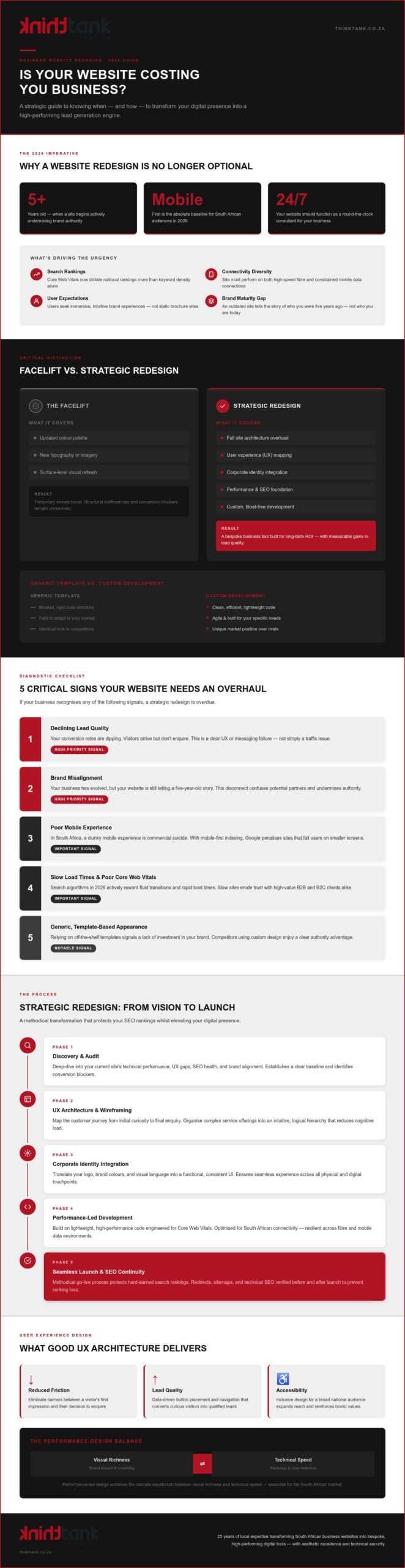
Professional Website Redesign: Strategic 2026 Guide

Your business website is no longer a digital business card; in 2026, it's either the most powerful member of your sales team or your greatest competitive liability. You've likely noticed that whilst your brand has evolved and your internal goals have scaled, your current digital interface feels stuck in a previous era. It's frustrating to watch conversion rates dip or see potential clients struggle with a clunky mobile experience. By engaging with professional business website redesign services, you can ensure your digital presence finally reflects the premium quality and sophisticated expertise your brand provides.

We understand the hesitation that comes with change, especially the fear of technical downtime or losing hard-earned search rankings. Our goal is to guide you through a strategic transformation that turns your site into a high-performing lead generation engine. This guide details the methodology behind a seamless transition that ensures your new, responsive site delivers measurable increases in lead quality. We'll explore how to align your digital platform with your broader marketing strategy to secure long-term growth and maintain market authority in the South African market.

Key Takeaways

  • Learn why 2026 demands a shift from simple navigation to immersive brand experiences that prioritise mobile-first connectivity for South African audiences.
  • Understand the critical difference between a cosmetic facelift and professional business website redesign services that overhaul architecture and user experience to solve conversion problems.
  • Identify the internal and external signals, such as declining lead quality and brand misalignment, that indicate your platform requires a strategic overhaul.
  • Discover a methodical process for aligning your new digital presence with your corporate identity whilst ensuring seamless integration with SEO and marketing efforts.
  • Explore how 25 years of local expertise can transform your website into a bespoke business tool that offers both aesthetic excellence and technical security.

Why Business Website Redesign Services are Vital in 2026

Digital interactions have shifted. Users no longer merely navigate; they seek immersive brand experiences that feel intuitive and immediate. If your interface feels like a relic from 2021, you aren't just losing aesthetics; you're losing market share. In the South African context, mobile-first connectivity is the absolute baseline. With diverse network speeds across the country, your platform must perform flawlessly regardless of whether a client is on high-speed fibre or a constrained mobile data connection. Professional business website redesign services ensure that your technical foundation meets the rigorous demands of Core Web Vitals, which now dictate national search rankings more than ever before. A tired, unresponsive site actively erodes trust amongst high-value B2B and B2C clients who equate digital polish with operational excellence.

Adapting to the High-Speed Digital Economy

Search engine algorithms in 2026 have evolved to prioritise genuine user engagement signals over static keyword density. They measure how users interact with your content, rewarding sites that offer fluid transitions and rapid load times. For South African businesses, this means adopting lightweight, high-performance code that remains resilient in varied connectivity environments. Performance-led design is the delicate equilibrium between visual richness and technical speed. By optimising these technical layers, you create a frictionless path that keeps visitors engaged rather than frustrated by lag.

Aligning Digital Presence with Brand Maturity

Your business has grown, yet your website might still be telling the story of who you were five years ago. This disconnect creates a brand gap that confuses potential partners and undermines your authority. Custom web design is essential for establishing a unique market position amongst competitors who rely on generic templates. Moving from a static brochure site to a conversion-centric platform requires a strategic rethink of your user journeys. Investing in business website redesign services allows you to bridge this gap, ensuring your digital presence acts as a 24/7 consultant that reflects your current maturity and scales with your future ambitions.

Facelift vs. Strategic Redesign: Understanding the Difference

A superficial facelift is often a missed opportunity. Whilst updating your colour palette might provide a temporary boost in morale, it rarely addresses the structural inefficiencies that stifle growth. A strategic redesign, by contrast, is a holistic overhaul of your site's architecture, user experience, and brand messaging. It treats your digital presence as a living extension of your business goals. When you invest in professional business website redesign services, you aren't just buying a new look; you're building a bespoke business tool designed for long-term ROI. Generic templates often carry bloated code and rigid structures that fail to adapt to your specific market needs. Custom development offers the agility required to outperform competitors by providing a clean, efficient foundation that search engines and users both appreciate. This approach ensures your technical infrastructure is as robust as your visual presentation.

The Role of User Experience (UX) Architecture

Strategic design begins with mapping the customer journey to eliminate friction. By understanding how your visitors move from initial curiosity to final enquiry, we can organise complex service offerings into an intuitive structure. This clarity is essential for increasing lead generation. In South Africa, accessible design is a commercial necessity. Ensuring your platform is usable for a broad national audience, regardless of their technical proficiency, expands your reach and reinforces your brand's inclusivity. Utilising professional business website redesign services allows for a data-driven approach to UX, where every button placement and menu item is a deliberate choice to enhance the user experience. We focus on creating logical hierarchies where the most important information is always within reach, reducing the cognitive load on your potential clients.

Integrating Corporate Identity into the UI

Synergy between your physical and digital presence is paramount. Your website should be the digital embodiment of your corporate identity design, translating your logo and brand colours into a functional user interface. This visual consistency ensures that a client's experience remains seamless, whether they are viewing a printed brochure or your latest landing page. High-quality typography and bespoke imagery elevate the perceived value of your services, positioning your brand as a meticulous leader in its field. This collaborative approach ensures that every pixel serves a purpose, moving your brand forward with confidence and precision whilst maintaining a sophisticated aesthetic that resonates with your target audience.

5 Critical Signs Your Business Needs a Website Overhaul

Recognise your website as the primary engine of your digital growth. When this engine begins to stall, the impact is felt across your entire sales pipeline. Identifying the right moment for a change requires a clinical look at your performance metrics and user feedback. Professional business website redesign services act as the catalyst for turning these technical frustrations into measurable growth. If your platform no longer serves your objectives, it's a liability rather than an asset.

Look for these five definitive indicators that your current platform is holding you back:

Analysing Conversion and Performance Data

Sales funnel leaks are often hidden in plain sight within your analytics dashboard. You might see a high volume of traffic that fails to reach your contact page, suggesting a friction point in the user journey. The cost of inaction is high, especially when calculating lost revenue from a poor mobile experience. A three-second delay in loading can result in a 50% drop in conversions, effectively halving your marketing ROI before a user even sees your value proposition. By addressing these bottlenecks, you ensure that every Rand spent on marketing works harder for your business.

The Competitive Gap Analysis

Evaluating your site against the current digital leaders in your industry reveals a widening competitive gap. Customers in 2026 expect integrated features like live chat, secure client portals, and bespoke interactive elements as standard. Being good enough is no longer sufficient in a saturated online market where your rivals are just a click away. Strategic business website redesign services allow you to close this gap and re-establish your brand as a sophisticated industry authority. This process isn't about chasing trends; it's about meeting the evolved expectations of a modern, digital-first clientele.

Professional Website Redesign: Strategic 2026 Guide

The Strategic Redesign Process: From Vision to Launch

A successful digital transformation requires a methodical, step-by-step framework that prioritises precision over speed. When you engage with professional business website redesign services, the journey begins with a deep discovery phase where we audit your existing assets and define clear commercial objectives. This is followed by creative conceptualisation, where your brand's vision is translated into a high-fidelity digital interface that remains faithful to your corporate identity. The development phase focuses on building a secure, scalable foundation, ensuring that technical SEO is baked into the code from the very first line, a hallmark of high-quality business website redesign services. Before any site goes live, it undergoes rigorous quality assurance testing across a wide range of devices and browsers to ensure a flawless user experience for every visitor. The final launch is not an end point, but a transition into a growth phase where your new platform is integrated with broader digital marketing and email campaigns to maximise impact.

Preserving SEO Equity During Transition

One of the most significant risks during an overhaul is the potential loss of search rankings. We mitigate this through meticulous 301 redirect mapping, ensuring that the authority of your old pages is transferred seamlessly to the new architecture. By auditing your existing content, we identify high-performing pages that must be preserved whilst refreshing outdated sections to align with current market trends. Technical SEO checks are performed throughout the process to guarantee that the new site structure is easily crawlable and indexed by search engines, protecting your digital footprint during the transition.

Post-Launch Support and Maintenance

The digital landscape of 2026 demands constant vigilance. Secure website maintenance and support are essential for protecting your investment against emerging security vulnerabilities and ensuring long-term functionality. During the first 30 days post-launch, we utilise real-time data to monitor user behaviour and refine conversion paths. This iterative approach allows us to make minor adjustments to the UX based on how your audience actually interacts with the live site, ensuring that the platform continues to evolve alongside your business. Ongoing support provides the stability needed for your brand to thrive in a competitive environment, allowing you to focus on your core operations whilst we manage the technical complexities.

Partnering with ThinkTank Creative for Brand Transformation

ThinkTank Creative approaches every project with the understanding that we aren't just building a website; we're crafting a sophisticated business tool. Our methodology is rooted in a collaborative partnership that seeks to understand your unique commercial DNA. With 25 years of expertise in the South African marketing and web development landscape, we've witnessed the digital shift from simple brochures to complex, high-performing engines. This legacy, dating back to our founding in 2001, allows us to offer bespoke business website redesign services that are as resilient as they are beautiful. By integrating Branding, SEO, PPC, and Printing Solutions under one roof, we ensure that your digital presence remains in perfect synergy with your physical touchpoints. This holistic perspective prevents the fragmentation that often occurs when working with multiple disconnected vendors.

A Legacy of Creative Excellence

Our "Strategic Visionary" persona serves as a steady guide throughout your transformation journey. We believe that high-end creative design and technical SEO are not mutually exclusive; they're two sides of the same coin. This dual focus ensures that your platform doesn't just attract visitors through search rankings but converts them through an elite user experience. We don't use templates. Our commitment to high-quality outcomes is backed by our focus on bespoke craftsmanship that reflects your brand maturity and drives measurable growth. We take pride in being a dependable partner that is deeply invested in your success, providing the meticulous attention to detail your business deserves.

Ready to Elevate Your Digital Presence?

The digital landscape of 2026 moves quickly, making now the ideal time to plan your transformation. A strategic redesign serves as the fundamental bedrock for all your future digital marketing and social media efforts. Without a high-performing destination, your advertising spend is often wasted on a leaky funnel. By revitalising your platform today, you secure a competitive advantage that will last for years. We invite you to discover how ThinkTank Creative can revitalise your business website and help you reclaim your market authority. Our team is ready to move you from a high-level concept to a concrete, high-performing reality. Let's build something exceptional together.

Secure Your Competitive Advantage in the Digital Economy

A high-performing website is the foundation of your brand's growth. We've explored how moving beyond a cosmetic facelift to a strategic overhaul ensures your platform resonates with the mobile-first South African market whilst solving deep-seated conversion issues. By identifying the signals of technical debt and aligning your digital presence with your brand maturity, you transform a static site into a powerful lead generation engine. Professional business website redesign services are no longer an optional luxury; they're a commercial necessity for maintaining authority in 2026.

As a full-service agency established in 2001, ThinkTank Creative brings 25 years of expertise to every bespoke project. We specialise in delivering SEO-centric, high-performance websites that harmonise perfectly with your corporate identity. Our collaborative approach ensures that your transition is seamless and your ROI is measurable. It's time to move from a high-level concept to a concrete reality. Begin your brand transformation with a professional website redesign from ThinkTank Creative. We look forward to helping you reach new heights of digital excellence.

Frequently Asked Questions

How much do business website redesign services cost in 2026?

Pricing is determined by the scope of your technical requirements and the complexity of bespoke development. Factors such as the total page count, custom integrations, and the depth of the initial strategy phase influence the final investment. Because every business has unique commercial goals, we provide tailored quotes based on a thorough audit of your digital needs. This ensures you receive a solution that scales with your growth without paying for unnecessary bloat.

How long does a typical professional website redesign take from start to finish?

A comprehensive redesign typically spans between eight to twelve weeks, depending on the project's scale. This timeline accounts for discovery, strategy, design conceptualisation, and meticulous development. We prioritise a methodical pace to ensure rigorous quality assurance across all devices. By following a structured roadmap, we maintain strategic depth whilst ensuring your team is collaborative and informed at every milestone, leading to a polished launch that meets your 2026 business objectives.

Will a redesign negatively affect my current Google search rankings?

A strategic redesign is designed to protect and enhance your search visibility rather than hinder it. We utilise precise 301 redirect mapping and technical SEO audits to preserve your existing search equity. By improving Core Web Vitals and mobile responsiveness, professional business website redesign services often result in improved rankings over the long term. We focus on maintaining the integrity of your high-performing pages whilst optimising the site architecture for better crawlability by search engines.

What is the difference between a website refresh and a full redesign?

A refresh is a cosmetic update focusing on visual elements like colours and typography, whilst a redesign is a holistic structural overhaul. Redesigns involve rethinking the user experience (UX) architecture, content strategy, and underlying code to solve conversion issues. If your business has outpaced its current digital presence, business website redesign services offer the strategic depth needed to realign your platform with your current market maturity and the technical requirements of the modern digital economy.

Do I need to change my hosting or domain when I redesign my website?

You aren't required to change your domain name, and in most cases, keeping your established URL is beneficial for SEO. However, a redesign is an ideal time to evaluate if your current hosting provider meets modern performance and security standards. If your current server causes slow load times or lacks robust security, moving to a high-performance environment can significantly improve your site's speed and reliability, protecting your new digital investment from the start.

Can you integrate my existing branding and logo into the new design?

We specialise in ensuring your digital presence remains in perfect synergy with your established corporate identity. Our creative team takes your professional logo and brand guidelines as the foundation for the new user interface. We translate these elements into a modern digital environment, utilising custom typography and imagery to elevate your brand's perceived value. This consistency ensures that your website feels like a natural and sophisticated extension of your existing business across every touchpoint.

How often should a business consider redesigning its website?

Most industry leaders recommend a strategic review every two to three years to keep pace with evolving user behaviour and technological shifts. In the fast-moving South African market, waiting longer can result in a significant competitive gap. If your conversion rates are declining or your site feels clunky on modern mobile devices, it's a clear signal that an overhaul is necessary. Regular updates ensure your business tool remains agile, secure, and commercially effective.

Will my new website be easy for my internal team to manage and update?

Yes, we build our bespoke platforms with internal agility in mind. We provide intuitive content management solutions that allow your team to update text, imagery, and SEO metadata without needing deep technical expertise. This empowers your marketing team to remain responsive to market changes whilst we handle the complex technical maintenance in the background. Our goal is to provide you with a high-performance tool that simplifies your daily operations and supports long-term business growth. For businesses seeking a flexible and scalable foundation, exploring professional WordPress web design in South Africa can provide the bespoke framework needed to maintain full control over your brand narrative. South African businesses looking to go further can also explore professional website design for South African businesses to understand how strategic website design transforms a digital presence into a high-converting business asset.