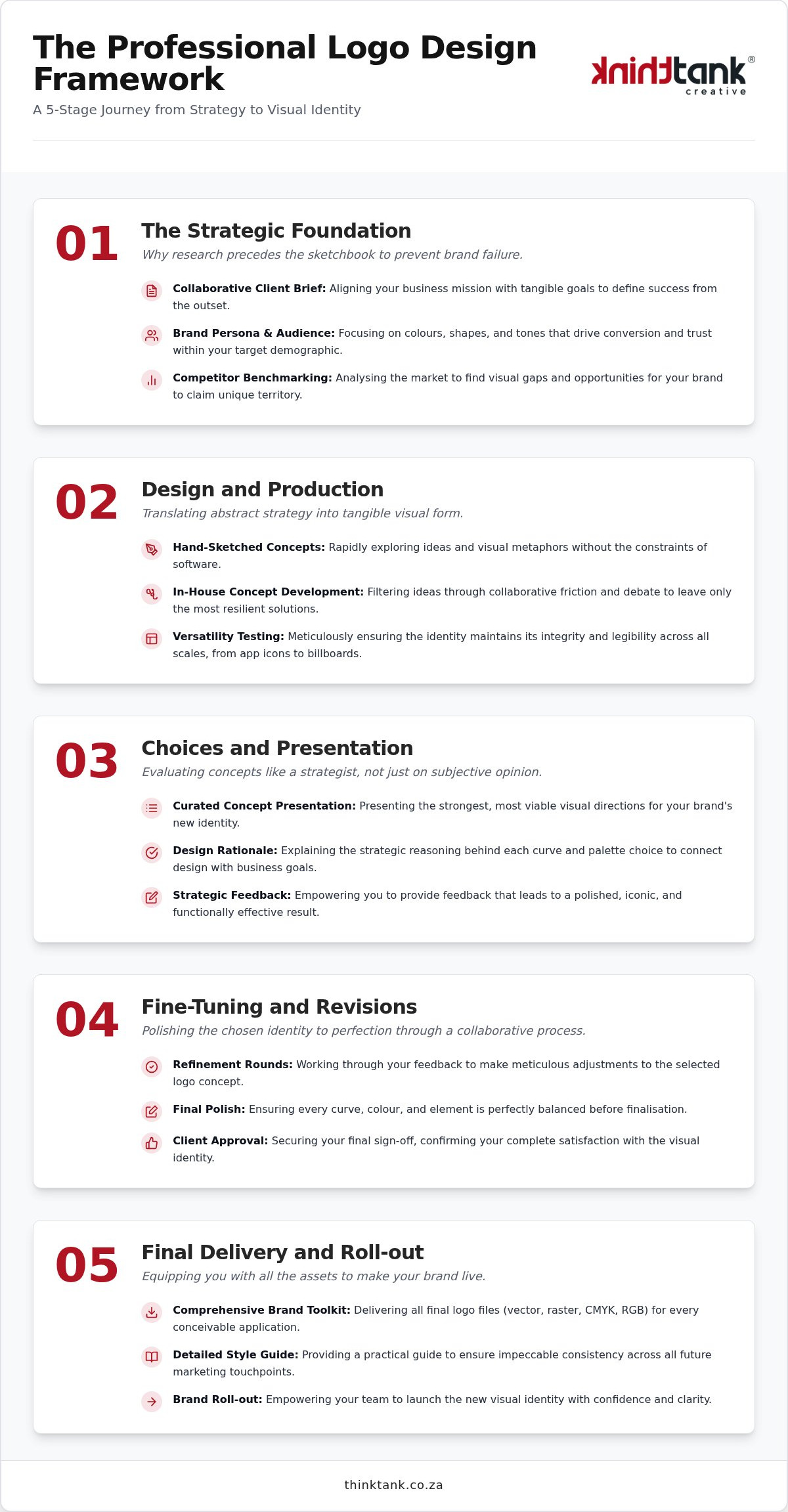
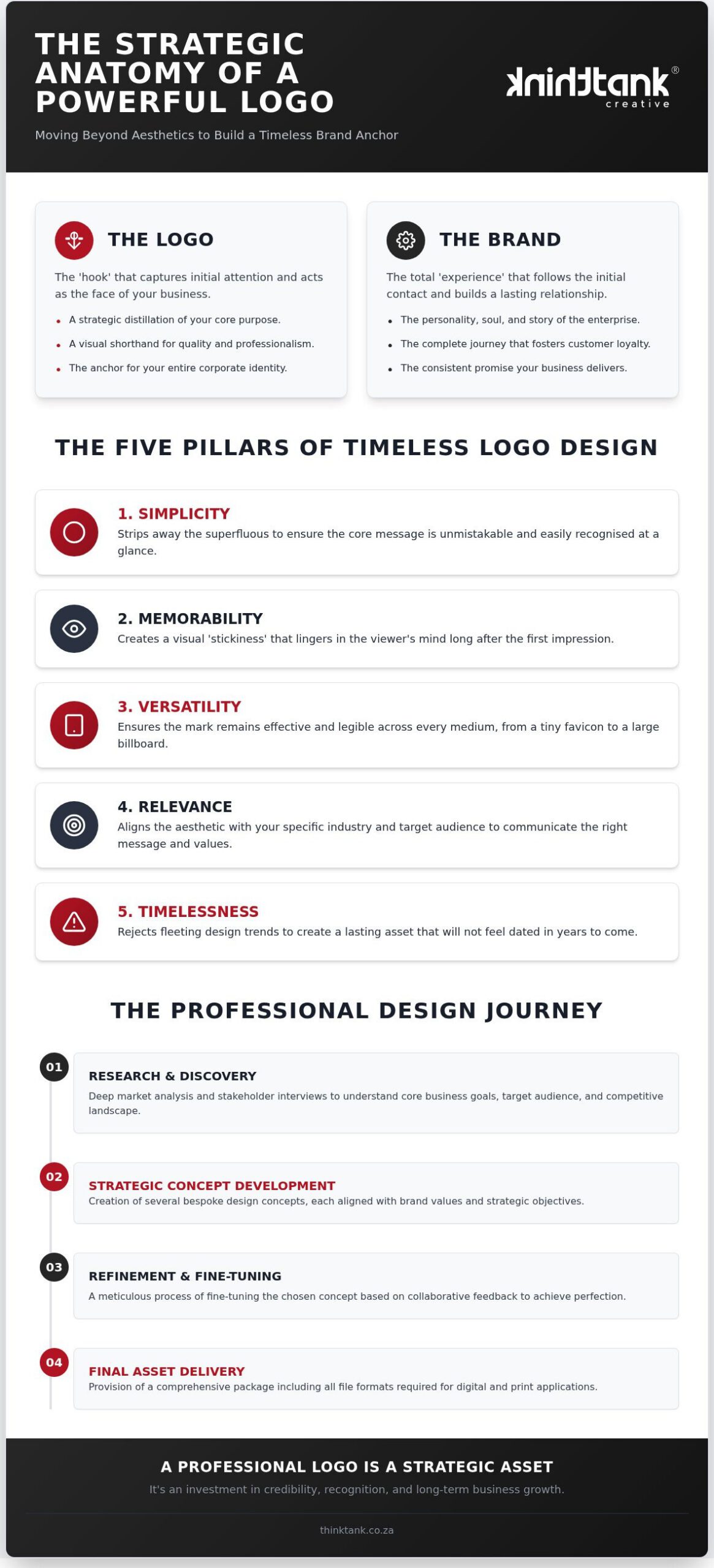
Rebranding Strategy Checklist: A Practical Guide for 2026

A new logo may be the least important part of a rebrand. If your business strategy has shifted but the customer experience still reflects an earlier direction, changing the visuals alone won’t close the gap. A rebranding strategy checklist helps you identify what’s driving the disconnect before you commit to a full rebrand or a more focused refresh.

It’s understandable to feel uncertain about how much needs to change. You’ll also want to avoid overlooking customer touchpoints or launching an identity your team isn’t ready to use consistently. Start with clear business and audience needs, not a design preference in isolation.

This practical guide will help you assess the gap between your strategy and customer experience, decide whether to refresh, reposition or rebrand, and plan the work across your identity, digital channels and printed materials. You’ll find ways to align decision-makers and employees, coordinate a rollout and review progress afterwards. Each step turns a complex project into a manageable plan, with a clear reason behind every change.

Key Takeaways

  • Use a rebranding strategy checklist to connect each proposed change to a clear business objective and customer need.
  • Build your direction around audience insight, positioning, messaging and evidence, rather than visual preference alone.
  • Compare a focused refresh, repositioning and full rebrand to choose a scope that fits the challenge.
  • Track identity, website, marketing, print and internal updates with clear owners, priorities and approval steps.
  • Plan a joined-up launch, then measure progress against the objectives that shaped the rebrand.

Rebranding Strategy Checklist: Identify the Business and Customer Gap

Uncertainty about whether your brand needs a refresh or a more substantial change is a useful starting point. A dated logo or mismatched marketing materials may be visible symptoms, but the underlying issue could be that the business has evolved while its positioning, message or customer experience has not.

Rebranding is a deliberate change to how a business is positioned, expressed or experienced. The scope can range from adjusting visual elements to reshaping the story customers encounter across the organisation. For an overview of corporate rebranding principles, consider how motivations and scope differ between minor identity adjustments and more fundamental change.

Before choosing a solution, use this diagnostic to connect business direction with audience experience:

Look for patterns rather than reacting to one isolated comment. If the same misunderstanding comes up in sales conversations, website feedback and customer enquiries, it may point to a messaging or positioning gap. If people understand the offer but encounter conflicting colours, names or materials, the problem may be visual or operational instead.

What signals that your current brand needs attention?

Compare the brand customers see with the organisation you are building. Review your offer, priorities and business direction, then check how they appear on your website, social channels and printed materials. Ask employees what they believe the business stands for and compare their answers with customer feedback. Repeated differences can show where recognition, relevance or consistency is weakening.

Is the issue strategic, visual or operational?

Separate the cause from the symptom. Unclear positioning can leave people unsure why the business is relevant; unclear messaging means the explanation is not reaching them. Outdated visual expression calls for a different response, while inconsistent touchpoints may need clearer identity guidance and coordinated updates. These issues can overlap, so identify the primary problem before selecting a remedy.

Write one evidence-based problem statement before proposing a solution. For example: “Customers understand our service, but feedback shows our website and printed materials describe it differently.” This is more actionable than “our brand looks old” because it identifies an observable gap and who experiences it. Support the statement with customer comments, staff observations or a review of existing materials. The goal is fit and clarity, not change for its own sake. This evidence gives the next stage of your rebranding strategy checklist a sound basis for deciding what should change.

Build the Rebranding Strategy Checklist Around Audience, Positioning and Proof

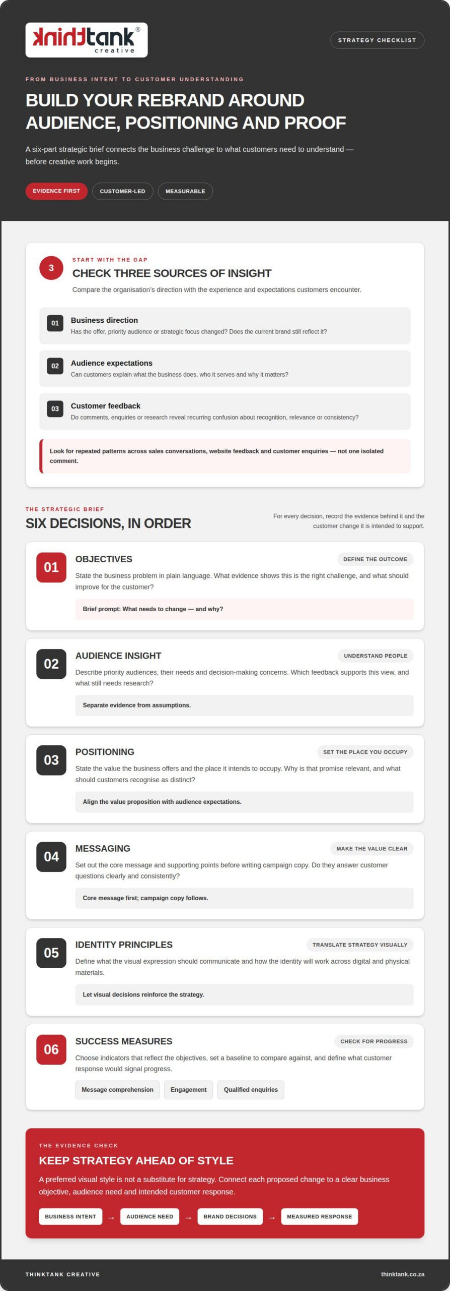
Turn the gap you’ve identified into a clear strategic brief before creative work begins. Connect business intent to what customers need to understand, then carry that direction into identity, website and campaign decisions. At each stage, record the evidence behind the decision and the customer change it is intended to support.

Set objectives and understand the audience

Start with the business problem in plain language, such as “our current message doesn’t explain the value of our expanded offer”. Then describe the people the brand needs to reach, what matters to them and what they should understand or feel. Separate evidence from assumptions: note existing feedback and identify unanswered questions rather than treating an internal opinion as a customer insight.

Clarify positioning, messaging and measures

Work through the decisions in order. This keeps a preferred visual style from standing in for strategy and makes the rebranding strategy checklist useful to both creative and digital teams.

  1. Objectives: Define the business outcome. What evidence shows this is the right challenge, and what should improve for the customer?
  2. Audience insight: Describe priority audiences, their needs and decision-making concerns. Which feedback supports this view, and what still needs research?
  3. Positioning: State the place the business intends to occupy and the value it offers. Why is that promise relevant to the audience, and what should they recognise as distinct?
  4. Messaging: Set out the core message and supporting points before writing campaign copy. Do they answer customer questions clearly and consistently?
  5. Identity principles: Define how visual expression should reinforce the strategy. What should the identity communicate, and how will it work across digital and physical materials? A practical good logo design guide can help translate these principles into visual decisions.
  6. Success measures: Choose indicators that reflect the objectives, such as message comprehension, engagement or qualified enquiries. What baseline will you compare against, and what customer response would signal progress?

Positioning is more than a cosmetic adjustment: strategic brand repositioning involves aligning the value proposition with audience expectations. Use that distinction to test whether the proposed change alters how customers understand the business, not just how it looks.

Align decision-makers before creative development

Agree who provides input, who approves the work and who makes the final decision. Set a shared method for gathering feedback, resolving conflicting views and keeping comments tied to the agreed objectives. This prevents the strategy from becoming a collection of individual preferences.

Bring the decisions together in a concise brief: objectives, priority audiences, positioning, core messages, identity principles, evidence and measures. Share it with creative and digital teams so the same direction informs logo and corporate identity, website content and marketing activity. ThinkTank Creative’s integrated marketing and creative approach connects strategy with the work customers encounter across channels.

Refresh, Reposition or Rebrand? Compare the Right Scope of Change

Choose the scale of change that addresses the gap, not the one that sounds most ambitious. A refresh may solve inconsistent visual expression, while a shift in audience or value proposition calls for deeper strategic work. These categories are decision-making guides, not rigid labels or promises of a particular outcome. A project can also combine elements from more than one category.

Use this comparison to test the likely scope against your evidence, business direction and the impact on customers:

Approach Scope and typical trigger What it involves
Focused refresh The core position remains relevant, but visual expression or materials feel dated or inconsistent. Targeted updates to identity elements and selected assets, preserving familiar recognition cues.
Repositioning The business needs to communicate a different value or become relevant to an audience whose expectations have shifted. Reworking the intended position and messaging, then aligning customer-facing materials with that promise.
Full rebrand Evidence points to substantial change in business direction, audience, offer or customer experience. Revisiting strategy and expression across the identity and the touchpoints that deliver the brand.

When is a focused brand refresh enough?

A refresh may be appropriate when customers still understand and value the business’s position, but the identity is difficult to use consistently or no longer feels clear. Update the elements linked to the diagnosed issue, such as templates or selected visual assets, rather than replacing everything by default. Keep recognisable cues where they support familiarity, while improving legibility and practical use.

When does repositioning or a full rebrand make sense?

Consider repositioning when the intended place in the audience’s mind needs to change, not simply the visual styling. If the business direction, priority audience or value proposition has materially shifted, review the strategy and messages before settling on a new expression. A broader rebrand is warranted only when evidence supports change across both foundations and customer experience.

How should you compare scope and effort?

Include implementation and internal alignment in the decision, not just creative deliverables. A change to messaging may require updates to website pages and campaigns; a broader identity shift may also affect printed materials and how employees explain the offer. The custom website design strategic guide explores how a website can support business objectives as part of that wider change.

Before committing, list the audiences, messages, identity assets and touchpoints affected by each option. Then consider what teams must approve, prepare or adopt. If the logo changes but customers still encounter unclear positioning or conflicting messages, the underlying problem remains. Let the diagnosed gap set the scope, and shape project planning around the requirements and timeline.
Rebranding Strategy Checklist: A Practical Guide for 2026

Use This Rebranding Strategy Checklist to Plan Every Touchpoint

A consistent launch depends on coordinating the details, not simply approving a new identity. Use this rebranding strategy checklist to turn decisions into assigned updates, so customers and employees encounter a coherent brand across digital and physical channels.

Audit the assets customers and employees encounter

Start with an inventory of what people see and use. Include customer-facing assets as well as internal templates and guidance. For each item, record its current version, intended audience and required change. Then assign the fields that will keep work moving:

Group the inventory so nothing is missed:

Coordinate website, marketing and production updates

Set dependencies before work begins. Website and campaign updates should use approved messaging and visual identity, while printed items should move into production only after their content and artwork are signed off. This reduces the risk of a new identity appearing in one channel while outdated materials remain in circulation elsewhere.

Prioritise high-visibility touchpoints first, such as the website and active social profiles. Then schedule lower-priority or less frequently used materials in manageable phases, with an owner and completion check for each. If the website changes, consider the organic search implications alongside design and content updates. The search engine optimisation strategic guide can help frame those considerations.

Prepare people and manage the rollout

Give employees accessible guidance on the positioning, key messages and correct use of identity assets. A short reference document and approved templates can help teams apply the same direction in everyday communications. Set a launch sequence with named owners, review points and a clear route for reporting and correcting inconsistencies.

Prepare customer-facing communication for changes that affect how people recognise or engage with the business. Keep explanations useful and straightforward, focusing on what customers need to know. ThinkTank Creative brings together identity, website, digital marketing and print services through connected marketing and creative support.

Turn the Rebranding Checklist into a Measurable, Joined-Up Launch

A brand change is ready to launch when the strategy, customer-facing assets and people responsible for using them are aligned. Close your rebranding strategy checklist with a sequence that makes ownership clear and gives the team a way to learn from the rollout:

  1. Approve: Sign off the positioning, messages and identity assets that will guide the launch.
  2. Prepare: Confirm channel owners, customer communication, launch responsibilities and baseline measures.
  3. Launch: Release approved updates in the planned order, coordinating website, marketing and production activity.
  4. Monitor: Review audience responses and selected performance measures against the original objectives.
  5. Refine: Use observations and feedback to prioritise practical improvements across touchpoints.

Prepare the launch and establish a baseline

Before launch, confirm that priority assets are approved, owners know their responsibilities and customer communication is ready. Record relevant pre-launch measures, such as existing engagement, enquiry patterns or website activity, so later reviews have a useful comparison point. Check key touchpoints together: the website, social channels and customer materials should all express the agreed positioning and identity, even if lower-priority updates are scheduled for a later phase.

Review performance and refine the experience

Connect each review to an objective rather than relying on general impressions. If the aim is clearer understanding, examine customer questions and feedback for signs of comprehension. If the aim is stronger engagement, review relevant interaction patterns; if it is more qualified enquiries, consider the nature of enquiries alongside their volume. These observations don’t prove a single cause, but they can reveal where messages or experiences need refinement.

Choose a collaborative partner for connected delivery

A joined-up launch needs the strategic direction to carry through creative work, website updates, digital marketing and production. When those disciplines are coordinated, approved messages and identity can be applied consistently across online and printed customer touchpoints. ThinkTank Creative is a marketing and creative agency established in 2001, bringing together strategy, branding and creative design, website design and development, digital marketing and SEO, and printing and production.

That collaboration can continue after launch, as review findings help guide practical refinements to the brand experience. Define the needs and timeline, then shape a plan around the project’s priorities. ThinkTank Creative’s connected services bring strategy and rollout together.

Make Your Next Brand Move With Confidence

A rebrand’s value is shaped not only by the identity you introduce, but by how consistently your business brings it to life as it grows. Treat the launch as the start of an ongoing practice: listen to customers, notice where the experience falls short of the intended position, and use those insights to guide thoughtful improvements. A rebranding strategy checklist gives your team a shared reference point for carrying that direction forward.

For a collaborative partner across strategy, creative, digital and production, ThinkTank Creative brings integrated capabilities to rebranding projects. The website states: “We are rated as one of the Top 5 Website design companies in South Africa by our clients according to The Independent Authority on Search Vendors.”

Ready to shape a clear next step for your business? Discuss your rebranding strategy with ThinkTank Creative. With a considered plan and the right people working together, your brand can move forward with greater clarity and purpose.

Frequently Asked Questions

Can a business rebrand without changing its name?

Yes. A business can retain its name while updating its value proposition, visual identity or the way it explains its offer. For example, a familiar name might stay in place while a clearer descriptor helps new customers understand what the organisation does. Before changing a name, consider the recognition it already carries and whether the real source of confusion lies in the name or in how the business presents itself.

How often should a business rebrand?

There’s no set interval that suits every business. Review the brand when you’re planning a meaningful change to your offer, audience or direction, or when customer feedback suggests people no longer understand its value. A regular review doesn’t need to trigger a redesign. Use your rebranding strategy checklist to assess whether the evidence points to a specific update or a more substantial shift.

What happens if a business changes its brand but keeps the same positioning?

The new look may attract attention without helping customers understand the business any better. For instance, if an expanded service offer is still described using language that only explains the original offer, the visual update won’t resolve that mismatch. Before approving creative work, test whether the core explanation makes sense to someone unfamiliar with the organisation. If it doesn’t, clarify the message before applying it across brand materials.

Is a rebrand only a new logo and colour palette?

No. Customers experience a brand through more than its visual identity: the words used to describe services, the tone of emails and the way information is organised all contribute to their impression. A new logo can’t fix confusing service names or inconsistent explanations. Include these everyday interactions in your review, so the identity and the practical experience customers receive support the same understanding of the business.

Can a rebrand be launched in phases?

Yes. A phased launch can make a complex set of updates easier to coordinate. For example, prepare approved website and campaign assets together, then schedule less frequently used materials for a later stage. Keep a shared record of which versions are current, who owns outstanding updates and what depends on earlier approvals. This helps employees avoid using old files while different channels move through their planned sequence.

How do you protect brand consistency after a rebrand?

Make correct brand use straightforward for the people creating customer communications. Keep approved messages, identity files and templates in an accessible shared location, and name someone to maintain them as the business evolves. When a new service or campaign is introduced, use the same guidance to review its language and presentation. Periodically check recurring materials, such as email templates and sales documents, for outdated details or conflicting versions.
Brand consistency builds trust and recognition

Recognition grows when every customer touchpoint feels part of the same story. Brand consistency for businesses means presenting a recognisable identity and message across channels while adapting details to each context. That includes visual elements, tone of voice and the experience people have when interacting with a business.

Consistency matters because a familiar logo or voice can help customers recognise a brand, but it must also feel relevant wherever they encounter it. Repetition without flexibility can feel rigid; variation without a clear foundation can cause confusion.

This article explains what brand consistency involves and how it can support trust, recognition, customer loyalty, revenue and more effective marketing. It also covers how brand guidelines, organised assets and thoughtful adaptation help create a coherent identity across a business’s communications.

Key Takeaways

  • Align your visual identity, messaging, tone and customer experience so each interaction feels recognisably part of the same brand.
  • Make brand guidelines and approved assets easy for everyone working on your marketing to find and use.
  • Adapt your communications to each channel without losing the identity customers recognise and trust.
  • Review your website, social media and marketing materials to spot inconsistencies that could weaken recognition or confuse customers.
  • Explore how coordinated website design, social media marketing and creative design can bring your brand identity to life.

What is brand consistency?

Brand consistency means presenting a recognisable identity across visual design, messaging, tone and customer experience. A South African business might express the same values through its website, social posts, printed materials and customer interactions.

A brand identity beyond visual elements

A brand identity is the combined impression created by visual elements, messaging, tone, values and customer experience. A logo and colour palette help people recognise a business, but its words and the way it treats customers shape that recognition too. For example, a business promising clear, practical advice should communicate plainly and make its service experience equally straightforward.

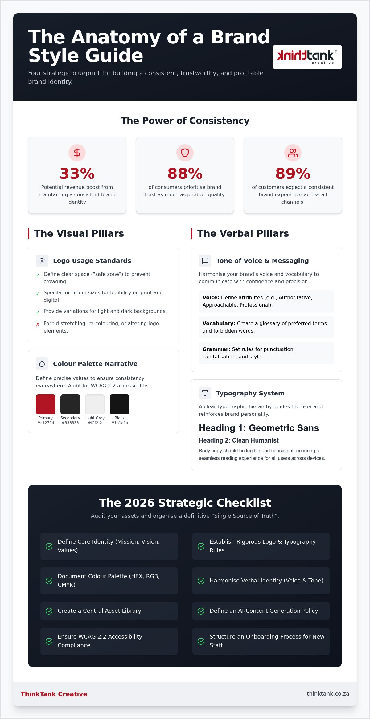
Build consistency by connecting each customer-facing element to the same principles. A brand guide can set out logo use, colours, typography, tone of voice and key messages, then show how to apply them to a website or social media post. This gives staff and collaborators a shared reference instead of leaving each person to interpret the identity independently.

Consider the full customer journey. A prospective customer may first see a social media post, visit the website, then speak with a staff member. If the post is warm and helpful, but the website is formal and the conversation feels dismissive, those experiences tell different stories. Consistent behaviour across touchpoints makes the brand promise more credible and can support customer loyalty.

Relevance within a core identity

Relevance within a core identity means adapting how a brand communicates without changing the values and character people recognise. A business can adjust its message for a new audience or platform while keeping its visual identity and central promise intact. This balance matters: an unchanged approach can feel out of step, while constant reinvention can weaken recognition.

For example, a professional services firm might use a concise LinkedIn post to explain an industry update, then offer fuller context on its website. The formats differ, but the same visual style, voice and commitment to useful guidance can connect them. In South Africa, a campaign may also need to reflect local language and audience context without losing the business’s distinctive character.

Use brand values as the decision point when reviewing a new design, campaign or channel. Ask whether the change expresses the same promise in a way that suits its audience. A refreshed layout may improve readability, while familiar typography, colours and wording preserve recognition. This lets a brand evolve with purpose rather than follow every passing trend.

For brand consistency for businesses, the goal isn’t identical content everywhere. It’s a clear identity people can recognise across a website, social media, print and customer interactions, even as each message suits its setting.

Centralising brand assets with digital asset management

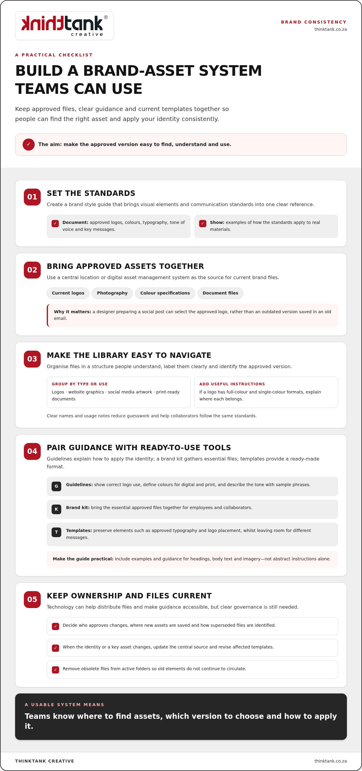
A brand style guide brings visual elements and communication standards into one clear reference. Create it by documenting approved logos, colours, typography, tone of voice and messaging, then add examples showing how each applies to real materials.

Centralising approved brand assets

Digital asset management brings approved brand files together in a central location, making it easier for teams to find and use the right source. Store current logos, photography, colour specifications and document files alongside usage notes. For example, a designer preparing a social post can use the approved logo rather than an outdated version from an old email.

Give the central library a structure people can understand. Group files by type or use, such as logos, website graphics, social media artwork and print-ready documents. Label each asset clearly and identify the approved version. If a logo has full-colour and single-colour formats, explain where each belongs. Clear naming and instructions reduce guesswork and help collaborators follow the same standards.

Guidelines, kits and templates

Brand guidelines explain how to apply identity elements, while a brand kit gathers essential files and a template provides a ready-made format. Together, they help employees, agencies and freelancers produce connected materials. A branded letterhead template, for instance, can preserve approved typography and logo placement while leaving room for different business messages.

Keep the document practical. Show examples of correct logo use, define the brand’s colours for digital and print applications, and describe the tone with sample phrases. Include guidance for headings, body text and imagery, so the standards are easier to apply than abstract instructions alone. An accessible guide is useful only when people can locate it and understand what to do.

Technology can support this process, but it can’t replace clear governance. A shared drive or digital asset management system can hold approved files, distribute them to teams and make the latest guidance easier to access. Set simple ownership rules: decide who approves changes, where new assets are saved and how superseded files are identified. This prevents competing versions from circulating across departments.

Review the library whenever the identity or a key asset changes. Update the central source, remove obsolete files from active folders and revise templates that still use old elements. For a website, aligning approved graphics and brand details with website maintenance and support can help keep published pages in step with current standards. The result is a usable system: teams know where to find assets, which version to choose and how to apply it.

Trust, customer loyalty, brand recognition, and revenue

Consistent branding helps customers connect familiar signals with a dependable experience. Its effects can extend from first recognition to repeat purchasing and revenue.

Consistency across customer touchpoints

Consistency across customer touchpoints means people encounter a coherent identity and experience wherever they interact with a business. A website, social media page, phone call and printed brochure should feel connected, even when each serves a different purpose. A gap between a campaign’s promise and the service experience can undermine confidence.

Map the journey from discovery to purchase, then review what each touchpoint communicates. For example, a South African retailer might use the same approved product descriptions and service details on its website, social posts and printed materials. Staff conversations should reflect those messages too. The words need not be identical, but the facts, tone and expectations should align.

Look for practical friction as well as visual differences. If customers see one set of opening hours on a social profile and another on the website, they may question which is current. Clear ownership of updates and a shared source for approved information help prevent these avoidable inconsistencies.

Recognition and customer loyalty

Brand recognition is the ability to identify a business through familiar visual and verbal cues; consistency reinforces those cues over time. A recurring logo, colour palette and phrase can help customers distinguish one business from another when comparing options. Familiarity makes an identity easier to recall when a need arises.

Familiarity alone doesn’t create loyalty. The customer experience must support what the brand signals. If a business presents itself as responsive but enquiries receive unclear or conflicting answers, repetition won’t fix the mismatch. Aligning materials with actual service behaviour gives customers a reason to return, not just remember the name.

Trust is also linked to purchasing behaviour: 81% of people must trust a brand before making a purchase, and customers who trust a brand are 88% more likely to buy again. These figures underline why consistency should extend beyond design. Reliable information, recognisable presentation and a customer experience that matches the brand promise work together.

Trust and revenue

Consistent brand presentation across all channels can increase business revenue by approximately 23%. This is a reported relationship, not a guaranteed result for every organisation. Consistency can support performance by helping customers recognise a business, understand its offer and feel confident moving towards a purchase.

Trust can also influence retention. Acquiring a new customer can cost up to five times more than retaining an existing customer, so a dependable experience has commercial relevance beyond the first sale. Review whether each interaction reinforces the same promise, from the first advertisement to after-sales communication.

Measure customer response alongside brand presentation. Track repeat purchases, feedback and points where people abandon an enquiry. If customers recognise a campaign but misunderstand the offer, refine the messaging. If the promise is clear but the experience varies, focus on the relevant touchpoints. This makes consistency a practical part of customer retention and revenue planning.

Brand consistency builds trust and recognition

Marketing and advertising effectiveness

In competitive markets, a clear, repeated identity helps each campaign build on the last. More than 70% of companies believe inconsistent brand use creates confusion in the market. Consistency helps audiences connect an advertisement with the business behind it, rather than treating each message as a separate introduction.

Repetition also gives marketing a stronger cumulative effect. Customers may need to see a brand and its message at least 7 times before committing to a purchase decision. If each appearance changes its visual identity, tone or core promise, those encounters may not reinforce one another. A recognisable system lets a business adapt creative work for different channels while retaining familiar cues.

That doesn’t mean publishing identical content everywhere. A social post can introduce an idea, while an email explains it in more detail and a website supports the next step. The format and emphasis change, but the central message and visual identity remain connected. For example, Nike has kept its “Just Do It” slogan and swoosh logo consistent for decades.

Make campaigns easier to manage

A defined marketing strategy reduces repeated decisions during campaign production. Teams can start with approved visual elements, tone and key messages, then tailor each execution to its audience and channel. This helps a campaign feel coherent across paid advertising, email and social media without forcing every touchpoint into the same format.

Use this marketing leader checklist before a campaign goes live:

Efficiency comes from making good decisions repeatable. Content management systems and social media schedulers can help teams coordinate messaging across channels. Shared campaign templates can preserve design standards, leaving staff to focus on the audience and message rather than rebuilding each asset.

Measure the system as well as the campaign. Audit websites, social media and marketing materials quarterly to identify outdated logos, off-brand colours or inconsistent messaging. Only 25% of companies actively enforce their brand guidelines, so clear ownership matters. Assign responsibility for review, record corrections and update the approved source, allowing the next campaign to begin with accurate materials.

Definition and business importance of brand consistency

Brand consistency connects a business’s identity and message across its audience-facing platforms. In South Africa, use brand names and visual assets you own or have permission to use, and keep advertising claims accurate and supportable.

Meaning of a consistent brand

A consistent brand presents its values, visual identity and messaging in recognisable ways across different contexts. Customers can more readily connect a campaign, service interaction and business to the same organisation. Consistency doesn’t require identical content everywhere; each expression should reflect the same central identity.

For example, a business promising straightforward advice can use clear language in an advert, on its website and in customer emails. Its tone may shift to suit each platform, but the promise remains recognisable. This alignment helps make the brand memorable for the right reasons, rather than relying on a logo alone.

Business importance of consistency

Consistency gives a business a coherent foundation for communicating with its audience. When brand assets, messages and customer experiences point in the same direction, each interaction can reinforce the last. This supports recognition and helps customers understand what the business stands for, especially when they encounter it through different channels.

It also makes internal decisions more focused. A team planning a campaign can compare its proposed design and language with the brand’s values and positioning. If an idea attracts attention but contradicts the business’s core promise, the team can refine it before publication. That discipline supports long-term success without ruling out fresh creative work.

Review consistency in real customer materials, not just a brand document. Compare a recent advert, website page and customer email. Check whether each uses current assets, describes the same offer and communicates a compatible tone. This simple comparison can reveal gaps between the identity a business intends to present and what its audience actually sees.

Branding and advertising rules

South African businesses should use their own branding or assets they’re authorised to use, and avoid advertising that could mislead customers. Keep claims clear and supportable, including statements about a product’s features, performance or benefits. These principles help protect customer understanding and reduce the risk of building a campaign around confusing or unsupported promises.

Before publishing an advertisement, match each claim to evidence the business can substantiate, and check that images and logos are approved for use. For instance, explain a promotion clearly and avoid visuals that suggest a benefit the business doesn’t provide. Consistent brand standards work best when creative choices and claims are reviewed together.

Brand consistency for businesses is both a communication discipline and a decision-making framework. Define what must stay recognisable, then adapt the delivery to each platform. That balance helps a brand remain distinctive as its audience, channels and marketing needs evolve.

ThinkTank Creative: Website Design and Development

ThinkTank Creative helps businesses bring their brand identity together through Website Design and Development, creative design, and Logo and Corporate Identity Design. Turn to these services when your website or visual materials no longer reflect a clear, unified identity, or when you’re shaping a new direction for your business.

A coherent website gives your messaging and visual identity a consistent home, while Social Media Marketing carries that identity into social channels. The work can be shaped around your brand’s priorities, from refining its visual foundations to aligning its digital presence.

If you’re ready to strengthen how your brand appears across your website and marketing, contact ThinkTank Creative or visit thinktank.co.za.

Shape a brand people recognise and remember

Make your next brand decision with the long view in mind. The choices you make today can create a clearer foundation for future campaigns, new channels and changing customer expectations. A deliberate approach to brand consistency for businesses helps keep that foundation coherent while leaving room for considered growth.

Start with the point where your brand feels least connected. Perhaps your website no longer reflects your current identity, or your social content has developed a different tone. A focused improvement can bring those pieces into closer alignment without requiring a complete brand overhaul.

ThinkTank Creative offers Website Design and Development, Social Media Marketing and creative design to help businesses develop a joined-up brand presence. If you’re ready to explore how your website and marketing can better reflect your brand, contact ThinkTank Creative to discuss your brand.

Build with clarity, and give your brand room to grow with purpose.

Frequently Asked Questions

Why is consistency important?

Consistency helps customers understand what to expect from a business. It also makes internal decisions easier: a team can assess a new campaign against established standards instead of debating every design choice from scratch. For example, a consistent service promise in an advertisement and an enquiry response reduces the chance of mismatched expectations. This supports clearer communication and a more dependable customer journey.

What is brand consistency and why does it matter for businesses?

Brand consistency is the disciplined use of a business’s identity and promises across its communications and actions. It matters because customers form impressions from separate interactions, not from a brand guide alone. A café, for example, should make its menu descriptions, online ordering information and staff communication feel connected. When those signals align, the business is easier to understand and distinguish from alternatives.

Which brand elements should stay consistent across channels?

Keep the core identity, logo treatment, colour palette, typography, imagery style, tone of voice and essential claims aligned. Maintain consistency in practical details too, such as product names, service descriptions and contact information. A business can vary a message’s length for different platforms, but a changed offer or conflicting detail can create uncertainty. Define what must stay fixed and where creative flexibility is appropriate.

How can businesses maintain brand consistency across social media, websites and print?

Use one approved source for brand files and current business information, then assign someone to review materials before publication. Compare a social post, website page and printed brochure for consistent details, visual treatment and tone. Use layouts suited to each channel rather than forcing one design everywhere. When an offer changes, update every active version, including scheduled posts and print files awaiting production.

What tools help manage brand assets and ensure consistent branding?

A shared, access-controlled folder can work well for a small team, while a digital asset management platform can help organise a larger library. Store approved logos, templates, photography and usage instructions together, with clear file names and version dates. A content management system and social media scheduler can support publishing. Set permissions and ownership so collaborators know which files are current and who approves changes.

How can a business measure brand consistency and its impact on customer trust or sales?

Measure the process and customer response separately. Audit a sample of current materials for correct logos, messages, tone and business details, then track indicators such as branded search activity, repeat enquiries, conversion rates and customer feedback. Compare performance across campaigns with similar audiences and objectives. These patterns are useful, although sales results can also reflect pricing, seasonality, product changes and campaign targeting.

What are common brand consistency mistakes and risks?

Common mistakes include using outdated logos, letting different teams make conflicting claims, and treating a style guide as a file nobody consults. Another risk is copying the same creative unchanged across channels, even when the format or audience differs. These choices can make a business seem disorganised or difficult to understand. Review live materials regularly and remove obsolete files from shared folders.

How should a business adapt its branding for different audiences without losing consistency?

Adapt the examples, language, format and level of detail to the audience, while keeping the brand’s central promise and character intact. A business might explain a technical service in simpler terms for first-time customers, then provide greater detail for experienced buyers. In South Africa, language and cultural context can shape how a message is received. Review each version for accuracy, respect and a recognisable brand voice.

Corporate Identity Design Services in South Africa: A Practical Guide

A polished logo can still leave a business looking disconnected if its website, documents and marketing materials use different visual styles. A coherent corporate identity brings these customer touchpoints together, turning business strategy into a consistent, recognisable expression. If you’re searching for corporate identity design services za, start by looking for a system that works across the materials your business actually uses.

It’s worth understanding what’s included before choosing a design approach. The value lies not just in attractive visuals, but in work that reflects your business objectives and can be applied consistently as your communications develop.

This guide explains what corporate identity design can cover, how to compare an agency’s approach and how to prepare a useful brief. It also offers practical ways to organise feedback and approvals, so the process stays collaborative and the final identity works across the places customers encounter your business.

Key Takeaways

  • A coherent corporate identity helps your business present a recognisable, professional image across customer touchpoints.
  • Corporate identity design services za can be tailored to your objectives, with elements such as logo design, stationery and company profiles.
  • Compare design approaches by looking beyond visual appeal to strategic thinking, creative rationale, communication and practical applications.
  • Prepare for a productive project by clarifying your business objectives, audiences and the communication challenge your identity needs to address.
  • ThinkTank Creative brings strategy, creative design, digital work and print production together in a collaborative process, with ongoing service after project completion.

What do corporate identity design services do for business?

Corporate identity is the visual system a business uses to present itself. It brings together recognisable design choices across customer, supplier and staff communications, helping the organisation look consistent wherever people encounter it. A considered identity can make a proposal, website and printed document feel as if they belong to the same business, rather than to separate organisations.

Identity and reputation are related, but they are not the same. Identity is what a business deliberately presents; reputation is shaped by people’s experiences, conversations and expectations. Thoughtful design can express what a business stands for, but it cannot control every audience response or resolve deeper issues with positioning, service or trust. For a broader overview of the concept, see Corporate Identity on Wikipedia.

For a visual introduction to identity design, watch this guide:

How is corporate identity different from a logo?

A logo is a central visual identifier. It helps people recognise a business, but it is only one part of its identity. Corporate identity design services za can address how the logo works with supporting choices such as colour, typography, layout and stationery. Together, these elements form a visual language that can be applied across different materials and platforms.

For example, a business might use its logo on a proposal, website and printed letterhead. If each item uses unrelated colours, type styles or layouts, the logo has to do all the recognition work by itself. Consistent supporting elements give it context and help each item feel connected. A logo is important, but it cannot, on its own, clarify a business’s position or repair a reputation challenge.

Why does a consistent identity matter across customer touchpoints?

Corporate identity is the visual system that helps a business look and communicate like itself across its touchpoints. These might include a website, a social media post, a business card or a printed document. When the visual approach changes substantially from one to another, audiences may find it harder to recognise the same organisation or understand what it wants to convey.

Consistency does not mean making every item identical. A website and a business card have different purposes, formats and amounts of space. The design challenge is to adapt the identity to each context while retaining recognisable elements and a clear overall character. This supports recognition and clearer communication, while the business’s actions and customer experiences continue to shape its reputation.

A useful identity gives a business a shared visual foundation, not a shortcut to customer trust. Its role is to make intended messages more coherent and recognisable. The way the business delivers on its promises remains essential to how people perceive it.

What can corporate identity design services include?

The scope should fit the business, its objectives and the audiences it needs to reach. Corporate identity design services za can bring together a core logo and practical applications, rather than treating every business as if it needs the same collection of materials. The aim is to create a visual direction that can be used consistently while allowing each item to do its job.

Logo design and stationery are key components. A company profile can carry the identity into a more detailed business introduction, while promotional branded material and printed marketing collateral extend it into customer communications. The right combination depends on where your business needs to present itself and what you need people to understand.

Which visual elements help an identity feel coherent?

Coherence comes from the relationship between visual choices, not from any one element in isolation. Colour, typography, imagery and layout should reinforce a recognisable character and suit the business context. For example, a heading style, colour palette and image treatment can carry through a company profile and website without making the two look identical. The guide to what makes a good logo design explores the logo’s role in more depth.

A useful system is also practical to apply. Clear visual choices give people creating future materials a shared direction, instead of leaving them to make unrelated decisions each time. This is especially valuable when a business communicates through both printed and digital channels.

Where should a corporate identity work?

Start with the materials customers and other audiences actually encounter. Stationery, company profiles and promotional material bring the identity into printed business communications. Website design and digital marketing carry it into online channels, where layouts and content formats differ but visual cues can still feel connected. A custom website design guide for South Africa offers further context on expressing a brand online.

Think through the customer journey. Someone might first see a social media post, then visit the website, and later receive a company profile. The identity should adapt to each format while preserving recognisable choices, such as colour, typography and image style. This continuity helps communications feel as if they come from the same business.

To define a useful scope, identify essential applications first, then consider which other materials would benefit from the same visual direction. ThinkTank Creative brings strategy, creative design, website work, digital marketing and printing and production together, connecting identity decisions with their use across business touchpoints. Explore ThinkTank Creative’s corporate identity design as a starting point for considering how a tailored system could support your communications.

How can you compare corporate identity design services?

Look beyond the first visual impression. A striking logo may catch your eye, but it does not automatically make the identity the strongest fit for your business. Compare how each approach connects your objectives to creative decisions, communicates throughout the project and prepares the identity for practical use.

Focus on evidence as well as presentation. A polished concept is valuable, but you also need to understand why its design choices make sense for your organisation and how they can work across the materials your audiences see. This helps distinguish connected strategy and design work from an asset-by-asset process, where individual pieces may look appealing but lack a shared direction.

What should you assess before choosing an identity service?

Start with discovery. Does the process explore your business, audiences and communication objectives before settling on a visual direction? Look for a clear explanation of how the creative rationale responds to that context. Then consider whether the identity is shown across relevant print and digital applications, rather than only in a logo presentation.

Use this framework to compare the proposal with the evidence provided:

Evaluation criterion Useful evidence
Strategic discovery A discussion of business context, priority audiences and the communication challenge.
Creative rationale An explanation of how the proposed visual choices relate to those objectives.
Communication A clear process for sharing feedback, discussing decisions and refining the work collaboratively.
Implementation Examples of how the identity can carry through relevant stationery, profiles, promotional material, website and digital marketing applications.

Apply the same questions to each option. If you are shown a logo, ask what design decisions support it and how the wider visual direction is intended to work. If the presentation includes several formats, look for consistent choices adapted to each one, rather than the same artwork simply placed in different mock-ups.

Why does an integrated creative approach matter?

Bringing strategy, creative work and implementation together can help carry context from the initial business discussion into the finished applications. When communication stays close to the work, feedback can be considered against the original objectives instead of treated as a series of isolated preferences. This supports more coherent decisions and purposeful refinements.

The right approach depends on your project scope, working preferences and intended applications. Some projects have a narrower need; others benefit from coordinating identity with website work or print production. ThinkTank Creative is a marketing and creative agency that brings strategy, branding, website work, digital marketing and physical production together, with personal client communication throughout projects.

Use your comparison to identify the approach that best connects your objectives, creative direction and practical needs. Explore ThinkTank Creative’s integrated creative approach to see how these elements can work together.

Corporate Identity Design Services in South Africa: A Practical Guide

How should you prepare for a corporate identity design project?

A clear brief gives creative work a useful starting point. Before beginning corporate identity design services za, align your team on what the business needs to communicate, who it needs to reach and where the identity will be used. This preparation gives the creative team context to develop and explain ideas against your objectives.

Work through these steps to get ready:

  1. Set the business context. Summarise what your business does, what it offers and why you are seeking identity work now. Note any changes or challenges that make the project timely.
  2. Describe the audience. Identify the people you need to reach and what they should understand about your business. Be specific rather than aiming to appeal to everyone.
  3. Define the communication challenge. Explain what feels unclear or inconsistent today, and what you want the identity to express. For instance, you might need your materials to present a more unified impression.
  4. Gather useful references. Collect existing logos, stationery, profiles, website pages and promotional material. Include examples of visual styles that feel appropriate or unsuitable, with a short note explaining why.

What belongs in a useful identity design brief?

Bring the context together in a concise document. Cover the business, its audiences, its offer and the reason for the project. Describe the qualities you hope the identity will convey, then list the practical places it needs to appear, such as stationery, a company profile, promotional material or digital channels.

Separate essential requirements from preferences. An essential might be that the identity remains legible across different materials; a preference might be a particular colour direction. This distinction helps the creative team understand what the work must achieve and where there is room to explore. Share relevant existing materials and explain whether they should be retained, reconsidered or used only as background.

How can a business review and refine creative concepts?

Return to the brief when concepts are presented. Consider whether each direction speaks to the intended audience, expresses the desired qualities and can be applied in the contexts you identified. Personal reactions can inform discussion, but “I like it” is more useful when paired with a reason tied to the brief. For example, explain whether a choice feels too formal for the audience or supports the intended tone.

Invite relevant decision-makers to review the concepts, then consolidate their feedback before sharing it with the creative team. This reduces conflicting instructions and keeps refinements purposeful. Agreeing who contributes and who makes the final decision can also prevent the review from becoming a collection of unrelated personal preferences.

A collaborative process makes space for discussion, considered creative choices and clear feedback. Explore ThinkTank Creative’s collaborative approach to corporate identity design and shape a project around your business objectives.

How does ThinkTank Creative deliver corporate identity design services?

ThinkTank Creative is a South African marketing and creative agency operating since 2001. Its corporate identity work sits within a broader combination of strategy, Branding & Creative Design, digital work and Printing & Production. This means identity decisions can be considered alongside how a business communicates online and through physical materials, rather than as isolated design assets.

The process is collaborative. Business context and objectives inform the creative direction, while client input, presentation, refinement and feedback help shape the work as it develops. Direct communication keeps decisions connected to the original brief. ThinkTank Creative also provides ongoing service after a project is complete.

ThinkTank Creative states: “We are rated as one of the Top 5 Website design companies in South Africa by our clients according to The Independent Authority on Search Vendors.”

How does ThinkTank Creative connect strategy, design and implementation?

Begin with the business challenge. Research and strategy provide context for creative choices, helping the design respond to the organisation, its audiences and the messages it needs to communicate. As concepts are presented and refined, client feedback guides decisions and keeps the work aligned with those priorities.

Implementation matters too. A visual direction can carry through website design and digital marketing, as well as physical production such as printed materials. Each application has its own format and purpose, so consistency does not mean reproducing the same design everywhere. It means making considered adaptations that retain a recognisable character across channels.

For businesses exploring corporate identity design services za, this connection between strategy, design and practical use helps show how the identity can work beyond its initial presentation. ThinkTank Creative brings these capabilities together as a marketing and creative agency, with communication and collaboration as part of the client relationship.

What is the next step towards a clearer corporate identity?

Prepare by defining the challenge you want the project to address and the audiences you need to reach. Note what your current identity communicates, where it feels disconnected and which business materials or digital channels are priorities. These points give an initial discussion a useful foundation without requiring you to arrive with every creative decision already made.

From there, the project scope can be shaped around your objectives and relevant applications. A conversation is an opportunity to share context, discuss possibilities and understand how strategy, creative design and implementation can work together for your business. The direction should be tailored to the challenge, rather than selected from a one-size-fits-all formula.

Start a conversation with ThinkTank Creative about your corporate identity project and the audiences you want it to reach.

Give your brand a clear direction to grow

Your next step does not need to be a fully formed visual brief. Start with one focused question: what should people understand about your business when they encounter it? Use the answer to guide conversations about your identity, the channels it needs to serve and the priorities your team will use to review creative work.

Choosing corporate identity design services za is an opportunity to build a more intentional connection between what your business stands for and how it presents itself. The process works best as a partnership: your knowledge of the business, customers and ambitions gives creative decisions meaningful context, while a considered design approach helps turn that context into a clear expression.

ThinkTank Creative brings strategy, creative, digital services and physical production together, with 25 years of experience as of 2026. Start a conversation with ThinkTank Creative about the challenge you are ready to address and the identity your business wants to build.

Frequently Asked Questions

Is corporate identity design suitable for a small business?

Yes. A small business can develop an identity around its current needs and the materials it uses most, rather than creating every possible brand asset at once. For example, a business that mainly shares proposals and communicates online may prioritise those contexts before extending the identity further. Corporate identity design services za can support businesses of different sizes; a clear brief helps keep the work relevant to your goals and audience.

Can an established business refresh its identity without changing its name?

Yes. A visual refresh can update how a business presents itself while retaining its existing name. The work might refine the logo, colour palette, typography or the way these elements appear on business materials. Before making changes, identify which parts audiences already recognise and which no longer fit the business. Keeping familiar cues where they remain useful can make the transition feel considered rather than arbitrary.

How long does a corporate identity design project take?

There is no fixed timeframe for every project. The scope, number of applications, decision-making process and timing of consolidated feedback all affect how the work progresses. A focused identity update has different requirements from a project that also needs a company profile, website design or printed materials. Discuss the deliverables and review stages early so the project plan reflects the work and your team can prepare for decisions.

What is the difference between corporate identity and brand reputation?

Corporate identity is the visual expression a business chooses to present, while reputation is shaped by what people think and say about the business over time. A company can present a polished identity, but customer experiences with its communication and service also influence how people regard it. Design helps express the business’s intended character; it cannot control audience opinion or replace consistently meeting customer expectations.

Can a business keep some of its existing brand materials during an identity refresh?

Yes. An identity refresh does not have to discard every existing asset. Review current materials to see what remains recognisable, useful and aligned with the direction you want to take. A familiar logo might be retained while colours or layouts are refined, for instance. Check how selected assets work across the formats you use, and identify outdated items that could create confusion beside refreshed designs.

How can employees help maintain a consistent corporate identity?

Employees can help by using agreed brand guidance when preparing presentations, documents and other customer-facing communications. Make the guidance easy to find, explain the purpose behind key visual choices and show practical examples of appropriate use. A shared review process can help catch inconsistent materials before they are distributed. Staff who understand the identity can apply it thoughtfully, rather than treating it as a set of rules without context.

Does corporate identity design also determine a company’s marketing strategy?

No. Corporate identity design gives marketing communications a coherent visual direction, but it does not by itself decide the business’s marketing objectives, audiences, channels or campaign priorities. Those questions belong in strategic planning. For example, a consistent identity can be applied to a campaign, while the campaign’s purpose and audience inform its message and channel choices. Keeping these roles distinct helps design support the strategy rather than stand in for it.

How to Plan a Website Redesign Project: A Practical 2026 Guide

A website redesign planned as a visual refresh can leave the problems that matter most untouched. If you’re asking how to plan a website redesign project, start by treating it as a business change, not simply a new look.

Priorities can blur when stakeholders have different expectations, content needs reviewing and technical decisions start to mount up. Without a clear plan, a redesign can also put search visibility and important user journeys at risk. Agreeing on a shared direction makes decisions easier to manage and keeps the project focused on what the website needs to achieve.

This guide sets out a practical sequence for connecting business goals with user needs, content, technology and launch readiness. You’ll learn how to shape a brief that aligns stakeholders and delivery teams, decide what to keep or improve, and prepare for launch while protecting key content and search performance. The result is a considered foundation for your redesign and a website your team can continue to refine after it goes live.

Key Takeaways

  • Plan your website redesign around defined business goals, rather than visual change alone.
  • Use customer questions, website insights and staff knowledge to shape a brief around audience needs and next steps.
  • Choose between a focused refresh and a broader redesign by weighing the scope against your business needs and the website’s technical condition.
  • Make the project manageable by assigning clear owners for decisions, content, reviews and approvals at each milestone.
  • Use a considered pre-launch check to catch issues, then treat launch as the start of ongoing improvement.

How to Plan a Website Redesign Project Around Business Goals

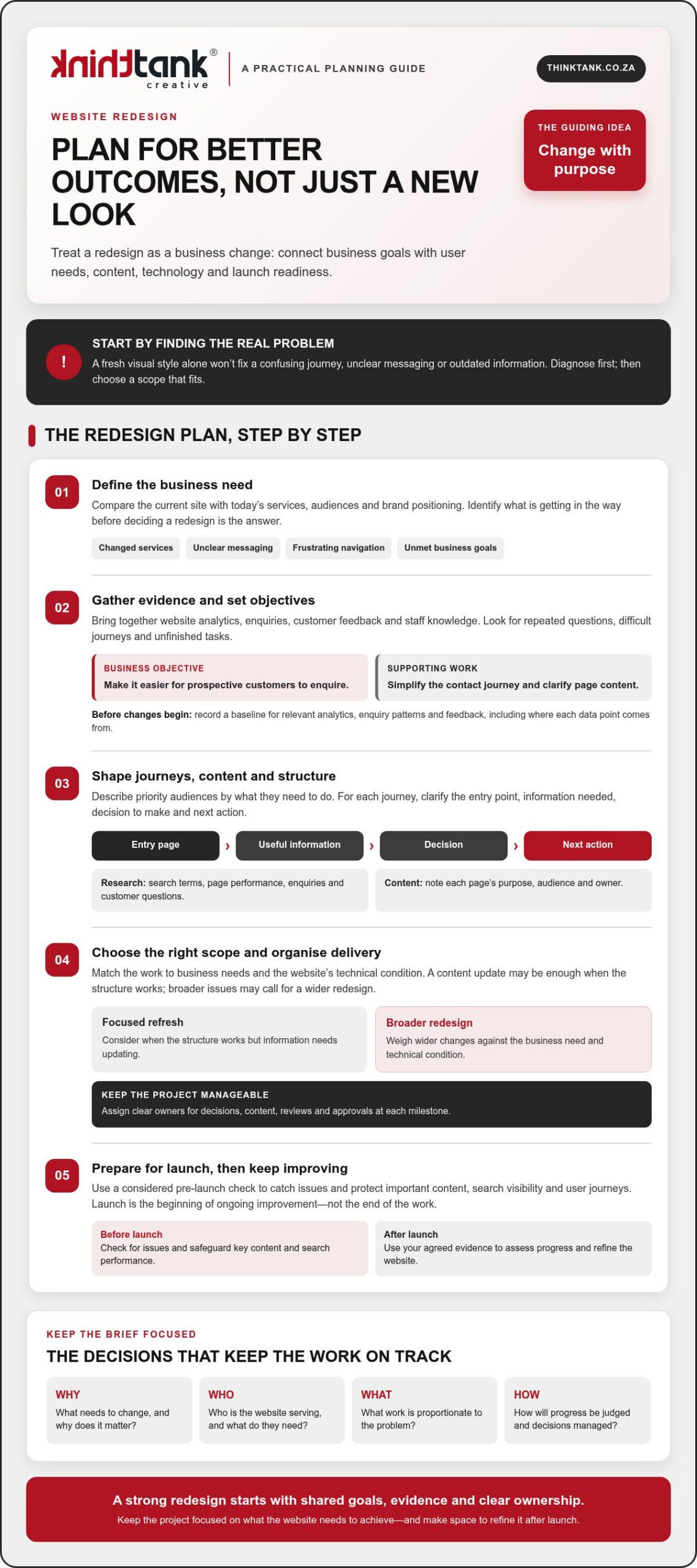
Changed services, unclear messaging, frustrating navigation or business goals the website isn’t helping to meet are all valid reasons to review your site. First, identify the underlying problem before deciding that a redesign is the answer. A new visual style alone won’t resolve a confusing journey or outdated information.

Gather evidence from website analytics, enquiries, customer feedback and staff who speak with customers or update the site. Look for patterns: visitors may struggle to find a service, ask questions the website should answer or leave an important journey unfinished. This gives stakeholders a shared view of what needs attention and helps distinguish structural or technical issues from problems a focused content update could solve.

A good project plan turns that evidence into decisions. This short video offers another perspective on why planning matters:

Decide whether your website needs a redesign

Compare the current site with your present-day services, audiences and brand positioning. If visitors can’t tell what you offer or staff repeatedly answer the same basic questions, the issue may involve messaging, navigation or page structure. If the structure works but some information is out of date, a content update may be enough. Understanding the difference keeps the scope proportionate to the problem.

Design should support clarity and ease of use, not compete with them. Reviewing established web design principles can help frame discussions about how layout, visual choices and interaction work together to serve visitors.

Set objectives and agree how progress will be judged

Choose a small set of objectives tied to business priorities, then define what evidence could show progress. Keep the objective separate from the website deliverable: “make it easier for prospective customers to enquire” is a business objective; “simplify the contact journey and clarify the relevant page content” describes work that may support it.

Record a baseline before changes begin. Note the relevant analytics, enquiry patterns and feedback, along with where each data point comes from, so you can make a fair comparison after launch. For a deeper look at how usability decisions shape the experience, see this website user experience strategic guide.

A redesign brief is the shared record of a project’s goals, scope and success measures. Use it to align stakeholders, guide design and development decisions, and keep the work focused as details emerge. Knowing how to plan a website redesign project starts with agreeing what needs to change, why it matters and how you’ll assess the outcome.

Research, Content and Site Structure: Build the Redesign Brief

Once the project’s goals are clear, gather the evidence that will shape the experience. Review search terms, page performance and enquiry patterns alongside the questions customers ask your team. Staff who handle sales, service or website updates often know where people get stuck, what details they need and which information is frequently missing. Bringing these perspectives together helps the brief reflect real needs, not assumptions.

Describe priority audiences by what they’re trying to do. For each group, note their likely entry point, the information they need, the decision they must make and the next action you want them to take. A prospective customer might arrive on a service page, compare options, then enquire. Sketching that path can expose missing information or unnecessary steps before design and development begin. The lead generation strategies framework can also help connect audience journeys with meaningful next actions.

Turn audience research into useful user journeys

Map the important journeys in a simple diagram. Show how someone moves from an entry page through key decisions to a call to action, and mark where they may need reassurance or more detail. Keep the map focused on user tasks rather than imagined demographic profiles. Check that each step is clear, relevant and easy to complete, then use the findings to guide content and structure decisions.

Create a content inventory and draft the sitemap

List current pages and record each page’s purpose, intended audience, owner, available performance evidence and recommended action. Classify content to retain, revise, combine, remove or create. Flag material that needs subject-matter review, approval, rewriting or migration so content work doesn’t become a late-stage obstacle.

Next, group pages into a sitemap with clear, audience-friendly labels. A sitemap shows the proposed hierarchy; user-flow diagrams show how people move through it. Together, they can reveal duplicated sections, gaps in key information and journeys that lead nowhere. Share these drafts with relevant stakeholders and invite specific feedback before they become design assumptions.

This is how to plan a website redesign project with a brief grounded in evidence and ready to guide delivery. If you’re considering professional support, you can explore ThinkTank Creative’s website design and development as one option for taking the work from research and strategy through design, development and testing.

Compare Redesign Approaches, Platforms and Key Project Risks

Choose the scale of change to fit the problem. A focused refresh may suit a site with a sound technical foundation but outdated content or inconsistent visual presentation. A broader redesign may be more appropriate if the structure, user journeys or underlying technology no longer support your business needs. The ultimate guide to website redesign offers further considerations, but your decision should reflect your own scope, capacity and requirements.

Choose an approach that matches your resources and requirements

An in-house project can keep decisions close to the business, provided the team has the time and skills to do the work and maintain content afterwards. DIY tools may suit a straightforward site, but assess their limits against your design and technical needs. An agency-led project brings external design and development capability, while requiring clear communication and timely feedback from your team. Consider your available decision-makers, internal skills and responsibility for ongoing content before choosing.

Approach Control Internal capacity Complexity and support
In-house High Requires dedicated staff time and skills Internal team manages delivery and ongoing needs
DIY High over routine edits Requires time to build and maintain the site Best assessed against the project’s technical demands
Agency-led Shared through agreed decisions Needs a client-side contact for input and approvals Can support design, development and testing; agree responsibilities upfront

Assess a content management system (CMS) by how well it supports your publishing workflow, required integrations, accessibility needs and long-term maintainability. Avoid choosing on popularity alone. If you’re weighing bespoke requirements against other options, this custom website design strategic guide provides broader service considerations.

Plan for content migration, search continuity and data protection

Before build work starts, list pages, files, forms and important URLs, then record whether each will move, change, be combined or be retired. Map old URLs to relevant new destinations and arrange suitable redirects for changed or removed pages. Test those redirects and key page links before launch. Rankings can’t be guaranteed, so record search and analytics performance beforehand, then check for broken pages, indexing issues and changes in relevant traffic after launch.

Include forms and analytics in your migration checks. Identify where personal information is collected, used or stored, and ask an appropriate person to review the project against current South African privacy requirements. Knowing how to plan a website redesign project means addressing these risks early, not treating them as final launch tasks.

How to Plan a Website Redesign Project: A Practical 2026 Guide

Turn the Website Redesign Plan into a Manageable Project Roadmap

A clear sequence turns the agreed brief into work people can own and approve. Use a roadmap to move from planning to launch without leaving key decisions until the last moment:

For each milestone, record the person responsible, what they need to deliver and who has final approval. Set review windows that reflect people’s availability, and ask contributors to consolidate feedback before sending it to the project team. Keep approved materials, decisions, open questions and dependencies in one source of truth, such as a shared project document or workspace, so the latest agreed direction is easy to find.

Set responsibilities, approvals and project boundaries

Name a decision-maker, then identify contributors for business, content, design and technical reviews. Define what the project includes and what requires separate discussion. If a new request changes the agreed scope, assess its impact on priorities, timing and estimated cost before approving it. Clear ownership and approval points reduce avoidable project uncertainty.

Coordinate content, design and development work

Track dependencies: design may need approved copy and brand assets, while development may rely on agreed integrations and access to existing systems. Plan design reviews before build work, then test against the user and business requirements in the brief. Include training and handover planning so the team understands how to manage day-to-day website tasks after launch.

Keep the timeline proportionate to the scope, review capacity and dependencies rather than selecting a launch date before the work is understood. Costs depend on the project’s needs and timeline. ThinkTank Creative provides an estimated cost after discussing these with you, not a fixed price before the requirements are clear.

If you want a collaborative team to help shape and deliver the roadmap, discuss your website redesign project with ThinkTank Creative, from research and strategy through design, development, testing, launch and support.

Prepare for Launch and Choose the Right Redesign Partner

Launch is a handover, not a finish line. A thorough readiness check helps the team catch avoidable issues, while a clear plan for monitoring and support gives the new site room to improve as people use it.

Use a practical website launch-readiness checklist

Before going live, test priority journeys on relevant devices and confirm that essential content and contact routes work as intended. Use this checklist with the project team responsible for each area:

Use the agreed project requirements as your reference rather than assuming a site is ready because it looks polished. Once live, monitor the measures set in the brief, gather feedback from users and staff, and prioritise improvements based on what you learn. Launch begins the next cycle of observation and refinement; it doesn’t prove that every business objective has already been achieved.

Evaluate a redesign partner beyond visual presentation

Ask prospective partners how they approach research and strategy, UX/UI design, coding, testing, launch and support. Discuss who will make decisions, how feedback and approvals are managed, and what your team will need to provide. A clear, collaborative process makes responsibilities easier to understand and keeps the work aligned with the brief.

Plan for ownership after launch, too. Ask what training, documentation and support are included, and how your team will learn to manage routine website tasks. These details help make handover a practical transfer of knowledge, rather than simply receiving a completed site.

ThinkTank Creative, founded in 2001, offers end-to-end website design and development, from research and strategy through design, development, testing, launch, training and support. Its approach reflects the promise, “We Do It All So You Don’t Have To”, while keeping discussion and collaboration central to the project. If you’re considering a redesign, discuss your website redesign with ThinkTank Creative.

Turn Your Redesign Plan into Lasting Progress

A successful redesign starts with clear business goals, evidence about what users need and a brief that gives stakeholders a shared direction. From there, choose an approach and platform suited to your requirements, assign clear owners, and plan content, testing and launch with care.

Knowing how to plan a website redesign project also means looking beyond launch day. Track the measures you agreed, listen to user feedback and use what you learn to guide ongoing improvements. A thoughtful plan gives your team a stronger foundation for making those decisions with confidence.

ThinkTank Creative was founded in 2001 and offers website services spanning UX/UI design, coding, testing, launch, training and support, with ongoing service after project completion. If you’re ready to explore a collaborative approach to your redesign, discuss your website redesign project with ThinkTank Creative.

With shared goals and a practical roadmap in place, your next website can become a more useful, adaptable part of your business.

Frequently Asked Questions

When should a business plan a website redesign?

Plan a redesign when the site no longer reflects your services, confuses visitors or makes important tasks difficult. Other signs include outdated content, repeated customer questions, navigation problems or website goals that aren’t being met. First, check whether a content update or focused improvement could address the issue. A broader redesign makes sense when the underlying structure, technology or user journeys also need attention.

How do you start planning a website redesign project?

Start by agreeing on the business problem the redesign needs to solve. Gather evidence from website analytics, customer enquiries and feedback, and staff who work with customers or manage the site. Then identify priority audiences, their key tasks and the actions they need to take. This helps you shape the scope, choose suitable measures of progress and build a shared brief before design and development begin.

What should a website redesign brief include?

A useful redesign brief records the project’s goals, scope and success measures. It should also outline priority audiences, key user journeys, content requirements, technical considerations, responsibilities and approval points. Note current performance where relevant, so you can compare results after launch. Keep business objectives distinct from deliverables: improving the enquiry journey is an objective, while updating page content or navigation may be work that supports it.

How do you redesign a website without losing search visibility?

Protect search continuity by recording important pages and URLs before work begins. Map each URL that will change to its most relevant new destination, and arrange suitable redirects for changed or retired pages. Before launch, check links, redirects and agreed search settings. After launch, monitor relevant search and analytics data and investigate broken pages or unexpected changes. These steps help manage risk, but no redesign can guarantee unchanged rankings.

Should I redesign my website myself or work with an agency?

Choose based on the project’s complexity, your team’s skills and the time available for delivery and ongoing content management. A DIY approach may suit a straightforward site; an in-house team can keep decisions close to the business if it has the required capacity. An agency can contribute design and development expertise, with your team providing input and approvals. Clarify responsibilities, process and post-launch support before deciding.

Who should be involved in a website redesign project?

Involve a decision-maker who can keep priorities clear, alongside people responsible for business requirements, customer insight, content and technical knowledge. Include those who manage enquiries or maintain the current website, as they can identify practical user and workflow issues. Assign clear owners for decisions, content supply, reviews and approvals. The right contributors depend on the project, but everyone should understand their role and when their input is needed.

What should be checked before a redesigned website goes live?

Test priority journeys, navigation, page content, links, forms and contact routes. Review responsive layouts on relevant devices, and confirm agreed analytics, search, backup and technical checks with the responsible project team. Make sure launch responsibilities are assigned, including who records issues and coordinates their resolution. Use the agreed project requirements as your checklist, and resolve any problems that could prevent visitors from finding information or completing key tasks.

What happens after a website redesign launches?

After launch, monitor the measures agreed in the brief, gather feedback from users and staff, and prioritise improvements based on what you learn. Check that key journeys and forms continue to work as expected. Make sure the team has the training and documentation needed to manage routine website tasks. Launch marks the transition to using and refining the new site, not proof that every business objective has already been achieved.

Responsive Web Design: A Practical Guide for 2026

What if a website looked polished on a large screen but made its most important content harder to use on a phone? That’s the real test of responsive web design: not whether a page simply shrinks, but whether its layout, navigation and calls to action continue to work as screen sizes change.

If you’re unsure how responsive design differs from a mobile-friendly site or a separate mobile website, you’re not alone. It can also be difficult to picture how content will rearrange across phones, tablets and desktops, or how a design team checks that the experience feels clear on each one.

This practical guide explains the principles behind adaptable layouts, how to plan a website around user needs and what to check across different screens. You’ll also learn what to look for when commissioning a professional build, from the connection between UX/UI design and development to testing and support. With a clear framework, you can make informed decisions and create a website that offers a cohesive experience as people move between devices.

Key Takeaways

  • Understand how responsive web design adapts layouts to available space while keeping content and key actions usable.
  • Learn why a page that looks right at one phone width may still need adjustments on other screens.
  • Use a practical planning and testing workflow to check real content across varied viewport widths before launch.
  • Assess a web design partner by how they connect audience needs, usability, visual design, testing and post-launch support.
  • Know what to review across mobile, tablet and desktop to make a more informed decision about your website.

What Is Responsive Web Design, and What Should It Do for Your Website?

Responsive web design is an approach to building websites in which layouts adapt to the available screen space while preserving usability and content. Rather than forcing a fixed-width page onto every screen, the design adjusts elements such as columns, text and navigation so visitors can read and act comfortably. A separate mobile-only website uses a distinct version for smaller screens; a responsive site adapts the same website to different spaces.

The goal is more than making a page fit. Content should remain readable, controls easy to use and the brand experience consistent, whether someone is browsing on a phone or a wide desktop display. For a foundational overview of the approach and its history, see Responsive web design (RWD).

For a practical visual introduction, watch this guide to responsive web design:

How Is Responsive Design Different from Mobile-Friendly Design?

“Mobile-friendly” describes a user experience goal: a website should be practical to use on a mobile device. It doesn’t prescribe a particular technical method. Responsive layouts can adjust fluidly as space changes or switch arrangement at chosen breakpoints, where the design changes to better suit the content and available width.

A page that looks fine at one phone width may still have cramped text, hidden navigation or awkward controls on a narrower phone or larger tablet. Check how the layout behaves across widths, rather than relying on one mobile check.

Which Screens and User Contexts Should a Website Support?

Plan for a range of available spaces: narrow and larger phones, tablets, laptops and wide desktop displays. Focus on where content needs to wrap, columns should stack or navigation needs a different arrangement, rather than designing for particular device models.

Consider how people interact, too. Touch targets should be comfortable to tap; keyboard users should be able to move through controls in a clear order; and pointer interactions should be understandable without relying on hover alone. Review key tasks, such as finding information or using a call to action, at different widths and with different input methods. This helps a cohesive design serve people, not just screens.

How Responsive Web Design Works: Flexible Layouts, Breakpoints, and Media

Responsive web design relies on coordinated decisions. Layouts must accommodate changing space, typography should remain readable, images and other media need to fit their containers, and navigation and controls should stay usable as the page rearranges.

A breakpoint is a point at which a layout changes to better suit its content and the available space. For example, a row of three information cards might work on a wide screen, then switch to a single column when each card becomes too narrow to read comfortably.

Choose breakpoints when the layout needs to change, not because a screen belongs to a particular device category. This content-led approach helps the design adapt to the space it actually has. MDN Web Docs explains how responsive layouts work, including the role of flexible layouts and media queries.

How Do Flexible Grids and CSS Layouts Adapt?

Fluid sizing lets elements use a proportion of the available space instead of relying on rigid, fixed dimensions. CSS Grid and Flexbox can organise content into columns, rows or flexible groups that rearrange as space changes. The right choice depends on the content and purpose of the page: a comparison may need aligned columns, while a set of service cards may work well as a flexible row that wraps.

Fixed-width elements can cause trouble when the viewport is narrower than expected. A wide table, image or navigation bar may overflow its container, forcing visitors to scroll sideways or making content difficult to reach. Flexible proportions help prevent this, but still need sensible limits so text doesn’t stretch across an uncomfortably wide line.

How Do Responsive Images, Typography, and Media Queries Help?

Media queries apply styling when specified conditions, such as available viewport width, are met. They can support a layout change, adjust spacing or refine typography. The aim isn’t to shrink every element uniformly; it’s to preserve clarity and hierarchy as the composition changes.

Responsive images can display or serve suitable image options for the space available. In either case, media should stay within its container rather than creating unwanted overflow. Text needs similar care: body copy should remain legible, headings should wrap cleanly and line lengths should feel comfortable on both narrow and wide screens.

Treat these choices as one design system, not a collection of isolated fixes. If you’re planning a site and want to see how layout, visual design and development can work together, explore custom website design and development.

Responsive Web Design Misconceptions: What a Smaller Screen Test Can Miss

A page that appears to work on one phone isn’t necessarily ready for every screen. A slightly narrower viewport might squeeze navigation, wrap a heading awkwardly or push a button beyond the visible area. Responsive web design needs to be checked across a range of layouts, not approved after a single small-screen test.

Shrinking a desktop page without changing its structure can create dense text and controls that are difficult to use. Some content may need to move, stack or be prioritised so visitors can complete essential tasks without struggling through a cramped version of the desktop experience.

Assumption Practical reality
“It works on my phone.” Check narrower and wider viewports, and look for clipped content, awkward wrapping and overflow.
“Everything should stay in place, just smaller.” Navigation and page sections may need to rearrange to preserve clarity and key tasks.
“Responsive means accessible and fast.” Adaptable layouts help, but accessibility and performance need their own checks.

Does Responsive Design Mean Making Everything Smaller?

No. Scaling every element down can weaken readability and visual hierarchy, leaving important information and actions hard to distinguish. A navigation bar might become a more compact menu, while a multi-column section could stack into a clear reading order.

Decide what visitors need to accomplish, then preserve those tasks as the layout changes. The aim isn’t to squeeze every desktop element onto a narrow screen; it’s to make the right content and controls easy to find and use.

Can a Responsive Website Still Be Difficult to Use?

Yes. A page can adapt to its viewport and still have small tap targets, clipped text, horizontal scrolling or unclear keyboard focus states. Check content, interaction and accessibility as well as layout. Google’s responsive design basics offer further context, but responsiveness alone doesn’t guarantee accessibility, speed, search rankings or conversions.

Test key actions with touch, keyboard and pointer input. Confirm that focus is visible, text remains readable and visitors aren’t forced to scroll sideways to reach essential content. For a broader usability perspective, read the guide to improving website user experience.

Responsive Web Design: A Practical Guide for 2026

How to Plan and Test a Responsive Website Before It Goes Live

Plan responsive behaviour from the start, then test whether people can complete key tasks as the layout changes. A useful test checks real content and essential tasks across varied viewport widths, rather than relying on one preferred device preset.

  1. Identify user needs. List the main things visitors need to do, such as find a service, submit an enquiry or locate contact details. Use these tasks to guide page priorities.
  2. Organise content and structure. Decide what information belongs on each page and what visitors should notice first. Consider how sections should reorder or stack when space is limited.
  3. Make UX/UI decisions. Plan the navigation, page hierarchy, typography, calls to action and layout together. Keep important actions easy to find without giving every element equal prominence.
  4. Build and review at varied widths. Use actual page content, including long headings, forms and images. Check narrow and wider viewports, not only standard presets, and refine layouts wherever text wraps awkwardly or elements compete for space.
  5. Test interactions, then refine. Move through the site with a keyboard and check touch interactions where relevant. Confirm focus states are clear, controls work as expected, and content isn’t clipped or pushed into horizontal scrolling.

What Should You Check Across Viewport Sizes?

At narrow widths, review the order of page content, navigation, calls to action, forms and other key information. Make sure images keep their proportions and fit within their containers. Look for cut-off labels, overlapping elements and unexpected sideways scrolling.

Repeat the checks at wider widths, too. A layout that works on a phone can feel sparse or stretched on a large display. Use both touch and keyboard input to check that controls remain understandable and the essential journey is easy to follow.

How Should a Team Build Responsive Design into Its Process?

Start with audience needs and page content, then connect UX/UI design to visual refinement and coding. Testing should inform improvements before launch, rather than being left until the end. A considered project process can also include launch, training and support, so the work continues beyond the initial design and build.

For broader project-planning context, explore custom website design strategy. If you’re ready to plan a responsive website around your organisation and its users, discuss your website design and development project.

Choosing a Responsive Web Design Partner: From Strategy to Ongoing Support

A strong responsive website starts with more than a visual style. It should reflect your organisation, audience, content and the tasks visitors need to complete. Choose a partner who can explain how those priorities shape design and development, and how the work will be tested and supported beyond launch.

What Should You Ask Before Commissioning Responsive Website Design?

Use early conversations to understand the team’s process and how you’ll work together. Ask questions such as:

Clear answers help you assess whether the process suits your organisation, not just whether a portfolio looks appealing. They also set shared expectations, so the project’s priorities and responsibilities are understood from the outset.

How ThinkTank Creative Connects Design, Development, and Support

ThinkTank Creative is a South African agency founded in 2001, offering custom website design and development. Its website process brings UX/UI design together with coding, testing and launch, followed by training and support. That connection matters: design decisions need to carry through development, while testing gives the team an opportunity to review the finished experience before it goes live.

For a responsive build, collaboration should keep your organisation’s identity, audience and user tasks in view throughout the project. ThinkTank Creative also offers ongoing service after project completion, providing continuity as your website moves beyond launch.

Every project has its own needs and timeline. Discussing both helps establish the scope, and an estimated cost is provided after that discussion rather than relying on a fixed price. To explore whether the approach fits your plans, discuss your website design and development needs.

Build a Website That Moves Your Business Forward

Make responsiveness part of a wider commitment to a clear, considered online experience. The strongest responsive web design choices begin with what your audience needs to do, then bring content, visual identity and development together around those priorities. Reviewing the site across screen sizes helps reveal where the experience needs refinement before launch.

Choosing the right partner matters, too. ThinkTank Creative has been helping businesses with website design and development since 2001. Its process includes UX/UI design, coding, testing, launch, training and support, with ongoing service after project completion. That continuity can help keep your website aligned with your organisation as its needs evolve.

If you’re planning a new website or considering improvements to an existing one, start with a conversation about your goals and timeline. Discuss your website design and development needs with ThinkTank Creative.

Frequently Asked Questions

What is responsive web design?

Responsive web design is an approach to creating websites that adapt their layouts to available screen space while keeping content and key actions usable. Columns may stack on a narrow screen, for example, while navigation adjusts to remain accessible. The goal isn’t simply to make a desktop page smaller. It’s to provide a clear, consistent experience across phones, tablets and larger displays, shaped around what visitors need to find or do.

How does responsive web design work?

Responsive web design combines flexible layouts, suitable typography, adaptable media and considered interaction choices. A layout can change at breakpoints, which are points where the arrangement shifts to suit the content and available space. For example, a row of information panels might become a single column when the panels no longer fit comfortably. Designers and developers then test the page at different widths and refine anything that feels cramped, unclear or difficult to use.

Is responsive web design the same as mobile-friendly design?

Not exactly. “Mobile-friendly” describes the broad goal of making a website practical to use on mobile devices; it doesn’t specify one technical method. Responsive design is one way to meet that goal by adapting a layout to different screen widths. A site that appears usable on one phone may still have awkward navigation or crowded content on another, so check it across a range of sizes rather than relying on one mobile test.

Does responsive web design improve SEO?

Responsive design can support a positive search experience by making pages easier to use across screen sizes, but it doesn’t guarantee higher rankings. Google primarily uses a website’s mobile version for indexing, so important content and functions should remain available and clear on smaller screens. Search visibility also depends on other factors, including content relevance and technical performance. Treat responsive design as part of sound website planning, not a standalone SEO solution.

How do I test whether a website is responsive?

Review important pages at varied viewport widths, including narrow and larger phones, tablets and desktop sizes. Check that text remains readable, navigation and calls to action work, images fit their containers, and no content is clipped or causes unwanted horizontal scrolling. Try completing key tasks, such as finding contact details or submitting a form. Also test keyboard navigation and touch interactions where relevant, since a layout can adapt visually yet remain awkward to use.

Can an existing website be redesigned to be responsive?

Yes. An existing website can be redesigned to adapt to different screens, although the right approach depends on its current layout, content and technical structure. A review can identify which pages, navigation patterns and user tasks need attention before design and development begin. The project may involve refining the visual experience, reorganising content, coding and testing the updated site. Plan for checks across screen sizes before launch, followed by suitable training and support.

Professional Business Logo Design: The 2026 Strategic Guide to Brand Identity

Whilst many entrepreneurs believe a brand is built on service alone, recent data confirms that 75% of consumers recognise a business primarily through its logo, making your visual mark the most hardworking employee on your payroll. In an era where 60% of people actively avoid brands with outdated or unappealing visuals, settling for a generic template isn't just a design choice; it's a significant commercial risk. You've likely felt the frustration of appearing "invisible" amongst more polished competitors or the technical headache of low-resolution files that fail on large-scale signage. Investing in professional business logo design is the definitive shift from being a mere company to becoming a recognisable national brand that commands immediate respect.

We understand that you want your visual identity to do more than just look pretty; you want it to make your customers feel smart for choosing you. This strategic guide explores how to bridge the gap between looking professional and achieving the 23% revenue boost associated with brand consistency. We will navigate the 2026 legal realities of AI-generated imagery, detail our signature 5-stage collaborative process, and show you how to secure bespoke, scalable assets that grow with your vision. By the end, you'll know exactly how to cultivate an identity that ensures you never blend into the background again.

Key Takeaways

  • Understand why a professional mark serves as the strategic cornerstone of your corporate identity, bridging the gap between mere visibility and true brand authority.
  • Explore a 5-stage collaborative process that transforms market research into a bespoke visual identity tailored to your specific growth objectives.
  • Learn why professional business logo design provides the unique craftsmanship and legal security that automated AI templates simply cannot replicate.
  • Master the principles of scalability to ensure your brand remains consistent and impactful across all digital platforms and physical printing solutions.
  • Discover how an end-to-end branding approach eliminates technical friction and creates a unified presence that makes your customers feel smart.

What is Professional Business Logo Design in 2026?

Professional business logo design serves as the definitive anchor for your entire corporate identity. It isn't merely a decorative element; it's a strategic asset that dictates how the market perceives your professional authority. In 2026, where 75% of consumers recognise a brand primarily by its logo, the precision of your visual mark directly correlates with your commercial success. A truly professional design moves beyond aesthetics, utilising the synergy of psychology and technical excellence to command respect in a crowded marketplace.

To better understand how a strategic approach differentiates a mere drawing from a powerful brand asset, watch this helpful video:

Strategic design choices are never arbitrary. Professional designers use colour psychology and bespoke typography to influence consumer behaviour, ensuring your brand feels dependable and sophisticated. This meticulous selection process ensures your identity remains consistent on a national scale, preventing the fragmented appearance that often plagues smaller competitors. By aligning your visual cues with your business goals, you transform a simple graphic into a tool that fosters long-term loyalty.

The Difference Between a Logo and a Brand

Think of your logo as the initial handshake and your brand as the reputation that follows. A well-crafted mark triggers specific emotional responses, building trust before a single word is spoken. It tells a cohesive story, moving beyond a simple graphic to represent your company's mission and culture. When 60% of people avoid businesses with poor visual design, your logo becomes the primary filter for customer acquisition. Research indicates that maintaining this visual consistency across all touchpoints can lead to an average revenue increase of 23%, proving that professional business logo design is a driver of growth rather than a sunk cost.

Technical Requirements for Modern Business Identity

Modern identity systems must be agile and resilient. We prioritise vector files over raster images because infinite scalability is non-negotiable for everything from social media favicons to massive physical billboards. A professional suite includes responsive variants that adapt to different viewports, ensuring the design remains legible in monochrome, greyscale, or full-colour formats. This technical rigour prevents the low-resolution issues that make a company look amateurish, providing the high-fidelity files necessary for professional printing solutions and digital excellence. By investing in these scalable assets, you ensure your brand remains sharp and recognisable, regardless of the medium.

The Strategic 5-Stage Logo Design Process

Success in branding is rarely the result of a single "eureka" moment. Instead, it's the outcome of a methodical, disciplined roadmap that ensures every pixel serves a commercial purpose. At ThinkTank Creative, we've refined a five-stage framework that transforms abstract ideas into high-impact visual assets. This journey ensures that your professional business logo design isn't just aesthetically pleasing but is strategically engineered to withstand the pressures of a competitive market.

Phase 1: Why Research Precedes Design

We begin by immersing ourselves in your industry's visual landscape. Designing without research is merely decorating; we aim to solve business problems through visual communication. By analysing your competitors, we identify visual clichés to avoid and opportunities for distinction. This phase is crucial for establishing your mark as a unique source identifier, which is a fundamental requirement according to USPTO trademark guidelines. We translate your core values into a strategic brief, ensuring the final design is anchored in reality and avoiding "pretty but pointless" designs that fail to communicate your value.

Once the strategy is set, we move into Design and Production. This is where our award-winning team explores technical execution, testing bespoke typography and high-contrast foundations. We then curate the most promising directions into a Presentation of Choices. We don't overwhelm you with hundreds of sketches. Instead, we present a refined selection of strategic paths that align with your growth objectives.

Phase 4: The Power of Collaborative Feedback

We view our clients as creative partners rather than passive recipients. During the Fine-Tuning stage, we engage in what we call "challenging interaction." This collaborative friction allows us to stress-test the design against your real-world needs. We don't just take orders; we provide professional guidance on how specific revisions might affect brand perception. This iterative cycle is essential for achieving 100% satisfaction and ensures the final result feels like a natural extension of your business.

The process concludes with Final Delivery and Support. We provide a comprehensive suite of scalable files, from website favicons to large-scale printing solutions, ensuring your professional business logo design remains crisp across every touchpoint. Because we've been a national South African partner since 2001, we provide the stability you need for long-term brand evolution. If you're ready to begin this transformation, our team is here to help you organise your corporate identity with precision and flair.

Professional Design vs AI: Why Strategy Beats Automation

Speed often masquerades as efficiency, yet the rise of automated logo generators has highlighted a significant "Uncanny Valley" in brand identity. These tools produce marks that feel soulless because they lack the contextual nuance of human experience. Whilst a machine can arrange shapes, it cannot understand your market's emotional pulse or the subtle cues that build trust. Research indicates that at the 12-month mark, custom identities developed by professional human designers hold a 94% satisfaction rate, compared to just 61% for automated marks. According to Harvard Business Review research on logo design effectiveness, specific descriptive characteristics in a logo significantly influence consumer willingness to buy, a level of strategic intentionality that AI simply cannot replicate.

There's also a looming legal reality that many businesses overlook. Purely AI-generated imagery currently lacks legal copyright protection because it lacks human authorship, as affirmed by the 2026 legal precedent in Thaler v. Perlmutter. Choosing a non-unique, generated template leaves your brand unprotected against competitors who can legally copy your visual mark without consequence. Our award-winning human team prioritises usability and functionality, ensuring your mark is a defensible asset that makes your customers feel smart for choosing you. By investing in professional business logo design, you're securing a unique visual signature that belongs exclusively to your company.

The Hidden Costs of "Cheap" Logo Solutions

Opting for a generic solution often triggers a cycle of diminishing returns. When a low-cost logo fails to scale or lacks the technical fidelity for high-quality printing, the subsequent rebranding costs can average between $5,000 and $20,000. Beyond the financial drain, an inconsistent visual presence erodes your credibility amongst national competitors. You risk appearing as a temporary player rather than an established authority, a perception that is difficult and expensive to reverse. A professional approach eliminates these technical nightmares by providing scalable, high-resolution files from the outset.

The All-Rounder Advantage: Beyond the Digital File

Our "We Do It All" philosophy ensures your identity isn't confined to a single digital file. We specialise in integrating your mark with custom website design, ensuring your brand story remains fluid and impactful across the digital space. Because we also provide comprehensive printing solutions, we guarantee that your identity translates perfectly from a smartphone screen to a physical billboard. This long-term partnership means we're here for the fine-tuning and maintenance that automated platforms ignore, providing a steady, reassuring foundation for your brand's future growth.

Professional Business Logo Design: The 2026 Strategic Guide to Brand Identity

Essential Elements of a Scalable Corporate Identity

Scaling a brand isn't just about size; it's about maintaining integrity across every medium. A professional business logo design succeeds when it remains recognisable whether it's on a tiny social media icon or a massive national billboard. We prioritise simplicity because the human brain processes simple shapes faster than complex ones. This ease of recall is why the most iconic brands avoid clutter. We also ensure your mark is relevant to your specific sector, avoiding fleeting trends that will look dated by 2028. By focusing on timelessness, we protect your investment, ensuring you don't face the $20,000 rebranding costs that often follow short-sighted design choices.

Versatility is the true test of a corporate identity. We stress-test every design to ensure it functions in black-and-white, as a physical stamp, and as a high-fidelity digital asset. This technical rigour prevents the "invisible" feeling that occurs when a logo disappears against a busy background or loses detail on a mobile screen. By creating a responsive visual system, we ensure your brand commands respect in every environment, from a humble business card to a prominent physical storefront.

Choosing the Right Brand Colours

Colours are the emotional language of your business. In the South African market, specific palettes evoke trust, energy, or heritage, and choosing the wrong shade can alienate your target audience. We meticulously select hues that bridge the gap between digital screens and physical print marketing collateral. Consistency here is vital; maintaining a uniform appearance across all touchpoints is linked to an average revenue increase of 23%. This careful selection process is a core part of what makes a good logo design, ensuring your identity feels deliberate rather than accidental.

Typography and Visual Hierarchy

The fonts you choose speak as loudly as the words they form. We select bespoke letterforms that reflect professional authority whilst allowing for imaginative creativity. This balance is achieved through the strategic use of white space, which prevents visual fatigue and highlights your most important information. Whether your logo appears on a letterhead or a custom video post, it must remain legible and command respect. A clean visual hierarchy ensures your message is never lost in translation, making your brand appear organised and dependable.

Our end-to-end approach ensures your stationery and signage are as sharp as your digital presence. If you're ready to build a visual system that scales effortlessly, you can book a brand identity consultation with our expert team today.

Elevating Your Brand with ThinkTank Creative

Choose a partner that understands the holistic nature of your business ecosystem. Our "We Do It All So You Don’t Have To" philosophy is designed to save you time and resources by providing a single, authoritative point of contact for your entire brand journey. We don't just hand over a digital file and walk away; we ensure your professional business logo design integrates seamlessly into a wider corporate identity. This includes everything from high-fidelity stationery to physical signage and digital assets that command attention.

Visibility is the companion of great design. Integrating your new visual mark with search engine optimisation ensures that your brand isn't just beautiful, but also visible to the right audience. A cohesive identity improves user engagement metrics and builds the trust necessary for higher conversion rates. We remain committed to delivering complete solutions for national organisations, ensuring that your brand's voice remains clear and consistent across every province and platform.

The ThinkTank Credentials: 25 Years of Excellence

Founded in 2001, ThinkTank Creative has spent over two decades evolving alongside the digital landscape. We've grown into a top all-rounder agency by treating every project with meticulous precision, whether we're designing simple flyers for a local start-up or managing the complex requirements of international companies. Our award-winning in-house design team brings a wealth of experience to the table, as seen in successful projects like Lebo the Accountant for the TaxShop franchise. Working with us means you're not just hiring a vendor; you're gaining a strategic visionary partner invested in your long-term growth.

Starting Your Brand Transformation Today

Your journey toward a more authoritative brand begins with a collaborative discussion. We believe that every business is unique, which is why an estimated cost is provided only after we've explored your specific needs and timeline. This ensures that the value we provide is perfectly aligned with your commercial objectives. During your initial imaginative journey with our team, we'll peel back the layers of your current identity to find the core values that will drive your future success.

The transition from a mere company to a recognisable national brand is a significant milestone. By choosing professional business logo design that's backed by strategic depth and technical excellence, you're setting a foundation that will serve you for decades. If you're ready to elevate your presence and make your customers feel smart for choosing you, it's time to take the first step. Embark on your branding journey with ThinkTank Creative and discover the power of a bespoke visual identity.

Secure Your Brand's Future through Strategic Distinction

Your visual identity is the silent ambassador of your business, and its effectiveness depends on the strategic depth behind its creation. We've detailed why professional business logo design is a non-negotiable investment for those seeking a 23% revenue boost whilst maintaining brand consistency and a defensible legal standing. By moving beyond the soulless output of automated tools, you secure a bespoke asset that scales effortlessly from digital screens to physical billboards.

ThinkTank Creative has championed this collaborative approach since 2001, offering complete end-to-end branding and printing solutions that simplify your path to success. Our award-winning in-house designers don't just create marks; they build legacies that resonate with the South African market and beyond. If you're ready to transform your presence and command the authority your hard work deserves, we're here to guide you. Partner with ThinkTank Creative for your professional logo design and let's build something extraordinary together.

Frequently Asked Questions

Is it worth paying for professional business logo design in 2026?

Investing in professional business logo design is essential because it serves as the strategic foundation of your corporate identity. Beyond aesthetics, a professional mark provides the legal copyright protection that automated AI tools currently lack. Since 75% of consumers recognise brands primarily by their logos, a bespoke design ensures you stand out amongst competitors whilst driving a measurable 23% increase in revenue through visual consistency and improved customer trust levels.

How much does a professional logo design cost in South Africa?

We provide an estimated cost after a comprehensive discussion regarding your specific requirements and project timeline. This tailored approach ensures that the value we deliver aligns perfectly with your commercial goals. Whether you're a small start-up needing a simple mark or a national organisation requiring a complete corporate identity, our pricing reflects the bespoke craftsmanship and strategic depth involved in creating a unique, scalable brand asset that grows with your vision.

How long does the professional logo design process typically take?

The timeline for a professional business logo design project typically spans several weeks to ensure thoroughness at every stage. We follow a disciplined 5-stage process, including research and strategy, design and production, and fine-tuning. This methodical rhythm allows for the "challenging interaction" and collaborative debate necessary to generate great ideas. The final duration depends on the complexity of your market and the specific revision cycles required to perfect your new visual identity.

What files should I receive at the end of a logo design project?

You'll receive a comprehensive suite of high-fidelity files designed for every possible application. This includes scalable vector formats for large-scale printing solutions and billboards, along with high-resolution raster files for digital use. We also provide responsive variants for social media profiles, favicons, and monochrome versions for dark modes or physical stamps. These assets ensure your brand remains sharp and recognisable across every digital and physical touchpoint, maintaining your professional authority everywhere.

Can a professional designer help me refresh an existing logo?

Yes, we frequently assist organisations in modernising their visual identity through a strategic brand refresh. This process involves refining your existing mark to improve its technical functionality and aesthetic relevance whilst preserving the brand equity you've already built. We focus on enhancing legibility and scalability for modern platforms, ensuring your updated identity reflects your company's evolution and remains impactful in a competitive national marketplace through 2026 and across all customer touchpoints.

Why is a brand style guide included in professional identity packages?

A brand style guide is a critical tool for maintaining national brand consistency across all customer touchpoints. It provides clear instructions on colour palettes, bespoke typography, and white space usage to ensure your identity is never diluted or misrepresented. By following these guidelines, you prevent the fragmented appearance that makes businesses feel "invisible" to consumers. This document empowers your team to produce marketing collateral that always aligns with your core strategic vision and values.

What happens if I don’t like the initial logo design concepts?

Our collaborative 5-stage process is designed to ensure you're deeply involved in the journey of imagination. If the initial concepts don't perfectly align with your vision, we enter a dedicated fine-tuning and revision phase. We use your feedback as creative fuel to refine the designs until we achieve 100% satisfaction. This iterative cycle of discussion and debate ensures the final mark is a powerful, authentic representation of your business's professional authority and long-term growth.

Business Card Design Tips 2026: The Strategic Guide to Physical Branding

In an era of fleeting digital interactions, your business card is no longer a mere data carrier; it is the definitive physical anchor for your brand's identity. We understand the frustration of seeing meticulously crafted materials discarded or noticing a jarring disconnect between your polished website and your printed assets. This guide delivers the essential business card design tips 2026 to help you navigate these challenges, ensuring your first impression is both tactile and transformative.

You deserve a brand presence that moves seamlessly from a physical handshake to a digital follow-up. We will explore how to utilise sophisticated finishes like brushed copper and champagne gold, alongside the strategic integration of dynamic QR codes that actually drive engagement. By applying our signature five-stage design methodology, you can transition from a standard template to a bespoke piece of craftsmanship that commands attention. Discover how to elevate your corporate identity and create a lasting connection that survives the initial meeting. Our insights will help you master the synergy between high-end printing solutions and modern tech integration.

Key Takeaways

  • Apply essential business card design tips 2026 to transition from cluttered layouts to minimalist, high-impact designs that act as tactile brand ambassadors.
  • Master the art of visual hierarchy and professional typography to ensure your core message is legible whilst guiding the recipient's eye with precision.
  • Utilise premium finishes such as spot UV and foil stamping to create a multi-sensory experience that reinforces your brand's authority and craftsmanship.
  • Integrate modern technology like dynamic QR codes and NFC functionality to provide a seamless transition between your physical card and digital platforms.
  • Understand how a disciplined 5-stage design process ensures your business card remains a cohesive part of your overall corporate identity and branding strategy.

The Evolution of Business Card Design in 2026

The business card has transcended its origins as a simple contact directory to become a sophisticated tactile brand ambassador. Whilst the history of business cards shows a progression from 15th-century social visiting cards to corporate staples, 2026 marks a pivotal shift towards the card as a high-value marketing asset. As digital noise reaches a saturation point, a physical card serves as a grounded anchor, offering a tangible connection that an email or a LinkedIn request simply cannot replicate.

To better understand how these physical assets are evolving, watch this helpful video:

Modern business card design tips 2026 focus on the card as a "leave-behind" piece of collateral. It's no longer just about sharing a phone number; it's about leaving a physical remnant of your brand's excellence. We see a move away from the cluttered, information-heavy layouts of the past. Instead, the focus has shifted toward minimalist, high-impact designs that command respect through simplicity and strategic craftsmanship.

Why Physical Cards Remain Essential in a Digital World

Tactile interaction remains a powerful psychological tool for building trust. When you hand over a premium card, you're initiating a multi-sensory experience that cements your professional authority. In the South African business environment, this exchange is a vital ritual of mutual respect and reliability. It facilitates a friction-free contact exchange, removing the awkwardness of typing into a smartphone during a meaningful conversation. Physical cards allow you to remain present whilst ensuring your brand stays in the recipient's hand long after the meeting concludes.

2026 Design Trends: Minimalism and Purpose

The most effective business card design tips 2026 emphasise the strategic use of "white space" and bold focal points. By stripping away non-essential elements, you guide the recipient's attention to your core identity. This "less is more" philosophy directly improves information retention, as the brain processes a singular, well-defined message more effectively than a crowded list of services. Purposeful colour palettes are also central to this evolution. We help our partners select tones that evoke specific brand emotions, moving beyond aesthetic preference to a deeper, psychological level of brand alignment.

Mastering the Visual Hierarchy of Your Brand Identity

Visual hierarchy serves as a silent guide, directing the recipient's attention to your most critical information with surgical precision. On a canvas as compact as a business card, every millimetre must be earned. Effective business card design tips 2026 prioritise a clear path for the eye, typically moving from the brand mark to the individual's name and then to the primary call to action. This structured approach prevents cognitive overload, ensuring your brand message remains clear and memorable during those vital first few seconds of an encounter.

The Golden Rules of Layout and Typography

Typography acts as the voice of your brand. To maintain a professional polish, your primary contact details should never drop below an 8pt font size. This ensures accessibility for all recipients whilst projecting a sense of quiet confidence. You only have about three seconds to capture a recipient's interest during a scan; if the text is too small or the layout is cluttered, the card loses its utility immediately. It's vital to align these choices with your brand style guide essentials to maintain national consistency. Observing current business card trends for 2026, we see a move toward high-contrast serif fonts that provide a sophisticated, editorial feel, standing out amongst a sea of generic sans-serif templates.

Logo Placement and Visual Impact

Your logo functions as the anchor of the entire design. It requires sufficient "breathing room," or padding, to retain its visual impact and avoid looking cramped against the edges or other text elements. When considering what makes a good logo design, remember that simplicity often scales better on physical print. A well-placed logo creates a sense of balance, allowing the eye to rest before moving to the essential contact details. Our experts at ThinkTank Creative excel in Logo and Corporate Identity Design, ensuring that your physical assets are a perfect mirror of your digital presence. This synergy is non-negotiable for high-level corporate identities that want to be taken seriously. By following these business card design tips 2026, you ensure that your logo remains the hero of the card, reinforcing brand recognition every time the card is pulled from a wallet or desk drawer.

Choosing Materials and Finishes for a Lasting Impression

Selecting the right substrate is the physical manifestation of your brand's promise. Whilst the visual hierarchy organises your message, the material you choose communicates your values before a single word is read. Our business card design tips 2026 prioritise the haptic experience, recognising that the physical "feel" of a card is the final delivery stage of a high-level corporate identity. By moving beyond standard templates, you transform a simple contact tool into a bespoke piece of craftsmanship that reflects your commitment to excellence.

The Haptic Experience: Weight and Texture

The weight of your card, measured in grams per square metre (gsm), serves as a silent indicator of professional authority. While a standard 350gsm card is functional, upgrading to a 450gsm or a luxury 600gsm+ triple-layer stock creates an immediate sense of stability and prestige. This added substance prevents the card from feeling flimsy or disposable. We often recommend textured papers such as linen, felt, or soft-touch lamination to add a sophisticated layer of sensory engagement. The tactile quality of a card correlates directly with perceived business reliability, as it suggests an investment in enduring quality rather than temporary convenience.

Special Finishes That Demand Attention

Premium finishes allow you to highlight specific elements of your design, such as a logo or a strategic tagline, with surgical precision. Spot UV creates a compelling contrast between matte and gloss surfaces, inviting the recipient to run their fingers over the card. For high-end corporate identity designs, metallic foils in champagne gold or brushed copper offer an elite finish that catches the light and the eye. Modern techniques like Scodix or 3D effects provide a tech-forward aesthetic that feels both innovative and grounded. These finishes shouldn't be used at random; they should serve the strategic reasoning behind your brand, elevating the most important information through physical depth.

Sustainability has become a non-negotiable standard for 2026. Incorporating eco-friendly materials, such as recycled stocks or seed paper, demonstrates that your organisation is forward-looking and responsible. To further differentiate your brand, consider die-cutting to create unique shapes that break the traditional rectangular mould. Whether it is rounded corners for a softer approach or a custom shape that mirrors your logo, die-cutting adds a distinct personality to your business card design tips 2026. Our comprehensive Printing Solutions ensure that these complex finishes are executed with meticulous detail, resulting in a card that is not just kept, but admired.

Business Card Design Tips 2026: The Strategic Guide to Physical Branding

Bridging the Gap: Integrating Digital Elements into Print

Physical branding in 2026 is no longer an isolated effort. It serves as the definitive starting point of a digital journey, acting as a high-fidelity portal between a handshake and a lead conversion. Modern business card design tips 2026 focus heavily on this "phygital" integration, ensuring your physical assets work in perfect synergy with your online presence. By embedding digital touchpoints directly into your card, you provide a frictionless transition that respects the recipient's time whilst elevating your brand's technical competence. This synergy ensures that your card isn't just kept; it's used.

Strategic QR Code Implementation

A common mistake is treating a QR code as a visual intrusion. In 2026, we design these codes to complement the aesthetic, using custom colours or brand-aligned frames that feel intentional rather than accidental. The destination is just as critical as the code itself. Every scan should lead to a custom website design that is meticulously optimised for mobile interaction. We recommend using dynamic QR codes, which grant you the flexibility to update your digital portfolios or contact details without the cost and waste of reprinting your entire physical inventory. This approach ensures your cards remain relevant for years, regardless of how your digital assets evolve.

The Rise of Smart Cards and NFC

Near Field Communication (NFC) technology has moved from a niche novelty to a standard for high-level corporate identity. Embedding a small chip within your premium stock creates an immediate "wow" factor during networking, allowing for instant vCard downloads or portfolio links with a simple tap. It bridges the gap for a broader demographic, appealing to traditionalists who value the feel of paper and tech-forward professionals who prefer digital efficiency. This technology also allows you to track the ROI of your physical cards through digital analytics, providing data-driven proof of your networking success. You can see exactly when and where your card was tapped, allowing for more strategic follow-ups.

Beyond contact details, your card should serve as an invitation to explore your broader digital ecosystem. Including subtle, well-placed social media handles or a direct link to a digital portfolio allows potential clients to witness your expertise in real-time. This level of transparency builds trust quickly, moving the relationship from a brief introduction to an active engagement. By combining these digital elements with premium print, you create a brand anchor that is both timeless and technologically advanced. If you're ready to integrate these features, our team offers the elite Creative design and tech expertise required to transform your physical networking strategy.

Developing Your Corporate Identity with ThinkTank Creative

ThinkTank Creative stands as your dedicated all-rounder partner, bridging the gap between visionary branding and high-fidelity printing. We recognise that applying business card design tips 2026 requires more than just an eye for aesthetics; it demands a strategic partner who can manage the entire lifecycle of your brand's physical presence. Our philosophy is simple: "We Do It All So You Don't Have To." This approach allows you to focus on your core operations whilst we ensure every tactile touchpoint reflects your elite corporate identity with meticulous precision.

Our Strategic 5-Stage Design Process

Every project we undertake is governed by our rigorous 5-stage design process, ensuring that the final product is both beautiful and functional. We begin with Research & Strategy, where we dive deep into your brand's DNA to inform every visual choice. This is followed by Design & Production, where our award-winning in-house team brings concepts to life. During the Choices and Presentation stages, we collaborate closely with you, offering curated directions that align with your objectives. Finally, the Fine-Tuning stage allows for precise adjustments, ensuring the final delivery meets the highest South African printing standards. This methodical rhythm ensures reliability and high-quality outcomes for every client.

Beyond the Card: A Complete Branding Solution

Your business card is a singular component of a much larger ecosystem. To achieve true national consistency, your card must be intimately connected to your broader logo design process. We support businesses across the spectrum, from local startups requiring simple flyers to international web companies needing complex corporate identities. Our expertise extends to Printing Solutions, serving as the final delivery stage where your digital vision becomes a tangible asset. For organisations looking to maximise the impact of every printed touchpoint, exploring strategic print marketing ideas for local businesses can provide a powerful framework for building a cohesive physical brand presence. By positioning ourselves as a partner rather than just a vendor, we remain deeply invested in your journey of growth, providing ongoing service and post-project support that ensures your brand remains elevated in a competitive market. We invite you to embark on a journey of imagination with us, transforming your professional identity into a powerful brand anchor.

Transform Your First Impression into a Lasting Legacy

Mastering the nuances of business card design tips 2026 allows you to move beyond the limitations of digital-only networking. We've explored how the synergy between high-gsm stocks and sophisticated finishes, such as spot UV or metallic foils, creates a multi-sensory brand experience that commands respect. By integrating dynamic QR codes and NFC technology, you ensure your physical card functions as a seamless gateway to your digital portfolio, providing a friction-free experience for your clients.

Since 2001, ThinkTank Creative has empowered businesses to navigate these evolving trends with our award-winning design team and comprehensive in-house printing solutions. We don't just create cards; we build physical anchors for your corporate identity. It's time to Elevate your corporate identity with ThinkTank Creative today and turn every handshake into a strategic opportunity. Your brand's potential is limitless when backed by meticulous craftsmanship and visionary design. We look forward to partnering with you on your journey of brand transformation.

Frequently Asked Questions

Are business cards still relevant for networking in 2026?

Business cards remain vital because they offer a tactile connection that digital requests lack. In 2026, they serve as "leave-behind" marketing collateral that reinforces trust and professional authority. Handing over a card is a ritual of mutual respect that ensures your brand stays in the recipient's hand. These business card design tips 2026 highlight the card's role as a physical anchor for your corporate identity, bridging the gap between a handshake and a digital follow-up.

What is the best font size for a professional business card?

Maintaining a minimum font size of 8pt is essential for professional legibility and accessibility. Whilst your name or logo may be significantly larger to establish hierarchy, your primary contact details must remain clear to avoid frustrating the recipient. A well-designed card respects the "three-second rule" for scanning. Choosing clean, high-contrast typography ensures that your brand message is communicated effectively, even during a brief encounter in a busy professional setting.

How much does it cost to have professional business cards designed?

At ThinkTank Creative, an estimated cost is provided after a thorough discussion of your specific requirements and timeline. We avoid a one-size-fits-all approach, as each project is tailored to the unique needs of your organisation. Whether you require a simple layout or a complex corporate identity design with premium finishes, our 5-stage process ensures high-quality outcomes. This collaborative methodology allows us to deliver bespoke solutions that align perfectly with your brand's strategic goals.

What information is essential to include on a modern business card?

A modern card should include your name, job title, company logo, and essential contact details like a phone number and email address. It is also vital to include a link to your website and a digital portal, such as a QR code or NFC trigger. These business card design tips 2026 recommend keeping the layout minimalist to ensure that the most important information remains the focal point, preventing the cognitive overload of cluttered designs.

How can I make my business card stand out from the competition?

You can differentiate your brand by utilising premium finishes such as spot UV, foil stamping, or 3D effects that create a multi-sensory experience. Custom die-cut shapes also break the traditional rectangular mould, making your card more memorable. By focusing on a "less is more" philosophy and using purposeful colour palettes, you evoke specific brand emotions. These strategic choices transform a standard card into a sophisticated tactile ambassador that commands attention amongst generic templates.

What is the difference between standard and premium paper stocks?

Standard paper stocks typically sit around 350gsm, providing a functional but basic feel. Premium stocks, ranging from 450gsm to luxury 600gsm+ triple-layer cards, offer a significant increase in physical authority and durability. Texture also plays a role; premium options include linen, felt, or soft-touch lamination. This added substance prevents the card from feeling disposable and correlates directly with perceived business reliability, suggesting a long-term investment in quality and professional excellence.

Can I integrate my social media profiles into my business card design?

Integrating social media handles or digital portfolios is highly recommended to provide a seamless transition to your digital ecosystem. You can use subtle icons or a dynamic QR code that leads directly to your LinkedIn profile or an online showcase of your work. This level of transparency builds trust quickly, allowing potential partners to witness your expertise in real-time. It ensures your physical card serves as an active portal for deeper engagement beyond the initial meeting.

Should I use a QR code on my business card in 2026?

Using a QR code is a strategic necessity in 2026, provided it is implemented with design in mind. We recommend dynamic QR codes, which allow you to update the destination URL without needing to reprint your physical cards. Ensure the code is at least 2.5 x 2.5 cm for reliable scanning and leads to a mobile-optimised landing page. This tech-forward approach demonstrates your brand's competence and provides a friction-free way for contacts to save your details.

Brand Style Guide Essentials: The 2026 Strategic Checklist for National Consistency

Did you know that maintaining a consistent brand identity can boost your revenue by as much as 33%? In a market where 88% of consumers prioritise trust as much as quality, your visual and verbal coherence isn't just a design choice; it's a vital financial driver. It's frustrating when different departments use conflicting logos or when the wrong colours appear in your print marketing. By mastering the brand style guide essentials, you transform your identity from a collection of assets into a strategic engine for growth that eliminates confusion and builds lasting authority.

You likely already recognise that a strong brand is built on reliability, yet achieving that uniformity across every department often feels like chasing a moving target. We're here to help you bridge that gap. This article provides a definitive roadmap to define your core identity, ensuring your business maintains a coherent and trustworthy presence at every digital and physical touchpoint. We'll explore a strategic checklist for 2026, covering everything from WCAG 2.2 accessibility standards and AI-content policies to the latest typography trends and the serene Cloud Dancer colour palette.

Key Takeaways

  • Discover why a comprehensive style guide serves as the strategic "DNA" of your corporate identity, building the consumer trust essential for long-term revenue growth.
  • Master the brand style guide essentials by establishing rigorous standards for logo usage and typography to ensure visual excellence across all physical and digital touchpoints.
  • Develop a sophisticated verbal identity that harmonises your brand's "voice" and vocabulary, allowing your team to communicate with confidence and precision.
  • Utilise our 2026 strategic checklist to audit your current assets and organise them into a definitive "Single Source of Truth" for seamless internal and external collaboration.
  • Learn how a structured implementation process protects your brand's integrity whilst simplifying the onboarding of new staff and creative partners.

Why a Brand Style Guide is a Non-Negotiable Business Asset

Think of your brand style guide as the strategic DNA of your corporate identity. It's the definitive blueprint that ensures every interaction, whether it's a social media update or a high-end brochure, feels like it belongs to the same family. Without this framework, businesses often fall victim to brand fragmentation. This occurs when different platforms look like they belong to entirely different companies, causing immediate cognitive dissonance for your customers. When 89.4% of customers expect a consistent brand experience across all channels, fragmentation is a risk you simply shouldn't take.

Maintaining these brand style guide essentials builds deep-seated trust. It reduces friction whilst customers navigate your digital space, ensuring your core values remain clear and undiluted. Beyond the external benefits, a guide empowers your internal team to produce high-quality work with increased velocity. By codifying your standards, you remove the guesswork, allowing marketers and designers to create content faster and more accurately. Whilst every brand transformation project is unique, we provide estimated costs after a thorough discussion of your specific requirements, ensuring the final asset is as bespoke as your business.

Protecting Your Brand Equity in a Digital-First World

A comprehensive style guide prevents the slow erosion of your visual impact over time. In our digital-first environment, your brand must remain instantly recognisable amongst a crowded marketplace. This consistency also aids search engine visibility, as a unified identity reinforces user recognition and encourages repeat engagement. Brand equity is the cumulative value of a recognisable identity that translates into consumer preference and long-term business stability.

The "All-Rounder" Advantage: Consistency Across Media

Bridging the gap between high-quality printing solutions and sophisticated digital interfaces requires a meticulous, multi-disciplinary approach. Your social media presence must speak the same language as your corporate profile, ensuring a seamless transition for the user at every touchpoint. Just as Wikipedia's Manual of Style provides a rigorous framework for verbal clarity and tone, your guide ensures your brand voice remains steady across every medium. This synergy starts with a solid foundation. Understanding what makes a good logo design is the critical first step in building a resilient corporate identity that stands the test of time.

The Visual Pillars: Core Brand Style Guide Essentials

Visual identity serves as the immediate visual shorthand for your brand's reputation. Establishing brand style guide essentials ensures that this shorthand remains clear, professional, and impactful across every application. A logo is often the first point of contact; however, its power is easily diluted by improper usage. Your guide must strictly forbid alterations such as stretching, "creative" recolouring, or the removal of key elements. By mandating minimum sizes for both print and digital formats, you ensure legibility remains constant, regardless of the medium. Our 5-stage design process prioritises these rules early, ensuring your identity is resilient from the moment of its creation.

Logo Anatomy and Usage Standards

Effective design requires breathing room to maintain its visual impact. We define a "safe zone" or padding around the logo to prevent it from being crowded by text or other graphic elements. This meticulous attention to detail extends to secondary marks and favicons, which are critical components of custom website design. Your document should also provide specific variations for placement on dark versus light backgrounds, ensuring your mark always maintains its visual authority without losing contrast or clarity.

Mastering the Colour Narrative

Colour is a powerful tool that influences customer behaviour and emotional response. To achieve national consistency, you must define your palette using HEX, RGB, and CMYK values. This precision ensures that the vibrant blue on your website perfectly matches the ink on your business cards or large-scale printing solutions. We also recommend auditing these choices against WCAG 2.2 accessibility standards to ensure contrast ratios are inclusive for all users. Looking at U.S. government style guides offers excellent examples of how complex organisations manage these technical requirements at scale whilst maintaining a friendly, accessible persona.

Typography and imagery provide the final layers of your visual personality. Select primary and secondary fonts that balance distinct character with high readability across different screens. Your imagery standards should define the "vibe" of photography, whilst custom iconography should follow a consistent line weight and style to ensure synergy. If you're ready to refine your visual presence, our specialists can help you develop a bespoke corporate identity that resonates with your audience and reflects your strategic vision.

Defining Your Verbal Identity: Messaging and Tone

Verbal identity is the heartbeat of your brand, yet it remains one of the most overlooked brand style guide essentials in the corporate world. Whilst many organisations obsess over hex codes and logo clear space, they often neglect the words that actually build the relationship. Your brand personality must be defined with precision. Are you the "Authoritative Expert" who leads with data, or the "Approachable Partner" who prioritises collaboration? At ThinkTank, we embody the "Strategic Visionary"—a persona that is elite in execution yet warm in professional relationships. This clarity allows us to champion our "We Do It All So You Don't Have To" philosophy, reassuring clients that their entire digital footprint is in expert hands.

A vocabulary list is a vital tool for maintaining this consistency. It establishes the specific words you use frequently to build authority and the terms you strictly avoid to prevent confusion. This level of detail ensures your messaging remains coherent across every touchpoint. For inspiration on how to codify these rules at scale, the U.S. government style guides demonstrate how even the most complex entities can maintain a unified verbal identity. By documenting these messaging standards, you ensure your mission statement isn't just a sentence on a wall, but a living part of your corporate behaviour.

Crafting a Consistent Brand Voice

Your brand voice is a constant, whilst your tone should be variable based on the context. A formal business proposal requires a steady, reassuring cadence that suggests thoroughness and strategic depth. Conversely, a casual social media post might adopt a more fluid, conversational energy. The goal is to translate complex technical jargon into clear, customer-focused benefits. Ultimately, great marketing makes the customer look smart by providing them with the clear messaging they need to make confident decisions. This approach moves the reader from a high-level concept to a concrete understanding of the value you provide.

Editorial Standards and Grammar

Precision in grammar and formatting reflects the stability of a long-standing enterprise. For South African audiences, adhering to British English spelling—such as "colour" and "organise"—is essential for national resonance. Your guide should also specify date formats, currency representation (ZAR), and capitalisation rules to ensure total alignment across all platforms. These editorial standards work in tandem with the professional logo design process, ensuring that your corporate stationery and digital assets project a polished, unified front. Whilst we provide estimated costs after a thorough discussion of your needs, the value of this verbal consistency is immediate and profound.

Brand Style Guide Essentials: The 2026 Strategic Checklist for National Consistency

The Ultimate Brand Style Guide Checklist for 2026

Transforming your brand from a loose collection of ideas into a disciplined corporate powerhouse requires a methodical approach. This checklist outlines the brand style guide essentials necessary for a future-proof identity in 2026. Auditing your current assets is the first priority. You must identify every instance where a logo is misused or a colour is off-brand to understand the scope of your transformation. Once the audit is complete, codify your logo usage, typography, and colour rules into a single, accessible document. This serves as your team's definitive source of truth.

Efficiency is the natural byproduct of a well-documented brand. By creating templates for common assets, you empower your staff to produce high-quality content without needing constant oversight. This reduces the risk of "creative" departures that dilute your visual impact. Whilst we provide estimated costs for these strategic projects after a thorough discussion of your needs, the long-term savings in production time and brand clarity are substantial.

Technical Specifications for Multi-Channel Use

Precision in file formats ensures your brand remains sharp across all platforms. Your guide should mandate SVG files for web use to maintain scalability, whilst high-resolution PDFs remain the standard for printing solutions. As mobile-first browsing dominates, responsive logo versions are no longer optional. You need simplified marks that remain legible on small screens without losing their essence. Additionally, document the standards for "leave-behind" print marketing collateral to ensure your physical presence is as polished as your digital interface. Exploring print marketing ideas for local businesses is one of the most effective ways to ensure your physical touchpoints command the same authority as your digital presence. Applying the latest business card design tips 2026 is one of the most effective ways to ensure your physical touchpoints command the same authority as your digital presence.

Imagery and Iconography Guidelines

Visual assets must evoke a specific emotional "mood" that aligns with your corporate identity. Whether you opt for candid, high-energy photography or serene, minimalist compositions, the subjects and lighting must feel intentional. Rules for iconography are equally critical. Specify the exact line weights, corner radii, and colour applications for your custom icons to prevent visual clutter. This level of detail ensures that every graphic element works in synergy to elevate your brand's authority. If you are ready to consolidate your identity, our team can help you design a bespoke corporate identity that commands attention across the South African market.

Implementation: Bringing Your Identity to Life

Launching a refined corporate identity requires more than just a static document; it demands a cultural shift within your organisation. To ensure long-term success, you must centralise your brand assets in a cloud-based repository that serves as the "Single Source of Truth" for every department. This prevents the use of outdated versions and ensures that brand style guide essentials are always accessible to your creative team. When every staff member and external agency can find the correct files instantly, you eliminate the friction that leads to brand inconsistency.

Training is the vital human element of this implementation. Host a dedicated workshop to walk your team through the new standards, explaining the strategic reasoning behind each decision. This collaborative approach turns the guide from a restrictive set of rules into a shared vision for excellence. Furthermore, your digital presence requires constant vigilance. Ongoing website maintenance and support ensure that as new pages or features are added, they strictly adhere to the established styles, preventing the "brand creep" that often occurs over time. By reviewing and fine-tuning the guide as your business evolves, you maintain a dynamic identity that remains relevant in a shifting market.

The ThinkTank Creative 5-Stage Design Framework

Our award-winning team utilises a proven 5-stage design process to build resilient identities: Research, Design, Choices, Presentation, and Fine-Tuning. This methodology begins with deep research, where we encourage challenging interaction and debate to uncover the true essence of your business. We don't believe in templated solutions. Instead, we act as a bespoke creative partner, moving your brand from a high-level concept to a concrete, future-proof identity that reflects 25 years of experience in the South African market. This meticulous approach ensures that every visual and verbal element is grounded in strategic depth.

From Guide to Growth: Your Next Steps

A robust style guide is the essential foundation for effective lead generation strategies. When your identity is coherent and professional, your marketing efforts become significantly more persuasive and trustworthy. If you're ready to elevate your corporate presence and protect your brand equity, we invite you to request a consultation for a comprehensive corporate identity redesign. We provide an estimated cost for our services following a thorough discussion of your specific needs, ensuring our partnership is built on transparency, synergy, and a shared commitment to high-quality outcomes.

Elevate Your Identity for the Next Era of Growth

Mastering the brand style guide essentials is the definitive step toward transforming your business from a fragmented collection of assets into a unified, authoritative presence. By codifying your visual and verbal standards, you eliminate the friction that erodes customer trust and internal efficiency. A well-maintained guide ensures that your message remains resilient across every touchpoint, from high-quality printing solutions to sophisticated digital interfaces. It's about creating a legacy of consistency that scales with your ambition.

ThinkTank Creative has been at the forefront of this evolution since 2001. As a comprehensive all-rounder agency, our award-winning design team brings 25 years of experience to every project, ensuring your corporate identity is both bespoke and future-proof. We believe in a collaborative journey that prioritises your unique strategic goals. Whilst we provide estimated costs after a thorough discussion of your requirements, the value of a coherent brand is immediate and enduring. We invite you to start your brand transformation with ThinkTank Creative and build a foundation for sustainable success. Your brand's potential is limitless when every detail is aligned.

Frequently Asked Questions

What is the difference between a brand style guide and a brand identity?

A brand identity is the complete collection of visual and verbal elements that define your business, whilst a style guide is the definitive manual that documents how to use them. Think of the identity as the personality and the guide as the strategic blueprint that ensures everyone communicates that personality consistently. Without a guide, your identity risks becoming fragmented across different platforms, leading to customer confusion and a loss of trust.

How long does it typically take to create a professional brand style guide?

The timeline for a professional guide varies based on the complexity of your corporate identity and the scope of your assets. At ThinkTank Creative, we utilise a rigorous 5-stage design process, moving from research and strategy through to final delivery and support. This methodical approach usually spans several weeks to ensure every detail is refined and bespoke. We provide a tailored estimated cost and timeline after a thorough discussion of your requirements.

Do small businesses really need a full brand style guide?

Every business, regardless of size, benefits from documenting their brand style guide essentials to build immediate credibility. For a small enterprise, consistency is the fastest way to appear established and trustworthy amongst larger competitors. It prevents expensive mistakes, such as printing incorrect colours or using low-resolution logos, and ensures that your first impression is always professional and aligned with your long-term growth strategy and vision.

How often should we update our brand style guide?

You should review your guide annually to ensure it remains aligned with your business objectives and current digital standards. A more comprehensive update is typically required every two to three years to incorporate evolving trends, such as 2026's focus on WCAG 2.2 accessibility or new AI-content policies. Regular maintenance prevents your brand from feeling dated and ensures your team remains energised by a forward-looking identity that adapts to the shifting marketplace.

What are the most common mistakes in a brand style guide?

One of the most frequent errors is focusing exclusively on visuals whilst neglecting the verbal identity and brand voice. Other common pitfalls include failing to define "safe zones" for logo usage or providing vague instructions that lead to "creative" departures by different departments. A successful guide must be meticulous and prescriptive, leaving no room for ambiguity that could dilute your visual impact or confuse your audience across different digital and physical touchpoints.

Can I create a brand style guide myself or should I hire an agency?

Whilst basic tools exist for DIY projects, partnering with an agency like ThinkTank Creative provides the strategic depth and award-winning expertise needed for a resilient identity. Our team has 25 years of experience in the South African market, offering an "all-rounder" perspective that covers everything from printing solutions to custom website design. This collaborative approach ensures your guide is a bespoke asset that reflects your unique value rather than a generic template.

How does a style guide help with digital marketing and SEO?

Consistency leads to improved brand recognition, which directly influences user engagement and conversion rates in digital marketing. When your social media, email campaigns, and website "speak the same language," you build the trust necessary for successful lead generation. From an SEO perspective, unified standards for imagery, alt text, and messaging ensure your brand appears robust and authoritative to both users and search engine algorithms, enhancing your overall visibility.

What is the "ZAR" focus in a South African brand style guide?

A South African focus ensures your brand resonates with a national audience by adhering to local editorial standards and market expectations. This includes using British English spelling—such as "colour" and "organise"—and correctly representing the ZAR currency in all corporate stationery and digital assets. By documenting these specific nuances, you project a professional image that respects the cultural and linguistic expectations of your clients across the country, fostering deeper local connections.

Professional Logo Design Process: 2026 Strategic Guide

A professional logo is a high-performance strategic asset, not a mere drawing. We recognise that committing your hard-earned budget to a new visual identity often brings a sense of trepidation, especially if you've been burnt by vague timelines or confusing technical jargon in the past. It's frustrating to feel disconnected from the creative journey when designers mention vectors or CMYK colour profiles without context. You deserve a partner who respects your vision and your time. Understanding the professional logo design process for clients is the first step toward replacing that uncertainty with a sense of genuine excitement and clarity.

Discover the exact five-stage framework we utilise to transform South African business goals into visual identities that resonate with precision. You'll gain a transparent roadmap of the design journey, from the initial deep-dive research to the moment we deliver your final, polished files. We'll show you how to provide the kind of feedback that empowers our team to refine your vision into something extraordinary. By the end of this article, you'll feel confident in the strategic reasoning behind every curve and palette choice. We're inviting you to step into a structured process where your brand's growth is the ultimate destination.

Key Takeaways

  • Understand why a research-first approach is the only way to prevent brand failure and ensure your identity reflects your unique business mission.
  • Master the professional logo design process for clients by learning how to provide strategic feedback that leads to a polished, iconic visual result.
  • Discover the importance of a "Design Rationale" when evaluating concepts, allowing you to choose a logo based on functional usability rather than subjective opinion.
  • Learn how to utilise your final Brand Toolkit and style guide to maintain impeccable consistency across every touchpoint in the South African market.

Stage 1: The Strategic Foundation — Why Research Precedes the Sketchbook

A logo is the visual anchor of your entire business strategy. Jumping straight into the sketchbook is the primary cause of brand failure because it ignores the psychological connection between a business and its audience. We anchor our methodology in visual communication principles to ensure your identity is built on a rock-solid foundation. This initial stage of the logo design process for clients is where we align your business mission with tangible goals. It's a collaborative journey of imagination that prevents costly pivots later.

Success in the South African market requires a customer-smart philosophy. We don't just look at what looks good; we look at what works for your specific demographic. Your client brief is the most important document we'll create together. It establishes the project boundaries and defines exactly what success looks like for your brand. During these early discussions, we also provide an estimated cost based on the scope we've defined together, ensuring total transparency before a single pixel is moved.

To better understand how this collaborative strategy unfolds in a real-world setting, watch this detailed breakdown:

Defining Your Brand Persona and Target Audience

Your brand persona is more than a list of adjectives. It's the emotional behaviour you want to elicit amongst your customers. We move beyond subjective preferences. It doesn't matter if your favourite colour is lime green if your audience associates it with something unrelated to your service. We focus on colours and shapes that drive conversion and trust. By building a vision board together, we ensure our creative team and your leadership are looking at the same horizon. This ensures the logo design process for clients remains objective and results-oriented.

Market Analysis and Competitor Benchmarking

Standing out amongst the noise in South Africa's vibrant economy takes more than luck. We conduct a thorough benchmarking exercise to see what your competitors are doing well and, more importantly, where they are failing. We look for visual gaps where your brand can claim unique territory. This strategic positioning ensures that your logo remains relevant as you scale from a local startup to a national leader. We design with the future in mind, ensuring your identity is as functional on a website as it is on a printed billboard.

Stage 2: Design and Production — Translating Strategy into Visual Form

Visual transformation begins with a pencil, not a mouse. Our award-winning designers initiate the logo design process for clients by translating abstract strategic pillars into tangible metaphors through hand-sketched concepts. This raw, unfiltered exploration allows us to test ideas rapidly without the constraints of software. It's a stage where innovative creativity meets the golden rules of logo design, ensuring that every mark we make is intentional and rooted in the research conducted during Stage 1. We prioritise these sketches because they represent the purest form of the journey of imagination.

The Concept Development Phase

Refining these sketches involves a rigorous period of challenging interaction amongst our in-house team. We debate every curve and intersection to ensure the iconography tells a cohesive story that resonates with your sector. This collaborative friction filters out the ordinary, leaving only the most resilient visual solutions. We simultaneously prepare for both digital and printing solutions, ensuring your mark remains crisp whether it's embossed on premium stationery or glowing on a high-resolution screen. Our goal is to create a visual language that doesn't just follow trends but leads the way in your specific industry.

Ensuring Versatility Across Every Touchpoint

A professional identity must maintain its integrity across vastly different scales. We meticulously test legibility, ensuring your logo is as recognisable on a tiny business card as it is on a massive national billboard. In our mobile-first era, your icon needs to stand out within the small confines of social media profiles and favicon icons. This level of functional usability is essential when your logo integrates with custom website design South Africa, where it serves as the cornerstone of your digital presence.

Typography and colour palettes are chosen with precision to evoke the exact brand persona we defined together. We don't just select colours; we curate emotional responses that align with your long-term growth. This meticulous attention to detail ensures your brand is equipped for success across every medium. If you're ready to see your vision take shape through elite execution, we invite you to explore our creative design services to begin your own brand transformation.

Stage 3: Choices and Presentation — Evaluating Concepts Like a Strategist

The presentation phase represents the first time your strategic vision takes a definitive visual form. It's a significant milestone in the logo design process for clients, where abstract concepts are distilled into a selection of refined identities. We don't just send a PDF and wait for a "yes" or "no". Instead, we guide you through each concept, explaining the strategic reasoning that led to every line and shade. This ensures that the choices you make are informed by the goals we established together during the research phase.

We provide a comprehensive "Design Rationale" for every concept presented. This document clarifies the "why" behind our creative choices. If we've utilised a specific weight for a typeface or a particular geometric shape, it's because those elements align with the brand persona we established during Stage 1. This ensures your decision is based on objective business benefits rather than fleeting personal trends. By understanding the methodology behind the art, you can lead your brand with quiet assurance.

Seeing a logo in isolation is rarely enough to judge its efficacy. We present your new identity within high-fidelity, real-world mock-ups. You'll see how the logo behaves on a digital interface, a corporate letterhead, and even national signage. This context is vital. It helps you visualise the brand's potential and ensures the corporate identity remains robust across all physical and digital touchpoints. It's about seeing the potential for transformation in every application.

How to Review Your Logo Concepts

Effective review requires you to step into the shoes of your audience. Don't ask if you like the colour; ask if the colour elicits the correct emotional behaviour from your target market. A successful logo makes your customer look smart for choosing your service. We encourage you to evaluate each concept against the "Strategic Guide" objectives we set at the start. This keeps the focus on creating a professional corporate identity that drives growth rather than just settling for an attractive image.

The Collaborative Feedback Loop

Our team views this stage as a partnership, not a transaction. Constant communication is essential to refine the chosen concept into its final form. We value your insights as the expert in your industry, whilst we provide the expertise in visual strategy. Honest debate is welcomed. It's through this collaborative friction that we move from "good marketing" to "great marketing," ensuring the final result is as innovative as it is functional. This iterative synergy is what defines a truly elite logo design process for clients.

Professional Logo Design Process: 2026 Strategic Guide

Stage 4: Fine-Tuning and Revisions — Polishing the Identity to Perfection

Precision is the hallmark of this stage. Once you've selected a primary concept from the previous phase, we enter the meticulous fine-tuning process. This is the part of the logo design process for clients where we shift from broad creative strokes to microscopic technical adjustments. We examine the optical kerning between letters, the mathematical balance of icons, and the precise saturation levels of your colour palette. These refinements ensure your identity remains robust and legible whether it's embossed on premium stationery or glowing on a high-resolution digital interface.

Our designers focus on creating a sense of visual harmony that feels both effortless and intentional. We don't just move elements around; we apply strategic reasoning to every pixel. This ensures that the final result isn't just a pretty picture, but a functional tool that supports your business growth. By the time we reach the end of this stage, you'll feel a sense of quiet assurance that your brand is represented by an elite visual asset. It's about reaching that "eureka" moment where the identity feels perfectly aligned with the vision we established in Stage 1.

The Art of Constructive Revision

Feedback is a powerful tool when it's anchored in strategy. We encourage you to focus on the emotional behaviour you want the brand to elicit amongst your customers rather than subjective personal preferences. Instead of suggesting a specific font change, tell us if the current weight feels too aggressive for your professional persona. This collaborative approach empowers our award-winning team to find the most innovative solutions whilst maintaining the integrity of the brand. Avoiding "design by committee" is vital here; whilst gathering internal opinions is helpful, the final decision must always serve the strategic goals of the business.

Final Approval and Quality Assurance

Before moving to the final delivery, we conduct a rigorous quality audit. This includes testing the logo's performance across various platforms to ensure maximum usability and functionality. We verify that the concept adheres to the core principles of what makes a good logo design, focusing on longevity and scalability. Once you provide the final sign-off on the master concept, the creative project transforms into a permanent business asset. Secure your brand's future by partnering with experts who value this level of precision; explore our Logo and Corporate Identity Design solutions today.

Stage 5: Final Delivery and Roll-out — Making Your Brand Live

The culmination of our collaborative journey arrives with the delivery of your comprehensive Brand Toolkit. This final phase of the logo design process for clients ensures that your new visual identity is not just a static image, but a versatile engine for growth. We provide you with a curated suite of assets designed to maintain impeccable standards across every national touchpoint. This transition from design to implementation is where your brand truly begins its life in the South African marketplace, backed by our quiet assurance of quality and elite execution.

Our team remains deeply invested in your success well beyond the initial hand-off. We move beyond being a mere vendor to act as your long-term creative partner, ensuring your brand evolves alongside your business. Whether you are launching a new social media campaign or preparing for a national trade show, we provide the strategic depth needed to keep your identity sharp. We handle everything from the initial logo concept to professional printing and website development, providing a seamless end-to-end experience that respects your time and your vision.

Understanding Your Deliverables

We supply industry-standard vector files, such as AI and EPS, which allow for infinite scalability without any loss of resolution. These are essential for professional printing solutions and large-scale signage. Alongside these, you'll receive high-resolution raster files like PNG and JPG for immediate digital application. We provide specific files in CMYK for physical production and RGB for digital marketing and social media profiles. Your toolkit also includes the Master Logo and its functional variants, including monochrome versions for subtle applications, stacked layouts for vertical spaces, and isolated icons for mobile environments. To ensure your new identity extends seamlessly to every physical touchpoint, our business card design tips 2026 guide will help you translate your brand assets into bespoke printed collateral that commands attention.

Implementing Your New Visual Identity

Consistency is the foundation of brand trust. We provide a detailed Brand Style Guide that dictates exact spacing, colour codes, and typography rules to ensure your identity remains uniform amongst different vendors and platforms. This guide is vital when integrating your logo into your email marketing campaigns or PPC advertising. Using your new identity to enhance lead generation strategies for South African businesses ensures that every prospective client encounters a professional, cohesive brand persona. We facilitate the transition to professional printing for all your branded promotional material, ensuring the colours you saw on screen are perfectly replicated in the physical world.

Secure Your Brand's Future through Strategic Design

Your visual identity is the most hard-working asset in your business toolkit. By moving through a structured, research-led framework, you transform a simple graphic into a powerful symbol of trust and credibility. Understanding the logo design process for clients ensures that every creative decision is rooted in measurable business objectives rather than fleeting trends. You've seen how a collaborative journey, from the initial deep-dive to the final brand roll-out, creates a foundation for long-term growth and national recognition.

Since 2001, our all-in-house team of expert designers has been dedicated to this level of precision. We provide comprehensive end-to-end branding and printing solutions that ensure your message remains consistent across every medium. Partnering with award-winning designers means you aren't just buying a logo; you're investing in a strategic vision that elevates your presence in the South African market. We're ready to help you navigate this transformation with quiet assurance and elite execution.

Embark on a journey of imagination with ThinkTank Creative today. Your brand's next chapter starts here.

Frequently Asked Questions

How long does the professional logo design process usually take?

The timeline for a professional logo design process for clients generally spans several weeks to ensure thorough research and execution. We balance competitive time limits with a commitment to high-quality work that doesn't compromise on strategic depth. Factors like the speed of your feedback and the complexity of the project boundaries influence the final delivery date. We provide a clear schedule during the initial strategy phase to help you plan your brand roll-out with confidence.

How many logo concepts will I receive during the presentation stage?

We typically present a curated selection of initial concepts that directly address the strategic goals defined in your brief. Rather than overwhelming you with dozens of weak ideas, we focus on delivering a few resilient, high-fidelity directions that each tell a unique brand story. This approach allows us to engage in deep discussion and debate during the presentation stage, ensuring that the final choice is rooted in functional usability and innovative creativity.

What happens if I don't like any of the initial logo designs?

Our collaborative journey of imagination includes dedicated fine-tuning and revision stages to ensure the final result resonates with your vision. If the initial concepts don't immediately feel like a perfect fit, we use your strategic feedback to refine the direction. We encourage honest debate and constant communication throughout the project. This partnership ensures we navigate through the creative process together until we achieve a visual identity that makes your customers look smart.

Will I own the full copyright to my logo once the project is finished?

You will receive full ownership of the final approved logo once the project is completed and delivered. This includes the rights to use the master logo and its variants across all digital and physical marketing collateral. We provide all the essential file formats, such as high-resolution vectors for printing solutions and RGB files for social media. This gives you the quiet assurance that your brand assets are secure and ready for national implementation.

What is the difference between a logo and a full corporate identity?

A logo is the central visual mark of your business, whilst a corporate identity is a comprehensive ecosystem of brand elements. A full identity includes stationery, company profiles, and promotional branded material that work together to create a unified presence. This end-to-end approach ensures consistency across every touchpoint. Whilst a logo starts the conversation, a corporate identity builds a lasting relationship with your audience through professional and cohesive visual communication principles.

How much does a professional logo design cost for a South African business?

We provide a detailed estimated cost for our logo design process for clients after an initial discussion regarding your specific needs and timeline. This personalised approach ensures that the investment aligns with the scope of your project, whether you require a simple mark or a full brand roll-out. Since every business has unique goals, we avoid fixed pricing in favour of a tailored solution that focuses on the long-term growth of your brand.

Can you help me update my existing website with the new logo?

We certainly can assist with integrating your new identity into your digital presence. As a full-service agency, we specialise in custom website design and development, as well as ongoing website maintenance and support. Our in-house team can ensure your new logo is perfectly implemented across your site, social media profiles, and email marketing templates. This seamless transition ensures that your digital brand remains as professional and functional as your new corporate identity.

Do I need a brand style guide if I only have a small business?

Every business, regardless of size, benefits from a brand style guide essentials framework to maintain national consistency. This document acts as a strategic guide for any future marketing efforts, ensuring that external vendors or internal teams apply your colours and typography correctly. It prevents your brand from becoming fragmented as you grow. Having clear rules for your visual identity helps you maintain a professional corporate persona that builds trust with your South African customers.

What Makes a Good Logo Design? The 2026 Strategic Guide

Could a single graphic symbol be the difference between a forgotten startup and a market leader in 2026? Most ambitious business owners recognise that a visual identity needs to be more than just aesthetically pleasing. You likely feel the pressure to stand out whilst fearing your brand might fade into a sea of generic competitors. It's common to feel a disconnect between the vision in your head and the visuals on the screen, especially when the line between a simple logo and a comprehensive brand identity feels blurred.

This strategic guide clarifies exactly what makes a good logo design by exploring the fundamental principles that drive business growth. We'll show you how a professional identity acts as a catalyst for transformation, moving beyond simple graphics to create a bespoke asset that commands attention. By the end of this article, you'll have a clear checklist for evaluating design concepts and the confidence to choose a partner who understands the high-quality outcomes your business deserves. Let's explore the synergy between strategic thinking and creative excellence to elevate your brand for the years ahead.

Key Takeaways

  • Understand how a logo serves as the strategic anchor for your entire corporate identity rather than just a standalone graphic.
  • Discover the core pillars of what makes a good logo design, focusing on how simplicity and memorability ensure your brand remains unmistakable.
  • Learn to avoid the common pitfalls of generic templates by prioritising bespoke craftsmanship that aligns with your specific business goals.
  • Gain insight into a professional design journey that moves from deep market research to meticulous fine-tuning and final delivery.
  • Recognise the long-term ROI of a professional visual identity and how it integrates seamlessly with your digital presence to drive growth.

Beyond the Icon: Understanding the Strategic Role of Logo Design

A logo is far more than a decorative mark or a creative flourish. It's a strategic distillation of your brand's core purpose, acting as the visual foundation for your entire corporate identity. When business leaders ask what makes a good logo design, they aren't just looking for aesthetic appeal; they're seeking a visual anchor that translates complex values into a single, scalable symbol. To truly appreciate this impact, one should examine the history and principles of logo design, which demonstrate how symbols have evolved from simple identifiers into sophisticated psychological tools that drive consumer behaviour.

As we look toward 2026, the shift towards minimalist, purpose-driven visual communication has become undeniable. Consumers are increasingly weary of cluttered marketing and seek brands that project clarity and authenticity. In the South African market, a professional logo builds immediate credibility amongst consumers who value transparency and excellence. It signals that your business is established, dependable, and meticulous in its approach. This sense of quiet assurance is what separates market leaders from those who merely exist in the digital space.

To gain a deeper perspective on the synergy between design and strategy, consider this expert breakdown:

The Difference Between a Logo and a Brand

Think of your logo as the "hook" that captures attention in a crowded marketplace. Your brand, by contrast, is the total "experience" that follows that initial contact. A great logo often fails if it isn't supported by a consistent brand story that resonates with the audience. Visual cues are essential for fostering customer recognition and loyalty. They serve as mental shortcuts, allowing your clientele to instantly connect with your brand's promise and history. Whilst the logo is the face, the brand is the personality and the soul of the enterprise.

Why "Good Marketing" Needs a Great Visual Anchor

Great marketing makes the customer feel smart. It validates their decision-making process and respects their time by providing a clear, professional visual shorthand for quality. A well-crafted logo acts as this anchor, reassuring the viewer that they're engaging with a high-calibre partner. In a competitive national market, the cost of a poor first impression is exceptionally high. If your visual identity appears dated or generic, potential clients may assume your services lack innovation. Investing in a bespoke visual identity ensures you aren't just seen, but remembered as a leader in your field.

The Five Pillars of Timeless Logo Design

Strategic design is never the product of chance. It requires a disciplined adherence to the five principles of effective logo design that ensure a brand remains relevant across decades. When assessing what makes a good logo design, you must look beyond current aesthetics to find a symbol that is robust enough to carry your business legacy. Excellence in this field is defined by five foundational pillars:

A truly effective logo doesn't just look pretty; it functions as a hardworking business asset. By prioritising these pillars, you create a visual anchor that provides a consistent return on investment through increased recognition and trust.

Scalability and Technical Versatility

High-performing logos must be adaptable. A design that looks stunning on a desktop might lose all definition when viewed on a smartphone or as a tiny favicon. This is why mobile-first website design is a non-negotiable consideration during our creative process. We utilise vector graphics to ensure your visual identity maintains its integrity, whether it's featured in high-quality printing solutions or expanded for national billboard campaigns. Ensuring legibility across different colours and background textures is essential for maintaining a professional image in every context.

The Psychology of Colour and Typography

Colours are powerful emotional triggers that influence consumer behaviour amongst your target market. Whilst blue might suggest stability and authority, a vibrant orange can signal innovation and energy. Choosing the right palette requires a deep understanding of your brand's personality and the feelings you wish to evoke. Similarly, typography carries the weight of your brand's voice. A refined serif font might convey heritage and trust, whereas a sleek sans-serif suggests a forward-looking, modern enterprise. Maintaining this consistency across all corporate identity designs creates a unified experience that builds long-term equity. To ensure this consistency is codified and applied uniformly across every department, mastering the brand style guide essentials is a critical next step for any growing business. If you're ready to refine your vision, our team is here to help you organise your brand strategy for maximum impact.

Strategic Vision vs. Mere Aesthetics: Avoiding Common Branding Pitfalls

Settling for a generic template is perhaps the most dangerous shortcut a growing business can take. Whilst DIY tools promise speed and low costs, they often lead to the "DIY Trap" where your brand becomes indistinguishable amongst a sea of competitors. A professional designer doesn't just produce a graphic; they act as a creative partner who challenges your initial assumptions to uncover better ideas. This collaborative interaction is essential because what makes a good logo design isn't just aesthetic appeal, but its ability to communicate your unique selling points through original illustrations rather than overused stock icons.

Originality provides a level of precision that templates simply cannot match. When you rely on stock imagery, you're using a visual language that has already been spoken by thousands of other entities. This dilutes your authority and makes it difficult for consumers to form a genuine connection with your brand. By investing in bespoke craftsmanship, you ensure that every line and curve serves a specific strategic purpose, elevating your corporate identity from a mere icon to a powerful business asset that reflects your true professional standing.

The Problem with Chasing Design Trends

Many businesses fall into the trap of adopting whatever style is popular on social media at the moment. However, a trend that feels fresh in 2026 may look incredibly dated by 2027. There is a profound difference between being "modern" and being "trendy". Modernity is about clean, functional design that stands the test of time, whilst trendiness is often a superficial filter. For instance, consider "Lebo the Accountant". By moving away from a generic calculator icon to a bespoke, professional mark that prioritised clarity and trust, Lebo saw a marked increase in high-value enquiries. This professional clarity signals a level of sophistication that "trendy" icons often lack.

Ensuring Your Logo Works in the Digital Space

A logo must do more than look good on a business card; it needs to perform in the complex digital landscape. This involves seamlessly improving website user experience by ensuring the logo acts as a clear, intuitive home-link that doesn't distract from the user journey. From a technical perspective, your visual identity should be SEO-friendly through the strategic use of alt-text and a site architecture that supports fast loading times. When your logo is technically optimised, it enhances your social media engagement by providing a consistent, high-resolution anchor across every platform, ensuring your brand remains recognisable whilst consumers navigate their digital lives.

What Makes a Good Logo Design? The 2026 Strategic Guide

The Professional Journey: From Research to Final Delivery

A superior visual identity is the product of a deliberate, five-stage methodology. It aligns creative flair with commercial objectives to ensure every mark carries strategic weight. When evaluating what makes a good logo design, you're essentially evaluating the rigour of the process that created it. At ThinkTank Creative, we've refined this journey since 2001 to move beyond surface-level aesthetics into the realm of bespoke craftsmanship.

The journey encompasses Research and Strategy, followed by Design and Production where "innovative creativity" meets technical skill. We then move into Choice and Presentation, providing curated options that meet your specific brief. This leads to Fine-Tuning and Feedback, culminating in the Final Delivery of a comprehensive asset suite. This progression ensures that we don't just "make a logo", but instead build a functional business engine. To understand exactly what each of these stages involves, our detailed guide on the logo design process for clients provides a transparent roadmap of the entire creative journey.

Why Research and Strategy Come First

Successful design requires a deep understanding of your specific market dynamics. We begin by identifying whether your primary audience is the end-user or a dealer, as this distinction radically alters the visual tone and messaging. By meticulously analysing national market competitors, we identify a unique "gap" where your brand can stand unopposed. This phase also sets the foundation for search engine optimisation in South Africa, ensuring your brand is built for visibility from the very beginning. A logo without strategy is merely a decoration.

The Collaborative Feedback Loop

Synergy is at the heart of our creative process. We invite our clients to embark on a "journey of imagination", where your industry insight meets our technical skill. The role of revision is vital in this partnership. It isn't a process of correcting errors, but instead a methodical refinement to reach a "perfect" final delivery. We ensure the final result is functional, usable, and visualised across all intended platforms, from digital favicons to large-scale print. This collaborative spirit ensures you receive a full suite of files ready for immediate implementation. If you're ready to elevate your visual presence, partner with our expert designers to bring your vision to life.

Elevating Your Corporate Identity with ThinkTank Creative

Transforming a visual concept into a market-leading brand requires a partner who understands the full spectrum of digital and physical touchpoints. At ThinkTank Creative, we operate on the principle that we do it all so you don't have to. This all-rounder capability ensures that your strategic logo isn't just a static image, but a dynamic tool integrated into every facet of your business. Understanding what makes a good logo design involves recognising how that mark translates across various platforms, from a high-resolution print on a corporate brochure to the intricate interface of a digital storefront.

A bespoke visual identity finds its most powerful application in the digital sales environment. By integrating your new logo into a custom e-commerce website development, you create a seamless journey that builds trust at every click. This integration is vital for positioning your business as a smart, customer-focused leader. Ongoing support and brand maintenance are equally critical; a brand is a living entity that requires consistent care to remain effective as market conditions evolve and consumer behaviours shift.

A Complete Solution for National Growth

Consistency is the hallmark of professional excellence. Our award-winning design team ensures your brand speaks with a unified voice across social media marketing, email campaigns, and high-quality printing solutions. This holistic approach is what makes the difference in 2026. National growth in South Africa demands a visual identity that remains robust whether it's on a smartphone screen or a physical product package. We specialise in creating this synergy, ensuring your corporate identity remains unmistakable amongst a sea of competitors whilst projecting a sense of quiet authority. To ensure your visual identity is supported by a steady stream of strategic messaging, learning how to create a content marketing plan that aligns with your brand goals is an essential next step for sustained national growth.

Next Steps for Your Brand Transformation

Starting your journey with us begins with a collaborative discussion to map out your specific objectives and creative vision. We believe in transparency and strategic depth, which is why we provide a detailed estimated cost proposal after our initial consultation. This ensures the scope of work aligns perfectly with your ambitions for brand transformation. With a legacy spanning nearly 25 years, our agency offers the stability of a seasoned enterprise and the fluid energy of a creative studio. We invite you to partner with us for a long-term journey of elevation, craftsmanship, and mutual success.

Transforming Your Vision into a Lasting Commercial Asset

Crafting a visual identity that resonates across a national market requires more than just creative intuition. It demands a disciplined adherence to the pillars of simplicity and versatility whilst maintaining a deep connection to your brand's strategic purpose. We've explored how what makes a good logo design is found in the synergy between research-led strategy and bespoke craftsmanship. By moving away from generic templates and embracing a collaborative design journey, you position your business as a smart, credible leader ready for the challenges of 2026.

ThinkTank Creative has been at the forefront of this evolution since 2001. As a full-service "all-rounder" agency, our award-winning in-house designers specialise in creating cohesive corporate identities that scale seamlessly from high-quality print to complex digital platforms. We invite you to start your brand journey with ThinkTank Creative today and discover the potential for true transformation. Let's work together to build a visual legacy that commands attention and drives sustained growth for your enterprise.

Frequently Asked Questions

What is the most important element of a good logo design?

Simplicity is arguably the most vital element because it ensures the mark remains recognisable and scalable across all mediums. When considering what makes a good logo design, you must prioritise a mark that communicates your brand's core purpose without unnecessary clutter. This clarity allows for immediate recognition amongst your audience. A simple design functions effectively on a tiny smartphone screen or a massive billboard, ensuring your visual anchor remains consistent in every context.

Can I design my own logo using an online maker?

Whilst online makers are available, they often rely on generic templates that dilute your unique selling points. These tools cannot replicate the innovative creativity and strategic depth provided by an award-winning design team. Choosing a DIY route often results in a visual identity that lacks original illustrations, making it difficult to stand out in a competitive national market. A professional partner ensures your logo is a bespoke asset tailored specifically to your business goals and audience.

How much does a professional logo design cost in 2026?

We don't offer fixed pricing for our creative services because every brand transformation project is unique. Instead, an estimated cost is provided after a thorough discussion of your specific needs, timeline, and project scope. This bespoke approach ensures that the investment aligns perfectly with the strategic value delivered. Whether you require a simple corporate identity or a comprehensive rebranding for an international enterprise, our pricing reflects the meticulous research and craftsmanship involved in our five-stage process.

How long does the professional logo design process take?

The professional journey follows a structured five-stage process: Research and Strategy, Design and Production, Choice and Presentation, Fine-Tuning and Feedback, and Final Delivery. Whilst we work within competitive time limits to meet your business objectives, we never compromise on quality. The duration typically depends on the complexity of the brief and the speed of the collaborative feedback loop. This methodical approach ensures the final result is functional, usable, and perfectly aligned with your long-term vision. For a full breakdown of each stage, our guide on the professional logo design process for clients offers complete transparency on timelines and deliverables.

What files should I receive at the end of a logo project?

At the completion of your project, you should receive a full suite of files suitable for both high-quality printing solutions and digital applications. This typically includes vector formats like AI or EPS for infinite scalability, alongside high-resolution raster files such as PNG and JPEG for web and social media use. Providing these diverse formats ensures your visual identity maintains its integrity across every touchpoint, from corporate stationery to your custom e-commerce website development and email marketing campaigns.

Does my logo need to include a symbol or icon?

Not every brand requires a standalone symbol or icon to be effective. Some of the most successful identities rely on a bespoke wordmark where typography carries the brand's personality and authority. The decision depends entirely on your industry and target audience. Our designers focus on what makes a good logo design for your specific context, whether that involves a minimalist icon or a sophisticated typographic treatment that reflects your professional standing and builds trust with your clientele.

How often should a business refresh its logo design?

Most businesses consider a brand refresh every five to ten years to stay relevant as consumer behaviours and digital trends evolve. However, a refresh might be necessary sooner if your business undergoes a significant transformation, such as a shift in service offerings or target audience. The goal is to maintain a modern rather than trendy aesthetic. This ensures your visual identity continues to project credibility and excellence without losing the heritage you've built over time.

What is the difference between a logo and a corporate identity?

A logo is the primary graphic symbol or wordmark that represents your business. In contrast, a corporate identity is the comprehensive visual system that includes your logo, colour palette, typography, and stationery. Whilst the logo acts as the visual anchor, the corporate identity ensures consistency across all marketing collateral and digital platforms. This holistic approach builds a unified brand experience that makes your company look smart and ensures your customers feel smart for choosing your services. To maintain that consistency at scale, exploring the brand style guide essentials for national consistency will help you codify every visual and verbal element into a single, authoritative reference for your entire organisation.