Brand Style Guide Essentials: The 2026 Strategic Checklist for National Consistency

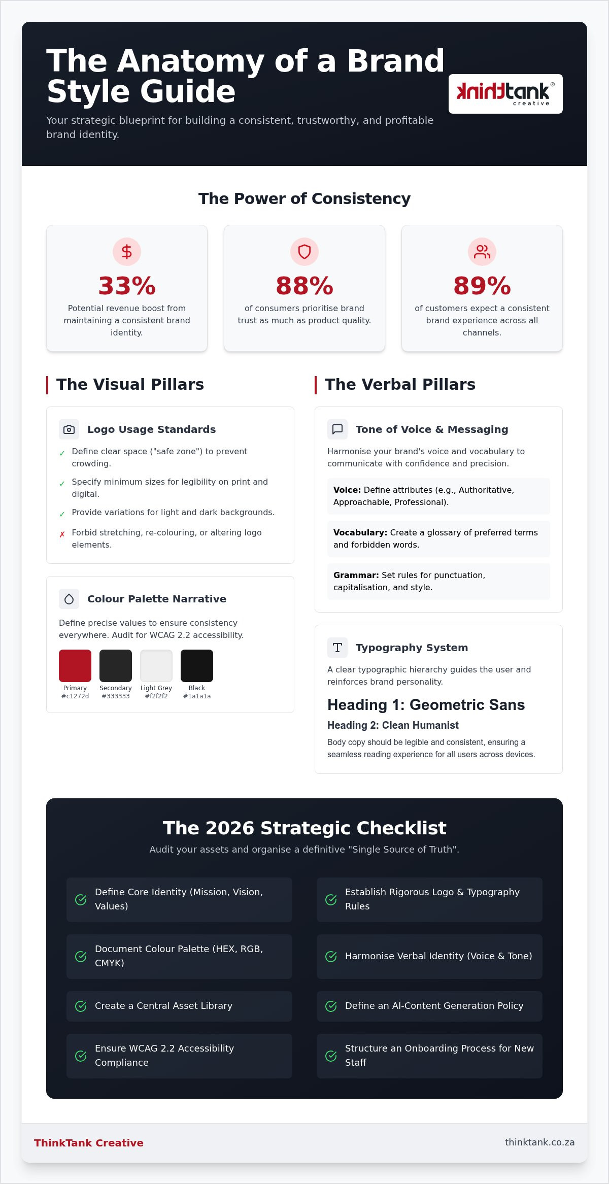
Did you know that maintaining a consistent brand identity can boost your revenue by as much as 33%? In a market where 88% of consumers prioritise trust as much as quality, your visual and verbal coherence isn't just a design choice; it's a vital financial driver. It's frustrating when different departments use conflicting logos or when the wrong colours appear in your print marketing. By mastering the brand style guide essentials, you transform your identity from a collection of assets into a strategic engine for growth that eliminates confusion and builds lasting authority.

You likely already recognise that a strong brand is built on reliability, yet achieving that uniformity across every department often feels like chasing a moving target. We're here to help you bridge that gap. This article provides a definitive roadmap to define your core identity, ensuring your business maintains a coherent and trustworthy presence at every digital and physical touchpoint. We'll explore a strategic checklist for 2026, covering everything from WCAG 2.2 accessibility standards and AI-content policies to the latest typography trends and the serene Cloud Dancer colour palette.

Key Takeaways

  • Discover why a comprehensive style guide serves as the strategic "DNA" of your corporate identity, building the consumer trust essential for long-term revenue growth.
  • Master the brand style guide essentials by establishing rigorous standards for logo usage and typography to ensure visual excellence across all physical and digital touchpoints.
  • Develop a sophisticated verbal identity that harmonises your brand's "voice" and vocabulary, allowing your team to communicate with confidence and precision.
  • Utilise our 2026 strategic checklist to audit your current assets and organise them into a definitive "Single Source of Truth" for seamless internal and external collaboration.
  • Learn how a structured implementation process protects your brand's integrity whilst simplifying the onboarding of new staff and creative partners.

Why a Brand Style Guide is a Non-Negotiable Business Asset

Think of your brand style guide as the strategic DNA of your corporate identity. It's the definitive blueprint that ensures every interaction, whether it's a social media update or a high-end brochure, feels like it belongs to the same family. Without this framework, businesses often fall victim to brand fragmentation. This occurs when different platforms look like they belong to entirely different companies, causing immediate cognitive dissonance for your customers. When 89.4% of customers expect a consistent brand experience across all channels, fragmentation is a risk you simply shouldn't take.

Maintaining these brand style guide essentials builds deep-seated trust. It reduces friction whilst customers navigate your digital space, ensuring your core values remain clear and undiluted. Beyond the external benefits, a guide empowers your internal team to produce high-quality work with increased velocity. By codifying your standards, you remove the guesswork, allowing marketers and designers to create content faster and more accurately. Whilst every brand transformation project is unique, we provide estimated costs after a thorough discussion of your specific requirements, ensuring the final asset is as bespoke as your business.

Protecting Your Brand Equity in a Digital-First World

A comprehensive style guide prevents the slow erosion of your visual impact over time. In our digital-first environment, your brand must remain instantly recognisable amongst a crowded marketplace. This consistency also aids search engine visibility, as a unified identity reinforces user recognition and encourages repeat engagement. Brand equity is the cumulative value of a recognisable identity that translates into consumer preference and long-term business stability.

The "All-Rounder" Advantage: Consistency Across Media

Bridging the gap between high-quality printing solutions and sophisticated digital interfaces requires a meticulous, multi-disciplinary approach. Your social media presence must speak the same language as your corporate profile, ensuring a seamless transition for the user at every touchpoint. Just as Wikipedia's Manual of Style provides a rigorous framework for verbal clarity and tone, your guide ensures your brand voice remains steady across every medium. This synergy starts with a solid foundation. Understanding what makes a good logo design is the critical first step in building a resilient corporate identity that stands the test of time.

The Visual Pillars: Core Brand Style Guide Essentials

Visual identity serves as the immediate visual shorthand for your brand's reputation. Establishing brand style guide essentials ensures that this shorthand remains clear, professional, and impactful across every application. A logo is often the first point of contact; however, its power is easily diluted by improper usage. Your guide must strictly forbid alterations such as stretching, "creative" recolouring, or the removal of key elements. By mandating minimum sizes for both print and digital formats, you ensure legibility remains constant, regardless of the medium. Our 5-stage design process prioritises these rules early, ensuring your identity is resilient from the moment of its creation.

Logo Anatomy and Usage Standards

Effective design requires breathing room to maintain its visual impact. We define a "safe zone" or padding around the logo to prevent it from being crowded by text or other graphic elements. This meticulous attention to detail extends to secondary marks and favicons, which are critical components of custom website design. Your document should also provide specific variations for placement on dark versus light backgrounds, ensuring your mark always maintains its visual authority without losing contrast or clarity.

Mastering the Colour Narrative

Colour is a powerful tool that influences customer behaviour and emotional response. To achieve national consistency, you must define your palette using HEX, RGB, and CMYK values. This precision ensures that the vibrant blue on your website perfectly matches the ink on your business cards or large-scale printing solutions. We also recommend auditing these choices against WCAG 2.2 accessibility standards to ensure contrast ratios are inclusive for all users. Looking at U.S. government style guides offers excellent examples of how complex organisations manage these technical requirements at scale whilst maintaining a friendly, accessible persona.

Typography and imagery provide the final layers of your visual personality. Select primary and secondary fonts that balance distinct character with high readability across different screens. Your imagery standards should define the "vibe" of photography, whilst custom iconography should follow a consistent line weight and style to ensure synergy. If you're ready to refine your visual presence, our specialists can help you develop a bespoke corporate identity that resonates with your audience and reflects your strategic vision.

Defining Your Verbal Identity: Messaging and Tone

Verbal identity is the heartbeat of your brand, yet it remains one of the most overlooked brand style guide essentials in the corporate world. Whilst many organisations obsess over hex codes and logo clear space, they often neglect the words that actually build the relationship. Your brand personality must be defined with precision. Are you the "Authoritative Expert" who leads with data, or the "Approachable Partner" who prioritises collaboration? At ThinkTank, we embody the "Strategic Visionary"—a persona that is elite in execution yet warm in professional relationships. This clarity allows us to champion our "We Do It All So You Don't Have To" philosophy, reassuring clients that their entire digital footprint is in expert hands.

A vocabulary list is a vital tool for maintaining this consistency. It establishes the specific words you use frequently to build authority and the terms you strictly avoid to prevent confusion. This level of detail ensures your messaging remains coherent across every touchpoint. For inspiration on how to codify these rules at scale, the U.S. government style guides demonstrate how even the most complex entities can maintain a unified verbal identity. By documenting these messaging standards, you ensure your mission statement isn't just a sentence on a wall, but a living part of your corporate behaviour.

Crafting a Consistent Brand Voice

Your brand voice is a constant, whilst your tone should be variable based on the context. A formal business proposal requires a steady, reassuring cadence that suggests thoroughness and strategic depth. Conversely, a casual social media post might adopt a more fluid, conversational energy. The goal is to translate complex technical jargon into clear, customer-focused benefits. Ultimately, great marketing makes the customer look smart by providing them with the clear messaging they need to make confident decisions. This approach moves the reader from a high-level concept to a concrete understanding of the value you provide.

Editorial Standards and Grammar

Precision in grammar and formatting reflects the stability of a long-standing enterprise. For South African audiences, adhering to British English spelling—such as "colour" and "organise"—is essential for national resonance. Your guide should also specify date formats, currency representation (ZAR), and capitalisation rules to ensure total alignment across all platforms. These editorial standards work in tandem with the professional logo design process, ensuring that your corporate stationery and digital assets project a polished, unified front. Whilst we provide estimated costs after a thorough discussion of your needs, the value of this verbal consistency is immediate and profound.

Brand Style Guide Essentials: The 2026 Strategic Checklist for National Consistency

The Ultimate Brand Style Guide Checklist for 2026

Transforming your brand from a loose collection of ideas into a disciplined corporate powerhouse requires a methodical approach. This checklist outlines the brand style guide essentials necessary for a future-proof identity in 2026. Auditing your current assets is the first priority. You must identify every instance where a logo is misused or a colour is off-brand to understand the scope of your transformation. Once the audit is complete, codify your logo usage, typography, and colour rules into a single, accessible document. This serves as your team's definitive source of truth.

Efficiency is the natural byproduct of a well-documented brand. By creating templates for common assets, you empower your staff to produce high-quality content without needing constant oversight. This reduces the risk of "creative" departures that dilute your visual impact. Whilst we provide estimated costs for these strategic projects after a thorough discussion of your needs, the long-term savings in production time and brand clarity are substantial.

Technical Specifications for Multi-Channel Use

Precision in file formats ensures your brand remains sharp across all platforms. Your guide should mandate SVG files for web use to maintain scalability, whilst high-resolution PDFs remain the standard for printing solutions. As mobile-first browsing dominates, responsive logo versions are no longer optional. You need simplified marks that remain legible on small screens without losing their essence. Additionally, document the standards for "leave-behind" print marketing collateral to ensure your physical presence is as polished as your digital interface. Exploring print marketing ideas for local businesses is one of the most effective ways to ensure your physical touchpoints command the same authority as your digital presence. Applying the latest business card design tips 2026 is one of the most effective ways to ensure your physical touchpoints command the same authority as your digital presence.

Imagery and Iconography Guidelines

Visual assets must evoke a specific emotional "mood" that aligns with your corporate identity. Whether you opt for candid, high-energy photography or serene, minimalist compositions, the subjects and lighting must feel intentional. Rules for iconography are equally critical. Specify the exact line weights, corner radii, and colour applications for your custom icons to prevent visual clutter. This level of detail ensures that every graphic element works in synergy to elevate your brand's authority. If you are ready to consolidate your identity, our team can help you design a bespoke corporate identity that commands attention across the South African market.

Implementation: Bringing Your Identity to Life

Launching a refined corporate identity requires more than just a static document; it demands a cultural shift within your organisation. To ensure long-term success, you must centralise your brand assets in a cloud-based repository that serves as the "Single Source of Truth" for every department. This prevents the use of outdated versions and ensures that brand style guide essentials are always accessible to your creative team. When every staff member and external agency can find the correct files instantly, you eliminate the friction that leads to brand inconsistency.

Training is the vital human element of this implementation. Host a dedicated workshop to walk your team through the new standards, explaining the strategic reasoning behind each decision. This collaborative approach turns the guide from a restrictive set of rules into a shared vision for excellence. Furthermore, your digital presence requires constant vigilance. Ongoing website maintenance and support ensure that as new pages or features are added, they strictly adhere to the established styles, preventing the "brand creep" that often occurs over time. By reviewing and fine-tuning the guide as your business evolves, you maintain a dynamic identity that remains relevant in a shifting market.

The ThinkTank Creative 5-Stage Design Framework

Our award-winning team utilises a proven 5-stage design process to build resilient identities: Research, Design, Choices, Presentation, and Fine-Tuning. This methodology begins with deep research, where we encourage challenging interaction and debate to uncover the true essence of your business. We don't believe in templated solutions. Instead, we act as a bespoke creative partner, moving your brand from a high-level concept to a concrete, future-proof identity that reflects 25 years of experience in the South African market. This meticulous approach ensures that every visual and verbal element is grounded in strategic depth.

From Guide to Growth: Your Next Steps

A robust style guide is the essential foundation for effective lead generation strategies. When your identity is coherent and professional, your marketing efforts become significantly more persuasive and trustworthy. If you're ready to elevate your corporate presence and protect your brand equity, we invite you to request a consultation for a comprehensive corporate identity redesign. We provide an estimated cost for our services following a thorough discussion of your specific needs, ensuring our partnership is built on transparency, synergy, and a shared commitment to high-quality outcomes.

Elevate Your Identity for the Next Era of Growth

Mastering the brand style guide essentials is the definitive step toward transforming your business from a fragmented collection of assets into a unified, authoritative presence. By codifying your visual and verbal standards, you eliminate the friction that erodes customer trust and internal efficiency. A well-maintained guide ensures that your message remains resilient across every touchpoint, from high-quality printing solutions to sophisticated digital interfaces. It's about creating a legacy of consistency that scales with your ambition.

ThinkTank Creative has been at the forefront of this evolution since 2001. As a comprehensive all-rounder agency, our award-winning design team brings 25 years of experience to every project, ensuring your corporate identity is both bespoke and future-proof. We believe in a collaborative journey that prioritises your unique strategic goals. Whilst we provide estimated costs after a thorough discussion of your requirements, the value of a coherent brand is immediate and enduring. We invite you to start your brand transformation with ThinkTank Creative and build a foundation for sustainable success. Your brand's potential is limitless when every detail is aligned.

Frequently Asked Questions

What is the difference between a brand style guide and a brand identity?

A brand identity is the complete collection of visual and verbal elements that define your business, whilst a style guide is the definitive manual that documents how to use them. Think of the identity as the personality and the guide as the strategic blueprint that ensures everyone communicates that personality consistently. Without a guide, your identity risks becoming fragmented across different platforms, leading to customer confusion and a loss of trust.

How long does it typically take to create a professional brand style guide?

The timeline for a professional guide varies based on the complexity of your corporate identity and the scope of your assets. At ThinkTank Creative, we utilise a rigorous 5-stage design process, moving from research and strategy through to final delivery and support. This methodical approach usually spans several weeks to ensure every detail is refined and bespoke. We provide a tailored estimated cost and timeline after a thorough discussion of your requirements.

Do small businesses really need a full brand style guide?

Every business, regardless of size, benefits from documenting their brand style guide essentials to build immediate credibility. For a small enterprise, consistency is the fastest way to appear established and trustworthy amongst larger competitors. It prevents expensive mistakes, such as printing incorrect colours or using low-resolution logos, and ensures that your first impression is always professional and aligned with your long-term growth strategy and vision.

How often should we update our brand style guide?

You should review your guide annually to ensure it remains aligned with your business objectives and current digital standards. A more comprehensive update is typically required every two to three years to incorporate evolving trends, such as 2026's focus on WCAG 2.2 accessibility or new AI-content policies. Regular maintenance prevents your brand from feeling dated and ensures your team remains energised by a forward-looking identity that adapts to the shifting marketplace.

What are the most common mistakes in a brand style guide?

One of the most frequent errors is focusing exclusively on visuals whilst neglecting the verbal identity and brand voice. Other common pitfalls include failing to define "safe zones" for logo usage or providing vague instructions that lead to "creative" departures by different departments. A successful guide must be meticulous and prescriptive, leaving no room for ambiguity that could dilute your visual impact or confuse your audience across different digital and physical touchpoints.

Can I create a brand style guide myself or should I hire an agency?

Whilst basic tools exist for DIY projects, partnering with an agency like ThinkTank Creative provides the strategic depth and award-winning expertise needed for a resilient identity. Our team has 25 years of experience in the South African market, offering an "all-rounder" perspective that covers everything from printing solutions to custom website design. This collaborative approach ensures your guide is a bespoke asset that reflects your unique value rather than a generic template.

How does a style guide help with digital marketing and SEO?

Consistency leads to improved brand recognition, which directly influences user engagement and conversion rates in digital marketing. When your social media, email campaigns, and website "speak the same language," you build the trust necessary for successful lead generation. From an SEO perspective, unified standards for imagery, alt text, and messaging ensure your brand appears robust and authoritative to both users and search engine algorithms, enhancing your overall visibility.

What is the "ZAR" focus in a South African brand style guide?

A South African focus ensures your brand resonates with a national audience by adhering to local editorial standards and market expectations. This includes using British English spelling—such as "colour" and "organise"—and correctly representing the ZAR currency in all corporate stationery and digital assets. By documenting these specific nuances, you project a professional image that respects the cultural and linguistic expectations of your clients across the country, fostering deeper local connections.

Professional Logo Design Process: 2026 Strategic Guide

A professional logo is a high-performance strategic asset, not a mere drawing. We recognise that committing your hard-earned budget to a new visual identity often brings a sense of trepidation, especially if you've been burnt by vague timelines or confusing technical jargon in the past. It's frustrating to feel disconnected from the creative journey when designers mention vectors or CMYK colour profiles without context. You deserve a partner who respects your vision and your time. Understanding the professional logo design process for clients is the first step toward replacing that uncertainty with a sense of genuine excitement and clarity.

Discover the exact five-stage framework we utilise to transform South African business goals into visual identities that resonate with precision. You'll gain a transparent roadmap of the design journey, from the initial deep-dive research to the moment we deliver your final, polished files. We'll show you how to provide the kind of feedback that empowers our team to refine your vision into something extraordinary. By the end of this article, you'll feel confident in the strategic reasoning behind every curve and palette choice. We're inviting you to step into a structured process where your brand's growth is the ultimate destination.

Key Takeaways

  • Understand why a research-first approach is the only way to prevent brand failure and ensure your identity reflects your unique business mission.
  • Master the professional logo design process for clients by learning how to provide strategic feedback that leads to a polished, iconic visual result.
  • Discover the importance of a "Design Rationale" when evaluating concepts, allowing you to choose a logo based on functional usability rather than subjective opinion.
  • Learn how to utilise your final Brand Toolkit and style guide to maintain impeccable consistency across every touchpoint in the South African market.

Stage 1: The Strategic Foundation — Why Research Precedes the Sketchbook

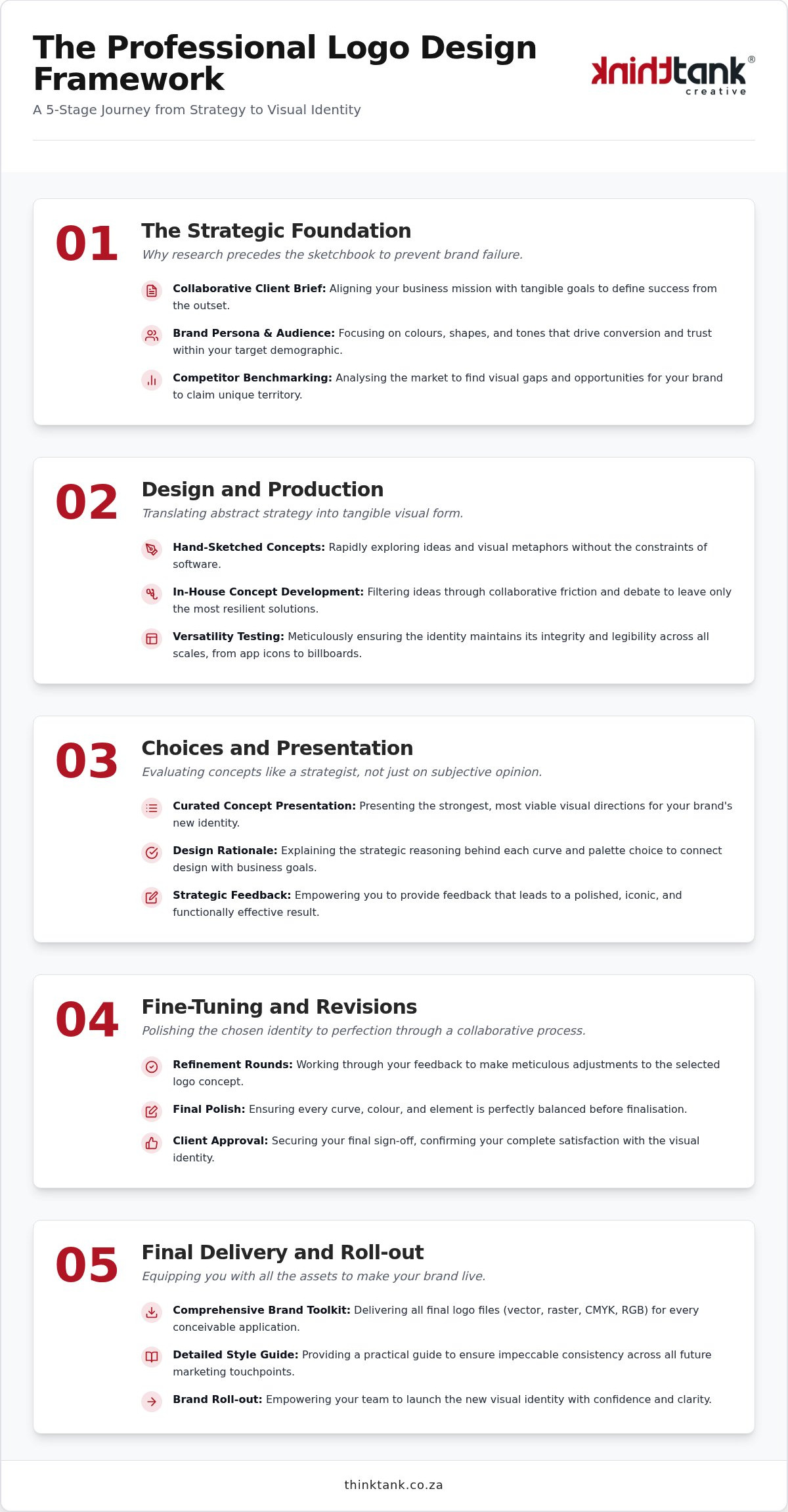
A logo is the visual anchor of your entire business strategy. Jumping straight into the sketchbook is the primary cause of brand failure because it ignores the psychological connection between a business and its audience. We anchor our methodology in visual communication principles to ensure your identity is built on a rock-solid foundation. This initial stage of the logo design process for clients is where we align your business mission with tangible goals. It's a collaborative journey of imagination that prevents costly pivots later.

Success in the South African market requires a customer-smart philosophy. We don't just look at what looks good; we look at what works for your specific demographic. Your client brief is the most important document we'll create together. It establishes the project boundaries and defines exactly what success looks like for your brand. During these early discussions, we also provide an estimated cost based on the scope we've defined together, ensuring total transparency before a single pixel is moved.

To better understand how this collaborative strategy unfolds in a real-world setting, watch this detailed breakdown:

Defining Your Brand Persona and Target Audience

Your brand persona is more than a list of adjectives. It's the emotional behaviour you want to elicit amongst your customers. We move beyond subjective preferences. It doesn't matter if your favourite colour is lime green if your audience associates it with something unrelated to your service. We focus on colours and shapes that drive conversion and trust. By building a vision board together, we ensure our creative team and your leadership are looking at the same horizon. This ensures the logo design process for clients remains objective and results-oriented.

Market Analysis and Competitor Benchmarking

Standing out amongst the noise in South Africa's vibrant economy takes more than luck. We conduct a thorough benchmarking exercise to see what your competitors are doing well and, more importantly, where they are failing. We look for visual gaps where your brand can claim unique territory. This strategic positioning ensures that your logo remains relevant as you scale from a local startup to a national leader. We design with the future in mind, ensuring your identity is as functional on a website as it is on a printed billboard.

Stage 2: Design and Production — Translating Strategy into Visual Form

Visual transformation begins with a pencil, not a mouse. Our award-winning designers initiate the logo design process for clients by translating abstract strategic pillars into tangible metaphors through hand-sketched concepts. This raw, unfiltered exploration allows us to test ideas rapidly without the constraints of software. It's a stage where innovative creativity meets the golden rules of logo design, ensuring that every mark we make is intentional and rooted in the research conducted during Stage 1. We prioritise these sketches because they represent the purest form of the journey of imagination.

The Concept Development Phase

Refining these sketches involves a rigorous period of challenging interaction amongst our in-house team. We debate every curve and intersection to ensure the iconography tells a cohesive story that resonates with your sector. This collaborative friction filters out the ordinary, leaving only the most resilient visual solutions. We simultaneously prepare for both digital and printing solutions, ensuring your mark remains crisp whether it's embossed on premium stationery or glowing on a high-resolution screen. Our goal is to create a visual language that doesn't just follow trends but leads the way in your specific industry.

Ensuring Versatility Across Every Touchpoint

A professional identity must maintain its integrity across vastly different scales. We meticulously test legibility, ensuring your logo is as recognisable on a tiny business card as it is on a massive national billboard. In our mobile-first era, your icon needs to stand out within the small confines of social media profiles and favicon icons. This level of functional usability is essential when your logo integrates with custom website design South Africa, where it serves as the cornerstone of your digital presence.

Typography and colour palettes are chosen with precision to evoke the exact brand persona we defined together. We don't just select colours; we curate emotional responses that align with your long-term growth. This meticulous attention to detail ensures your brand is equipped for success across every medium. If you're ready to see your vision take shape through elite execution, we invite you to explore our creative design services to begin your own brand transformation.

Stage 3: Choices and Presentation — Evaluating Concepts Like a Strategist

The presentation phase represents the first time your strategic vision takes a definitive visual form. It's a significant milestone in the logo design process for clients, where abstract concepts are distilled into a selection of refined identities. We don't just send a PDF and wait for a "yes" or "no". Instead, we guide you through each concept, explaining the strategic reasoning that led to every line and shade. This ensures that the choices you make are informed by the goals we established together during the research phase.

We provide a comprehensive "Design Rationale" for every concept presented. This document clarifies the "why" behind our creative choices. If we've utilised a specific weight for a typeface or a particular geometric shape, it's because those elements align with the brand persona we established during Stage 1. This ensures your decision is based on objective business benefits rather than fleeting personal trends. By understanding the methodology behind the art, you can lead your brand with quiet assurance.

Seeing a logo in isolation is rarely enough to judge its efficacy. We present your new identity within high-fidelity, real-world mock-ups. You'll see how the logo behaves on a digital interface, a corporate letterhead, and even national signage. This context is vital. It helps you visualise the brand's potential and ensures the corporate identity remains robust across all physical and digital touchpoints. It's about seeing the potential for transformation in every application.

How to Review Your Logo Concepts

Effective review requires you to step into the shoes of your audience. Don't ask if you like the colour; ask if the colour elicits the correct emotional behaviour from your target market. A successful logo makes your customer look smart for choosing your service. We encourage you to evaluate each concept against the "Strategic Guide" objectives we set at the start. This keeps the focus on creating a professional corporate identity that drives growth rather than just settling for an attractive image.

The Collaborative Feedback Loop

Our team views this stage as a partnership, not a transaction. Constant communication is essential to refine the chosen concept into its final form. We value your insights as the expert in your industry, whilst we provide the expertise in visual strategy. Honest debate is welcomed. It's through this collaborative friction that we move from "good marketing" to "great marketing," ensuring the final result is as innovative as it is functional. This iterative synergy is what defines a truly elite logo design process for clients.

Professional Logo Design Process: 2026 Strategic Guide

Stage 4: Fine-Tuning and Revisions — Polishing the Identity to Perfection

Precision is the hallmark of this stage. Once you've selected a primary concept from the previous phase, we enter the meticulous fine-tuning process. This is the part of the logo design process for clients where we shift from broad creative strokes to microscopic technical adjustments. We examine the optical kerning between letters, the mathematical balance of icons, and the precise saturation levels of your colour palette. These refinements ensure your identity remains robust and legible whether it's embossed on premium stationery or glowing on a high-resolution digital interface.

Our designers focus on creating a sense of visual harmony that feels both effortless and intentional. We don't just move elements around; we apply strategic reasoning to every pixel. This ensures that the final result isn't just a pretty picture, but a functional tool that supports your business growth. By the time we reach the end of this stage, you'll feel a sense of quiet assurance that your brand is represented by an elite visual asset. It's about reaching that "eureka" moment where the identity feels perfectly aligned with the vision we established in Stage 1.

The Art of Constructive Revision

Feedback is a powerful tool when it's anchored in strategy. We encourage you to focus on the emotional behaviour you want the brand to elicit amongst your customers rather than subjective personal preferences. Instead of suggesting a specific font change, tell us if the current weight feels too aggressive for your professional persona. This collaborative approach empowers our award-winning team to find the most innovative solutions whilst maintaining the integrity of the brand. Avoiding "design by committee" is vital here; whilst gathering internal opinions is helpful, the final decision must always serve the strategic goals of the business.

Final Approval and Quality Assurance

Before moving to the final delivery, we conduct a rigorous quality audit. This includes testing the logo's performance across various platforms to ensure maximum usability and functionality. We verify that the concept adheres to the core principles of what makes a good logo design, focusing on longevity and scalability. Once you provide the final sign-off on the master concept, the creative project transforms into a permanent business asset. Secure your brand's future by partnering with experts who value this level of precision; explore our Logo and Corporate Identity Design solutions today.

Stage 5: Final Delivery and Roll-out — Making Your Brand Live

The culmination of our collaborative journey arrives with the delivery of your comprehensive Brand Toolkit. This final phase of the logo design process for clients ensures that your new visual identity is not just a static image, but a versatile engine for growth. We provide you with a curated suite of assets designed to maintain impeccable standards across every national touchpoint. This transition from design to implementation is where your brand truly begins its life in the South African marketplace, backed by our quiet assurance of quality and elite execution.

Our team remains deeply invested in your success well beyond the initial hand-off. We move beyond being a mere vendor to act as your long-term creative partner, ensuring your brand evolves alongside your business. Whether you are launching a new social media campaign or preparing for a national trade show, we provide the strategic depth needed to keep your identity sharp. We handle everything from the initial logo concept to professional printing and website development, providing a seamless end-to-end experience that respects your time and your vision.

Understanding Your Deliverables

We supply industry-standard vector files, such as AI and EPS, which allow for infinite scalability without any loss of resolution. These are essential for professional printing solutions and large-scale signage. Alongside these, you'll receive high-resolution raster files like PNG and JPG for immediate digital application. We provide specific files in CMYK for physical production and RGB for digital marketing and social media profiles. Your toolkit also includes the Master Logo and its functional variants, including monochrome versions for subtle applications, stacked layouts for vertical spaces, and isolated icons for mobile environments. To ensure your new identity extends seamlessly to every physical touchpoint, our business card design tips 2026 guide will help you translate your brand assets into bespoke printed collateral that commands attention.

Implementing Your New Visual Identity

Consistency is the foundation of brand trust. We provide a detailed Brand Style Guide that dictates exact spacing, colour codes, and typography rules to ensure your identity remains uniform amongst different vendors and platforms. This guide is vital when integrating your logo into your email marketing campaigns or PPC advertising. Using your new identity to enhance lead generation strategies for South African businesses ensures that every prospective client encounters a professional, cohesive brand persona. We facilitate the transition to professional printing for all your branded promotional material, ensuring the colours you saw on screen are perfectly replicated in the physical world.

Secure Your Brand's Future through Strategic Design

Your visual identity is the most hard-working asset in your business toolkit. By moving through a structured, research-led framework, you transform a simple graphic into a powerful symbol of trust and credibility. Understanding the logo design process for clients ensures that every creative decision is rooted in measurable business objectives rather than fleeting trends. You've seen how a collaborative journey, from the initial deep-dive to the final brand roll-out, creates a foundation for long-term growth and national recognition.

Since 2001, our all-in-house team of expert designers has been dedicated to this level of precision. We provide comprehensive end-to-end branding and printing solutions that ensure your message remains consistent across every medium. Partnering with award-winning designers means you aren't just buying a logo; you're investing in a strategic vision that elevates your presence in the South African market. We're ready to help you navigate this transformation with quiet assurance and elite execution.

Embark on a journey of imagination with ThinkTank Creative today. Your brand's next chapter starts here.

Frequently Asked Questions

How long does the professional logo design process usually take?

The timeline for a professional logo design process for clients generally spans several weeks to ensure thorough research and execution. We balance competitive time limits with a commitment to high-quality work that doesn't compromise on strategic depth. Factors like the speed of your feedback and the complexity of the project boundaries influence the final delivery date. We provide a clear schedule during the initial strategy phase to help you plan your brand roll-out with confidence.

How many logo concepts will I receive during the presentation stage?

We typically present a curated selection of initial concepts that directly address the strategic goals defined in your brief. Rather than overwhelming you with dozens of weak ideas, we focus on delivering a few resilient, high-fidelity directions that each tell a unique brand story. This approach allows us to engage in deep discussion and debate during the presentation stage, ensuring that the final choice is rooted in functional usability and innovative creativity.

What happens if I don't like any of the initial logo designs?

Our collaborative journey of imagination includes dedicated fine-tuning and revision stages to ensure the final result resonates with your vision. If the initial concepts don't immediately feel like a perfect fit, we use your strategic feedback to refine the direction. We encourage honest debate and constant communication throughout the project. This partnership ensures we navigate through the creative process together until we achieve a visual identity that makes your customers look smart.

Will I own the full copyright to my logo once the project is finished?

You will receive full ownership of the final approved logo once the project is completed and delivered. This includes the rights to use the master logo and its variants across all digital and physical marketing collateral. We provide all the essential file formats, such as high-resolution vectors for printing solutions and RGB files for social media. This gives you the quiet assurance that your brand assets are secure and ready for national implementation.

What is the difference between a logo and a full corporate identity?

A logo is the central visual mark of your business, whilst a corporate identity is a comprehensive ecosystem of brand elements. A full identity includes stationery, company profiles, and promotional branded material that work together to create a unified presence. This end-to-end approach ensures consistency across every touchpoint. Whilst a logo starts the conversation, a corporate identity builds a lasting relationship with your audience through professional and cohesive visual communication principles.

How much does a professional logo design cost for a South African business?

We provide a detailed estimated cost for our logo design process for clients after an initial discussion regarding your specific needs and timeline. This personalised approach ensures that the investment aligns with the scope of your project, whether you require a simple mark or a full brand roll-out. Since every business has unique goals, we avoid fixed pricing in favour of a tailored solution that focuses on the long-term growth of your brand.

Can you help me update my existing website with the new logo?

We certainly can assist with integrating your new identity into your digital presence. As a full-service agency, we specialise in custom website design and development, as well as ongoing website maintenance and support. Our in-house team can ensure your new logo is perfectly implemented across your site, social media profiles, and email marketing templates. This seamless transition ensures that your digital brand remains as professional and functional as your new corporate identity.

Do I need a brand style guide if I only have a small business?

Every business, regardless of size, benefits from a brand style guide essentials framework to maintain national consistency. This document acts as a strategic guide for any future marketing efforts, ensuring that external vendors or internal teams apply your colours and typography correctly. It prevents your brand from becoming fragmented as you grow. Having clear rules for your visual identity helps you maintain a professional corporate persona that builds trust with your South African customers.

What Makes a Good Logo Design? The 2026 Strategic Guide

Could a single graphic symbol be the difference between a forgotten startup and a market leader in 2026? Most ambitious business owners recognise that a visual identity needs to be more than just aesthetically pleasing. You likely feel the pressure to stand out whilst fearing your brand might fade into a sea of generic competitors. It's common to feel a disconnect between the vision in your head and the visuals on the screen, especially when the line between a simple logo and a comprehensive brand identity feels blurred.

This strategic guide clarifies exactly what makes a good logo design by exploring the fundamental principles that drive business growth. We'll show you how a professional identity acts as a catalyst for transformation, moving beyond simple graphics to create a bespoke asset that commands attention. By the end of this article, you'll have a clear checklist for evaluating design concepts and the confidence to choose a partner who understands the high-quality outcomes your business deserves. Let's explore the synergy between strategic thinking and creative excellence to elevate your brand for the years ahead.

Key Takeaways

  • Understand how a logo serves as the strategic anchor for your entire corporate identity rather than just a standalone graphic.
  • Discover the core pillars of what makes a good logo design, focusing on how simplicity and memorability ensure your brand remains unmistakable.
  • Learn to avoid the common pitfalls of generic templates by prioritising bespoke craftsmanship that aligns with your specific business goals.
  • Gain insight into a professional design journey that moves from deep market research to meticulous fine-tuning and final delivery.
  • Recognise the long-term ROI of a professional visual identity and how it integrates seamlessly with your digital presence to drive growth.

Beyond the Icon: Understanding the Strategic Role of Logo Design

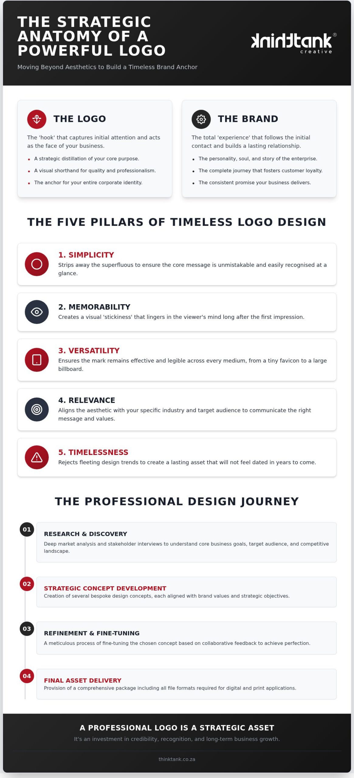
A logo is far more than a decorative mark or a creative flourish. It's a strategic distillation of your brand's core purpose, acting as the visual foundation for your entire corporate identity. When business leaders ask what makes a good logo design, they aren't just looking for aesthetic appeal; they're seeking a visual anchor that translates complex values into a single, scalable symbol. To truly appreciate this impact, one should examine the history and principles of logo design, which demonstrate how symbols have evolved from simple identifiers into sophisticated psychological tools that drive consumer behaviour.

As we look toward 2026, the shift towards minimalist, purpose-driven visual communication has become undeniable. Consumers are increasingly weary of cluttered marketing and seek brands that project clarity and authenticity. In the South African market, a professional logo builds immediate credibility amongst consumers who value transparency and excellence. It signals that your business is established, dependable, and meticulous in its approach. This sense of quiet assurance is what separates market leaders from those who merely exist in the digital space.

To gain a deeper perspective on the synergy between design and strategy, consider this expert breakdown:

The Difference Between a Logo and a Brand

Think of your logo as the "hook" that captures attention in a crowded marketplace. Your brand, by contrast, is the total "experience" that follows that initial contact. A great logo often fails if it isn't supported by a consistent brand story that resonates with the audience. Visual cues are essential for fostering customer recognition and loyalty. They serve as mental shortcuts, allowing your clientele to instantly connect with your brand's promise and history. Whilst the logo is the face, the brand is the personality and the soul of the enterprise.

Why "Good Marketing" Needs a Great Visual Anchor

Great marketing makes the customer feel smart. It validates their decision-making process and respects their time by providing a clear, professional visual shorthand for quality. A well-crafted logo acts as this anchor, reassuring the viewer that they're engaging with a high-calibre partner. In a competitive national market, the cost of a poor first impression is exceptionally high. If your visual identity appears dated or generic, potential clients may assume your services lack innovation. Investing in a bespoke visual identity ensures you aren't just seen, but remembered as a leader in your field.

The Five Pillars of Timeless Logo Design

Strategic design is never the product of chance. It requires a disciplined adherence to the five principles of effective logo design that ensure a brand remains relevant across decades. When assessing what makes a good logo design, you must look beyond current aesthetics to find a symbol that is robust enough to carry your business legacy. Excellence in this field is defined by five foundational pillars:

A truly effective logo doesn't just look pretty; it functions as a hardworking business asset. By prioritising these pillars, you create a visual anchor that provides a consistent return on investment through increased recognition and trust.

Scalability and Technical Versatility

High-performing logos must be adaptable. A design that looks stunning on a desktop might lose all definition when viewed on a smartphone or as a tiny favicon. This is why mobile-first website design is a non-negotiable consideration during our creative process. We utilise vector graphics to ensure your visual identity maintains its integrity, whether it's featured in high-quality printing solutions or expanded for national billboard campaigns. Ensuring legibility across different colours and background textures is essential for maintaining a professional image in every context.

The Psychology of Colour and Typography

Colours are powerful emotional triggers that influence consumer behaviour amongst your target market. Whilst blue might suggest stability and authority, a vibrant orange can signal innovation and energy. Choosing the right palette requires a deep understanding of your brand's personality and the feelings you wish to evoke. Similarly, typography carries the weight of your brand's voice. A refined serif font might convey heritage and trust, whereas a sleek sans-serif suggests a forward-looking, modern enterprise. Maintaining this consistency across all corporate identity designs creates a unified experience that builds long-term equity. To ensure this consistency is codified and applied uniformly across every department, mastering the brand style guide essentials is a critical next step for any growing business. If you're ready to refine your vision, our team is here to help you organise your brand strategy for maximum impact.

Strategic Vision vs. Mere Aesthetics: Avoiding Common Branding Pitfalls

Settling for a generic template is perhaps the most dangerous shortcut a growing business can take. Whilst DIY tools promise speed and low costs, they often lead to the "DIY Trap" where your brand becomes indistinguishable amongst a sea of competitors. A professional designer doesn't just produce a graphic; they act as a creative partner who challenges your initial assumptions to uncover better ideas. This collaborative interaction is essential because what makes a good logo design isn't just aesthetic appeal, but its ability to communicate your unique selling points through original illustrations rather than overused stock icons.

Originality provides a level of precision that templates simply cannot match. When you rely on stock imagery, you're using a visual language that has already been spoken by thousands of other entities. This dilutes your authority and makes it difficult for consumers to form a genuine connection with your brand. By investing in bespoke craftsmanship, you ensure that every line and curve serves a specific strategic purpose, elevating your corporate identity from a mere icon to a powerful business asset that reflects your true professional standing.

The Problem with Chasing Design Trends

Many businesses fall into the trap of adopting whatever style is popular on social media at the moment. However, a trend that feels fresh in 2026 may look incredibly dated by 2027. There is a profound difference between being "modern" and being "trendy". Modernity is about clean, functional design that stands the test of time, whilst trendiness is often a superficial filter. For instance, consider "Lebo the Accountant". By moving away from a generic calculator icon to a bespoke, professional mark that prioritised clarity and trust, Lebo saw a marked increase in high-value enquiries. This professional clarity signals a level of sophistication that "trendy" icons often lack.

Ensuring Your Logo Works in the Digital Space

A logo must do more than look good on a business card; it needs to perform in the complex digital landscape. This involves seamlessly improving website user experience by ensuring the logo acts as a clear, intuitive home-link that doesn't distract from the user journey. From a technical perspective, your visual identity should be SEO-friendly through the strategic use of alt-text and a site architecture that supports fast loading times. When your logo is technically optimised, it enhances your social media engagement by providing a consistent, high-resolution anchor across every platform, ensuring your brand remains recognisable whilst consumers navigate their digital lives.

What Makes a Good Logo Design? The 2026 Strategic Guide

The Professional Journey: From Research to Final Delivery

A superior visual identity is the product of a deliberate, five-stage methodology. It aligns creative flair with commercial objectives to ensure every mark carries strategic weight. When evaluating what makes a good logo design, you're essentially evaluating the rigour of the process that created it. At ThinkTank Creative, we've refined this journey since 2001 to move beyond surface-level aesthetics into the realm of bespoke craftsmanship.

The journey encompasses Research and Strategy, followed by Design and Production where "innovative creativity" meets technical skill. We then move into Choice and Presentation, providing curated options that meet your specific brief. This leads to Fine-Tuning and Feedback, culminating in the Final Delivery of a comprehensive asset suite. This progression ensures that we don't just "make a logo", but instead build a functional business engine. To understand exactly what each of these stages involves, our detailed guide on the logo design process for clients provides a transparent roadmap of the entire creative journey.

Why Research and Strategy Come First

Successful design requires a deep understanding of your specific market dynamics. We begin by identifying whether your primary audience is the end-user or a dealer, as this distinction radically alters the visual tone and messaging. By meticulously analysing national market competitors, we identify a unique "gap" where your brand can stand unopposed. This phase also sets the foundation for search engine optimisation in South Africa, ensuring your brand is built for visibility from the very beginning. A logo without strategy is merely a decoration.

The Collaborative Feedback Loop

Synergy is at the heart of our creative process. We invite our clients to embark on a "journey of imagination", where your industry insight meets our technical skill. The role of revision is vital in this partnership. It isn't a process of correcting errors, but instead a methodical refinement to reach a "perfect" final delivery. We ensure the final result is functional, usable, and visualised across all intended platforms, from digital favicons to large-scale print. This collaborative spirit ensures you receive a full suite of files ready for immediate implementation. If you're ready to elevate your visual presence, partner with our expert designers to bring your vision to life.

Elevating Your Corporate Identity with ThinkTank Creative

Transforming a visual concept into a market-leading brand requires a partner who understands the full spectrum of digital and physical touchpoints. At ThinkTank Creative, we operate on the principle that we do it all so you don't have to. This all-rounder capability ensures that your strategic logo isn't just a static image, but a dynamic tool integrated into every facet of your business. Understanding what makes a good logo design involves recognising how that mark translates across various platforms, from a high-resolution print on a corporate brochure to the intricate interface of a digital storefront.

A bespoke visual identity finds its most powerful application in the digital sales environment. By integrating your new logo into a custom e-commerce website development, you create a seamless journey that builds trust at every click. This integration is vital for positioning your business as a smart, customer-focused leader. Ongoing support and brand maintenance are equally critical; a brand is a living entity that requires consistent care to remain effective as market conditions evolve and consumer behaviours shift.

A Complete Solution for National Growth

Consistency is the hallmark of professional excellence. Our award-winning design team ensures your brand speaks with a unified voice across social media marketing, email campaigns, and high-quality printing solutions. This holistic approach is what makes the difference in 2026. National growth in South Africa demands a visual identity that remains robust whether it's on a smartphone screen or a physical product package. We specialise in creating this synergy, ensuring your corporate identity remains unmistakable amongst a sea of competitors whilst projecting a sense of quiet authority. To ensure your visual identity is supported by a steady stream of strategic messaging, learning how to create a content marketing plan that aligns with your brand goals is an essential next step for sustained national growth.

Next Steps for Your Brand Transformation

Starting your journey with us begins with a collaborative discussion to map out your specific objectives and creative vision. We believe in transparency and strategic depth, which is why we provide a detailed estimated cost proposal after our initial consultation. This ensures the scope of work aligns perfectly with your ambitions for brand transformation. With a legacy spanning nearly 25 years, our agency offers the stability of a seasoned enterprise and the fluid energy of a creative studio. We invite you to partner with us for a long-term journey of elevation, craftsmanship, and mutual success.

Transforming Your Vision into a Lasting Commercial Asset

Crafting a visual identity that resonates across a national market requires more than just creative intuition. It demands a disciplined adherence to the pillars of simplicity and versatility whilst maintaining a deep connection to your brand's strategic purpose. We've explored how what makes a good logo design is found in the synergy between research-led strategy and bespoke craftsmanship. By moving away from generic templates and embracing a collaborative design journey, you position your business as a smart, credible leader ready for the challenges of 2026.

ThinkTank Creative has been at the forefront of this evolution since 2001. As a full-service "all-rounder" agency, our award-winning in-house designers specialise in creating cohesive corporate identities that scale seamlessly from high-quality print to complex digital platforms. We invite you to start your brand journey with ThinkTank Creative today and discover the potential for true transformation. Let's work together to build a visual legacy that commands attention and drives sustained growth for your enterprise.

Frequently Asked Questions

What is the most important element of a good logo design?

Simplicity is arguably the most vital element because it ensures the mark remains recognisable and scalable across all mediums. When considering what makes a good logo design, you must prioritise a mark that communicates your brand's core purpose without unnecessary clutter. This clarity allows for immediate recognition amongst your audience. A simple design functions effectively on a tiny smartphone screen or a massive billboard, ensuring your visual anchor remains consistent in every context.

Can I design my own logo using an online maker?

Whilst online makers are available, they often rely on generic templates that dilute your unique selling points. These tools cannot replicate the innovative creativity and strategic depth provided by an award-winning design team. Choosing a DIY route often results in a visual identity that lacks original illustrations, making it difficult to stand out in a competitive national market. A professional partner ensures your logo is a bespoke asset tailored specifically to your business goals and audience.

How much does a professional logo design cost in 2026?

We don't offer fixed pricing for our creative services because every brand transformation project is unique. Instead, an estimated cost is provided after a thorough discussion of your specific needs, timeline, and project scope. This bespoke approach ensures that the investment aligns perfectly with the strategic value delivered. Whether you require a simple corporate identity or a comprehensive rebranding for an international enterprise, our pricing reflects the meticulous research and craftsmanship involved in our five-stage process.

How long does the professional logo design process take?

The professional journey follows a structured five-stage process: Research and Strategy, Design and Production, Choice and Presentation, Fine-Tuning and Feedback, and Final Delivery. Whilst we work within competitive time limits to meet your business objectives, we never compromise on quality. The duration typically depends on the complexity of the brief and the speed of the collaborative feedback loop. This methodical approach ensures the final result is functional, usable, and perfectly aligned with your long-term vision. For a full breakdown of each stage, our guide on the professional logo design process for clients offers complete transparency on timelines and deliverables.

What files should I receive at the end of a logo project?

At the completion of your project, you should receive a full suite of files suitable for both high-quality printing solutions and digital applications. This typically includes vector formats like AI or EPS for infinite scalability, alongside high-resolution raster files such as PNG and JPEG for web and social media use. Providing these diverse formats ensures your visual identity maintains its integrity across every touchpoint, from corporate stationery to your custom e-commerce website development and email marketing campaigns.

Does my logo need to include a symbol or icon?

Not every brand requires a standalone symbol or icon to be effective. Some of the most successful identities rely on a bespoke wordmark where typography carries the brand's personality and authority. The decision depends entirely on your industry and target audience. Our designers focus on what makes a good logo design for your specific context, whether that involves a minimalist icon or a sophisticated typographic treatment that reflects your professional standing and builds trust with your clientele.

How often should a business refresh its logo design?

Most businesses consider a brand refresh every five to ten years to stay relevant as consumer behaviours and digital trends evolve. However, a refresh might be necessary sooner if your business undergoes a significant transformation, such as a shift in service offerings or target audience. The goal is to maintain a modern rather than trendy aesthetic. This ensures your visual identity continues to project credibility and excellence without losing the heritage you've built over time.

What is the difference between a logo and a corporate identity?

A logo is the primary graphic symbol or wordmark that represents your business. In contrast, a corporate identity is the comprehensive visual system that includes your logo, colour palette, typography, and stationery. Whilst the logo acts as the visual anchor, the corporate identity ensures consistency across all marketing collateral and digital platforms. This holistic approach builds a unified brand experience that makes your company look smart and ensures your customers feel smart for choosing your services. To maintain that consistency at scale, exploring the brand style guide essentials for national consistency will help you codify every visual and verbal element into a single, authoritative reference for your entire organisation.